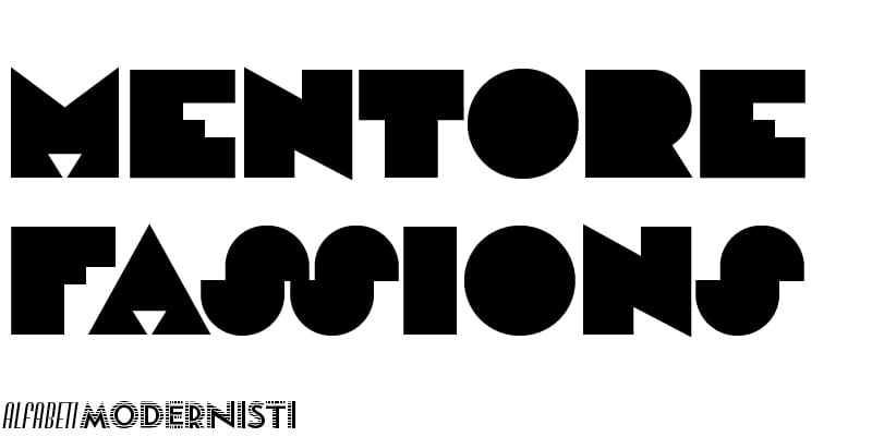
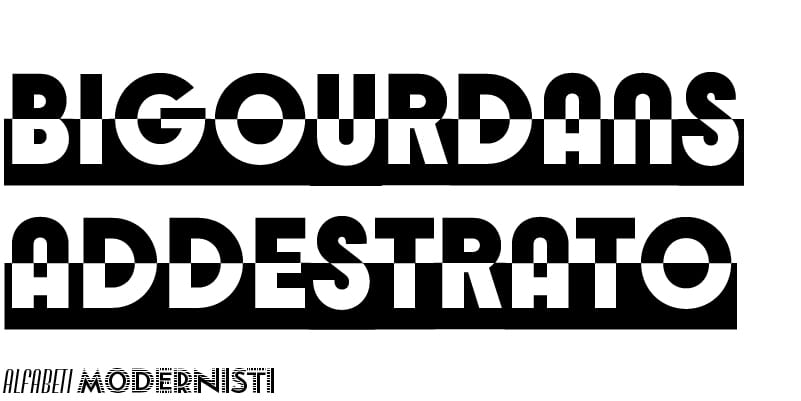
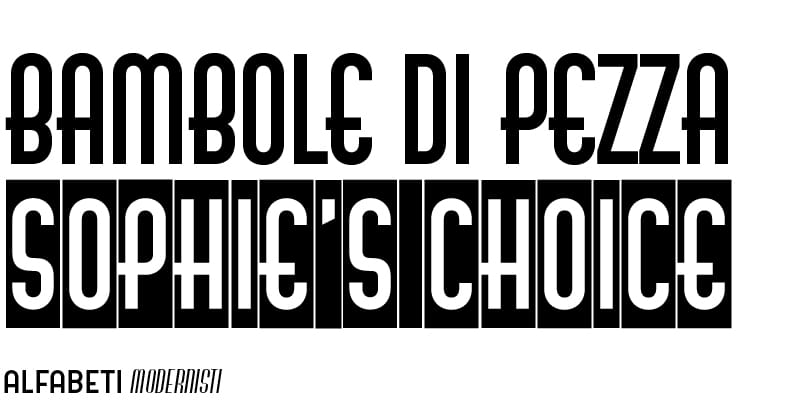
Radio is an all-caps sans serif with no thick/thin contrast in a modular design that was very popular in the 1930s. Rounded details of A, K and W, and lowercase shapes for M, N and Y are featured in other types in the Alfabeti Modernisti collection, such as Serie 610 and Udine. Radio’s distinctive details are the diagonally cropped terminals of horizontal strokes and, most notably, an unusual inline which cuts vertical stems into two halves. Originally cast in metal around 1935 by Fonderia Tipografica Meridionale Armando De Luca in Naples, it was released in several body sizes from 20 to 60 points.
Radio

‘When designing the AM Radio digital revival, I focused on improving the proportions to make the characters feel more natural,’ says Maria Jarzyna. ‘I used letters such as H and O as a basis for proportions and spacing, and adjusted a few stroke endings to achieve better proportions and balance. After testing several stroke and inline widths, I chose the one that felt most consistent. Overall, I only corrected what was necessary to keep the type in line with modern requirements, while preserving its original logic and texture. In Radio’s original design, round forms weren’t treated consistently. I worked to unify them, making overly round shapes a bit squarer and overly square ones smoother. The ampersand and brackets were problematic, so I redrew them. I also reused the left side of the question mark in characters like €, £, and quotation marks.’
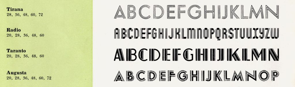
Courtesy of Archivio Enrico Tallone – Archives of Styles
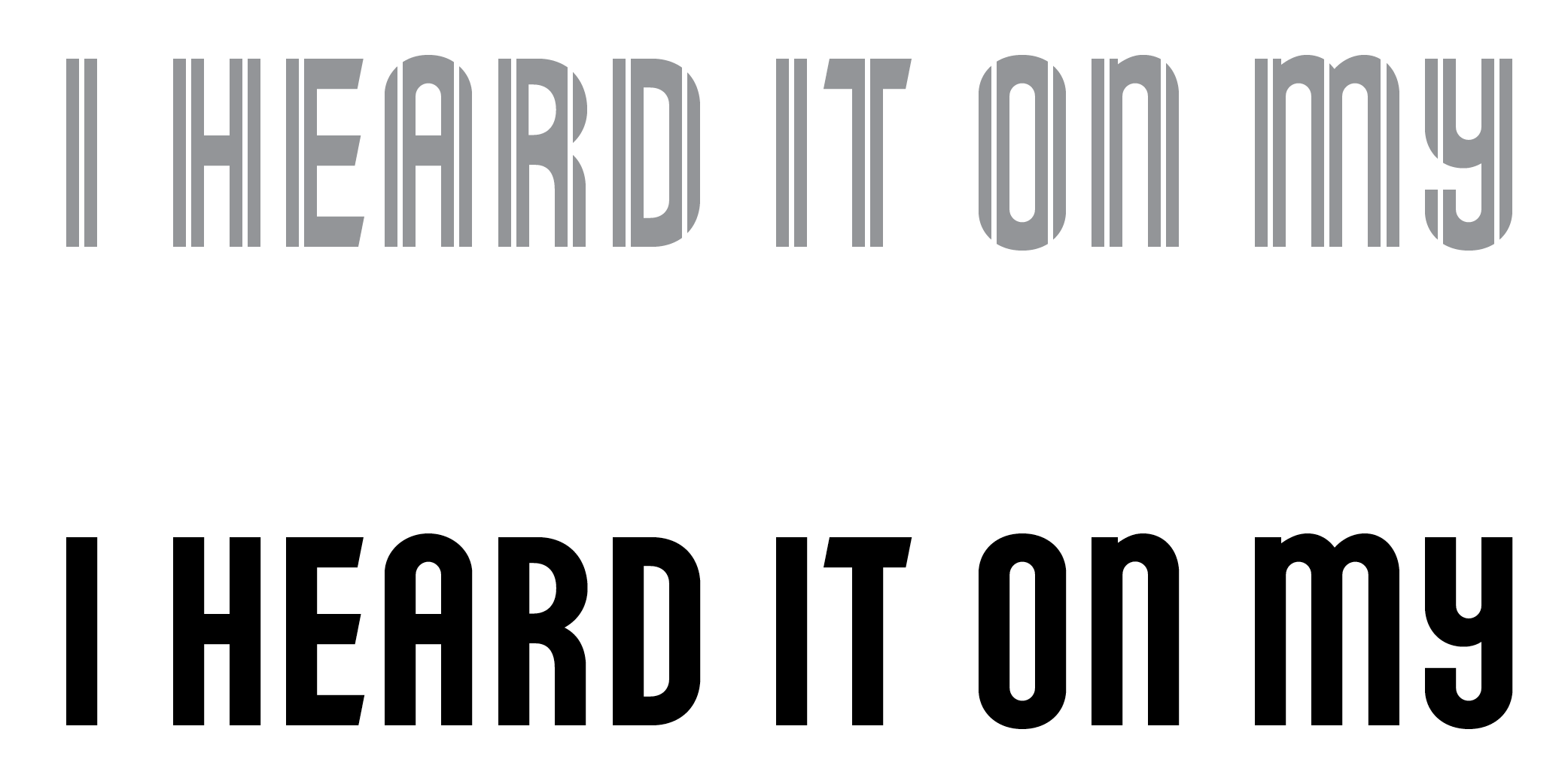
A solid version of the typeface has been added as a stylistic set. This is particularly useful for sizes smaller than 20 points where the inlines tend to disappear. However, this solid version can also be used at larger sizes in combination with the (default) inline style for a wider range of textural effects.
Solid (ss 01)