Pritzious is a flamboyant script typeface for branding and display purposes. It is based on Rosart’s and Fleischman’s ‘Financière’ style of script types. With its cultured shapes, its European roots and its contemporary demeanour, Pritzious stands out among all the scripts of its kind.
Pritzious


Pritzious, the tasty and charming unjoined script
Pritzious is a script typeface by the Italian letterer and designer Valentina Casali. Suitable for branding, publishing and packaging, it might also be a fine choice for titles and headings etc. and for setting certain historical texts.
Inspiration for this unusual face came to Casali from the 18th-century ‘Caractère de Finance’, a style of type following the ‘Financière’ handwriting style introduced by some 17th-century calligraphers and engravers, and above all the French ‘maître écrivain’ Louis Barbedor (1589–1670). Over a span of twenty years (1750s–1770s) the Caractère de Finance was cut several times by different punchcutters, such as Jacques-François Rosart (1714–1777), Joan Michaël Fleischman (1707–1768), and others including Rosart’s son Mathias (1743‒1815). Most of those types were cast and sold by the famous Dutch printer Johannes Enschedé (1708-1780).
The two main sources of Pritzious: the ‘Financière’ script types cut respectively by Fleischman in 1756 (above) and Rosart around 1760 (below).
Rosart’s and Fleischman’s sources taken into account by the designer display capitals that followed Barbedor’s large caps engraved on and printed from copper plates, while their lowercase letters continue the French bâtarde tradition. But due to technological limitations of the time the letters are not joined up. Indeed the earliest joined up script types with exit strokes meeting entry strokes such as those of calligraphic letters appeared in the early 19th century. The capitals must have been loved by Bodoni who in his compulsive production cut them in as many as 15 sizes. They are shown under the name of ‘Maiuscola Cancelleresca’ in his 1788 typographic manual Serie di maiuscole e caratteri cancellereschi and in all his following manuals.

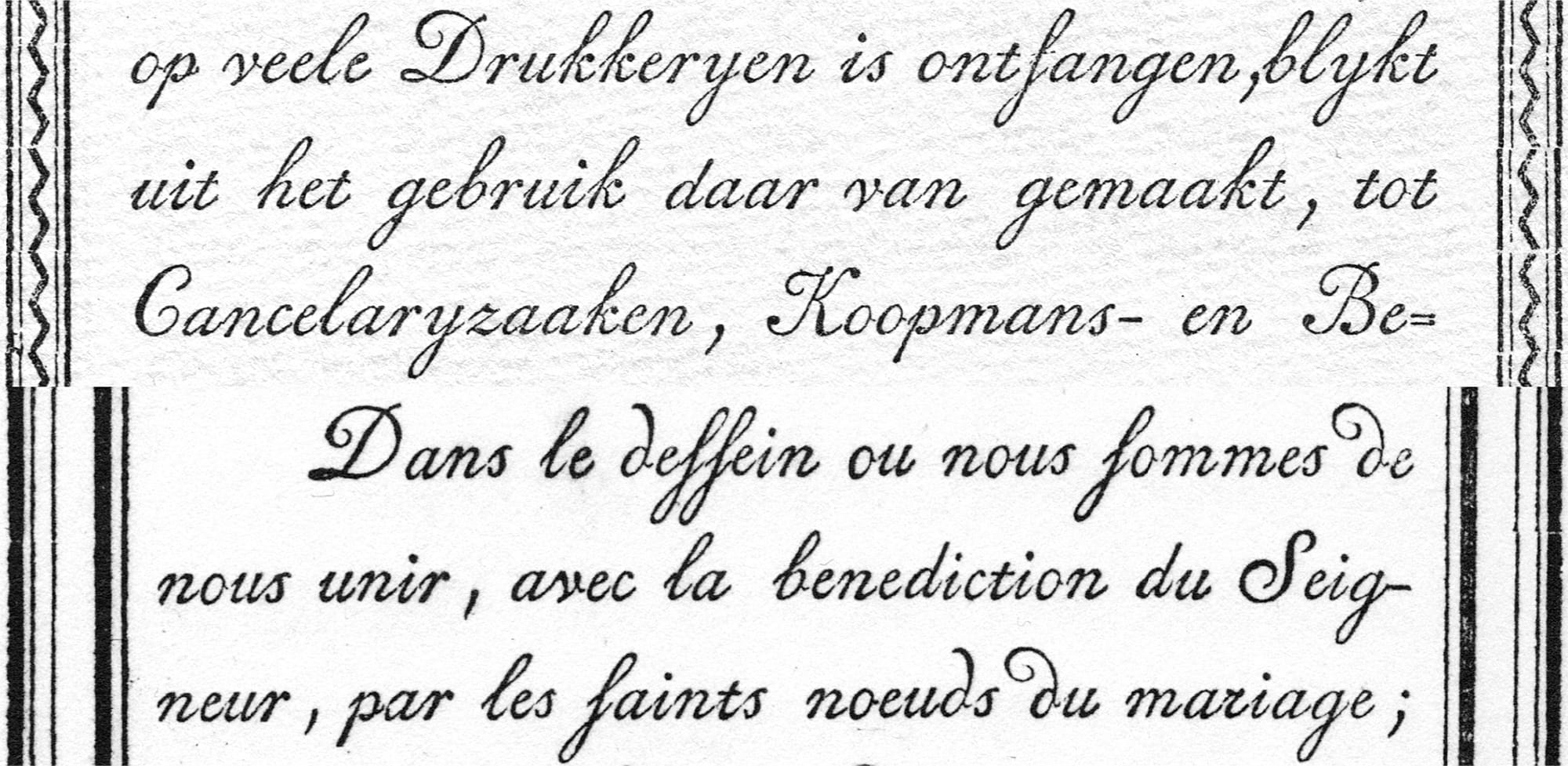
A copper plate print from Louis Barbedor’s Les Escritures Financière et Italienne-Bastarde. Paris, 1647.
Let’s talk with Valentina Casali and find out more about her Pritzious – the first script typeface released by CAST foundry.
How did you approach this project?
My goal was to design an ‘outsider’ historical script suitable for branding and display purposes. After scouting around, I focused mainly on two historical types: the Dubbelde Descendiaan Geschreven Schrift, whose punches were cut by J. M. Fleischman, 1756; and the Double Descendiaan cut by J-F. Rosart, around 1760. They look very similar (both measuring approximately 24 points), but differ in the slant angle (30° and 25°) and in the contrast distribution of some letters.

Close up of Fleischman’s (left) and Rosart’s types (right).
It was not my intention to achieve the revival of a single script typeface, I aimed to find a synthesis of a style of type, the Caractère de Finance, working on more than one model. I started my design process by looking at different printed instances of letter n; though having a different italic angle, they show a very similar structure, or ductus, if we want to use a calligraphic term. I started experimenting with contrast; first, I investigated the contrast distribution by modulating the ink distribution, then I played with the amount of contrast by amplifying the difference between thin and thick strokes, and also narrowing the width of the letters along the process.

Theoretical model of the design space, with four axes.
What are the main features of Pritzious?
Lowercase letters are not connected. This feature repeats what we find in Rosart’s and Fleischman’s types, where there are inconsistencies with the joining of letters due to technological limitations. I decided to transform these constraints into a design feature to maintain a strong connection with the sources. These inconsistencies show the technical limitations of 18th-century metal type and give the opportunity today for some fun and unexpected behaviour for a script typeface. Some of the connections were intentionally let looser to avoid stiffness as can be noticed in letters such as i, p, t and u.

Samples of loose connections between entry and exit strokes.
The uppercase letters B, F, P, R and T feature a hallmark of Barbedor’s hand: the thin vertical stem with no contrast, also known as ‘duty line’, a design detail also seen in Rosart’s and Fleischman’s types, and much appreciated by Bodoni who repeated it.
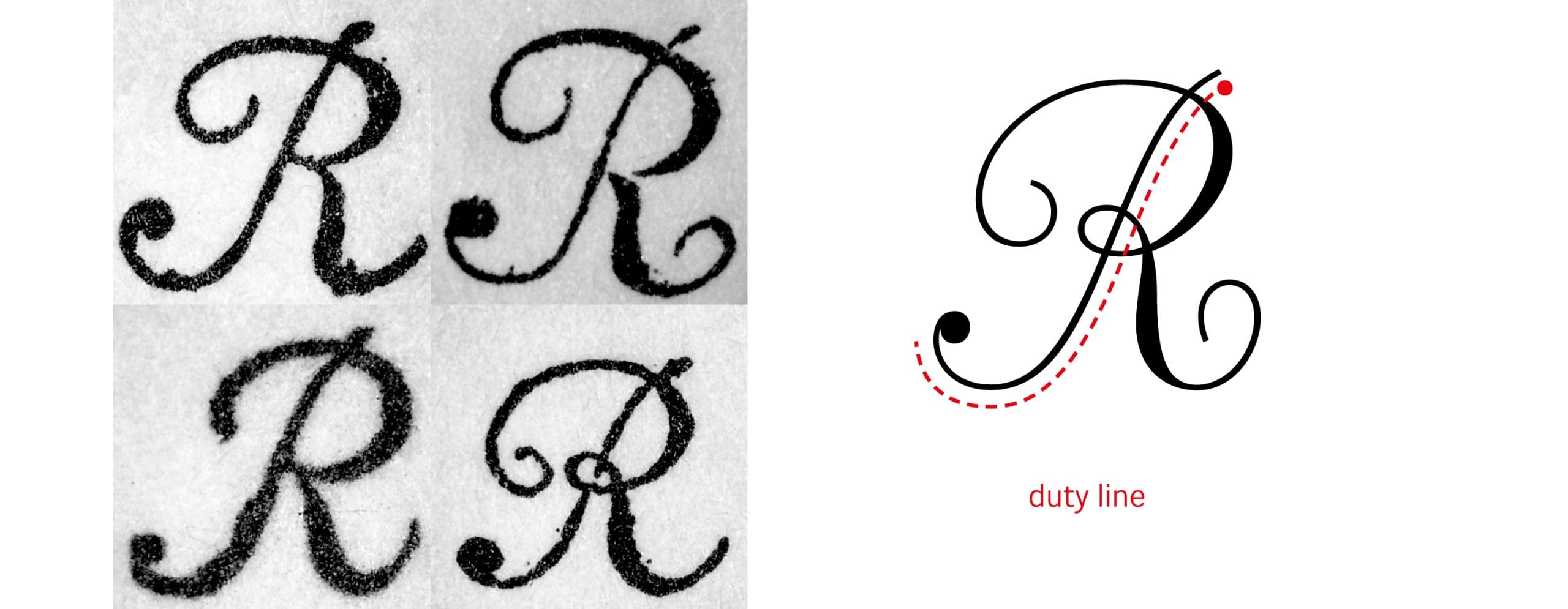
Samples of Fleischman’s and Rosart’s types showing capitals R with the characteristic thin ‘duty line’.
The typesetting of paragraphs, especially the ones in Rosart’s specimen, shows a fine way of displaying type. He used alternative shapes for certain letters depending on the surrounding letterforms – today we call them contextual alternates (calt) and I kept them in Pritzious, to help recreate the feeling of handwriting. I used various OpenType features in order to provide Pritzious with a more dynamic performance. Besides the contextual alternates, certain peculiar historical letters such as long s can be activated with the historical forms (hist) feature, and punctuation is case sensitive. The behaviour of the contextual alternates can be modified if necessary, however I had to decide which letterforms gave their best when placed at the initial, medial or final position of the words. For example, I put the very swashy d at the beginning of words because it is safer to use it there, where more space on its left side does not interfere with the previous letter – but users would retain freedom to choose a different version of d in their layout software.

Contextual alternates in the original metal types and in Pritzious: a plain letter d and an atypical r (on the right) already seen in Fleischman’s type and repeated later by Mathias Rosart, probably originated from the movement of the pointed nib. Since it creates a darker spot in the text the right stroke was reduced.
When did you start working on Pritzious?
Pritzious was conceived and developed during the Type Design Expert Class 2021–2022 chaired by Frank E. Blokland, with the help of Jan Van der Linden, at the Plantin Instituut voor Typografie in Antwerp. By the way, Pritzious would not have been possible without the feedback and encouragement from various people such as Troy Leinster, Kyle Letendre and Marco Goran Romano. Marco also helped me with illustrations and graphic design.

Other models of Caractère de Finance that were taken into account by Casali. From left to right: Dubbelde Mediaan Geschreven (J-F. Rosart, 1753), Dubbelde Garmond Geschreven Schrift (Fleischman, 1768), and Dubbelde Augustyn Geschreven (M. Rosart, 1773). All from Proef Van Letteren, Enschedé type specimen, 1768 and 1773.
What’s the meaning of the name ‘Pritzious’ ?
It is somewhat like a joke of mine. Pritzious plays with the words ‘pretzel’ and ‘precious’ and I thought it could fully embrace the concept of this design: historically tasty and genuinely charming.
Alternative A K d r (SS 01)

Alternative d r (SS 02)

Long-s (SS 03)