Interview by Massimo Gonzato

Following his BA thesis on tactile typefaces at the ISIA in Urbino, Giulio Galli started working closely with our Foundry. Though Capraia is not his first typeface it is the first to be released by CAST.
A CONTEMPORARY BOOK FACE
How would you describe Capraia, in a nutshell?
Capraia is a seriffed book typeface with a distinctly quirky streak that becomes evident only at big sizes.
What uses would you recommend for Capraia?
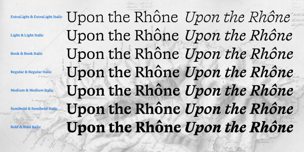
For publishing. Capraia includes seven weights with matching italics. Book and Regular are specifically designed for continuous texts.
The weights of Capraia Book and Capraia Regular are almost equal. How do you explain that?
While discussing the weights of Capraia with Riccardo Olocco and Luciano Perondi an interesting question emerged. Is there an ideal weight for setting a continuous text? We realised that this depends on at least two factors: the colour of the text and its background, and ink-spread. And this is why we designed the slightly lighter Capraia Book for normal texts printed in black on white (or in a dark ink on a lightly coloured background) and Capraia Regular for reversed texts on dark backgrounds, to compensate for ink-spread with its inevitable weakening of the type. Furthermore, Luciano’s professional experience has led him to notice that Italian publishers seem to prefer lighter typefaces than their German or British colleagues – another reason why we designed these two weights.

SOME UNEXPECTED DESIGN SOLUTIONS
You said that Capraia is a book face with a distinctly quirky streak…
True to its vocation for publishing, Capraia has a big x-height, medium contrast and wide bracketed serifs. On the other hand its slightly flattened curves, some unconventional roman letterforms (a, G, Q) and the ‘slanted roman’ italics, along with design details such as ball terminals, give the whole family a very contemporary appeal.
What about the arches at the terminations of a and G? These are unusually prominent and one wonders if they are telling us something of Capraia’s personality?
I think the fresh and sprightly appearance of Capraia on the page springs from some unconventional and unexpected design solutions. These concern the strangely wide proportions of the face and the protruding terminations of a, G, C, and also the unusual treatment of details like the tails of R and Q.
To sum up, Capraia could be defined as a contemporary book face or a historical pastiche.


A PLACE FOR GOATS
Even more than the romans, Capraia’s italics show unconventional letterforms…
That’s true because Capraia is more of a slanted roman than a proper italic. There are several oddities that I spread far and wide, including a two-storey a, a heeled b and e with a horizontal stroke. While working on the italics I made a lot of experiments in order to achieve a design with a contemporary taste. Take for instance all the upper serifs on lowercase letters and some stiff and straight strokes where we’re used to seeing classical and refined curves, like in in z, y, v, w.

Why did you call it Capraia? Does it refer to the little island in the Tyrrhenian Sea?
This face was conceived from the pure pleasure of reproducing an interesting shape – a figure 3 cut on a stone (part of the year 1938) that I noticed on the island. I left my first sketch to decant in my notebook and in my head for a few months until it became the starting point for building a new face. However, though Capraia is the name of the island where I got the inspiration, the name also has something to do with certain oddities of its design. Capraia means ‘a place for goats’. And if someone here in Italy compares you to a goat after seeing how you’ve performed a certain task, it means that you have no style. In short, it is a name that helps us not to take things too seriously.