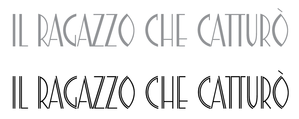
Vittoria is a condensed, all-caps geometric sans serif with a pronounced and elegant thick/thin contrast. Distinctive Art Déco attributes are the detached bar on A, the B with inverted bowls, the wide central bars of E and F and the O in the shape of an almond.
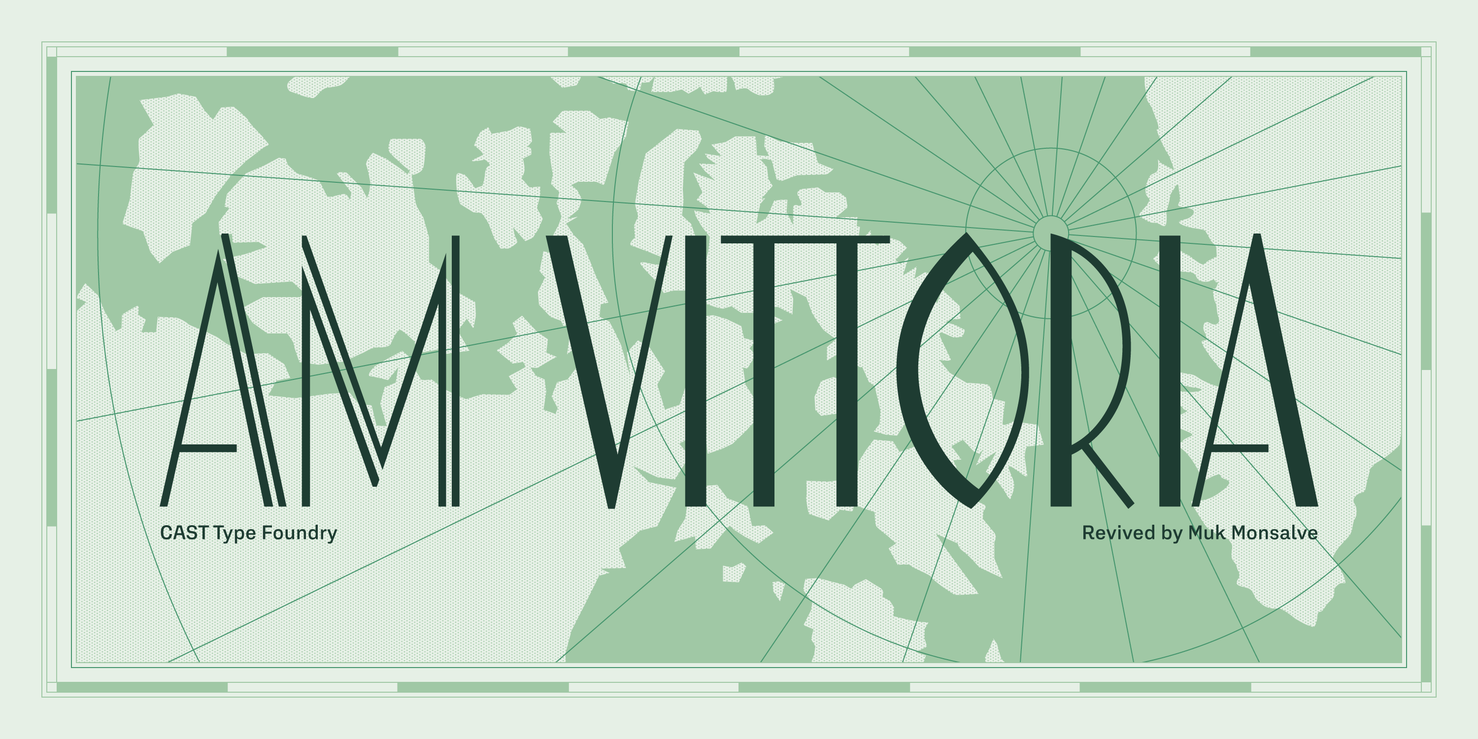
Vittoria
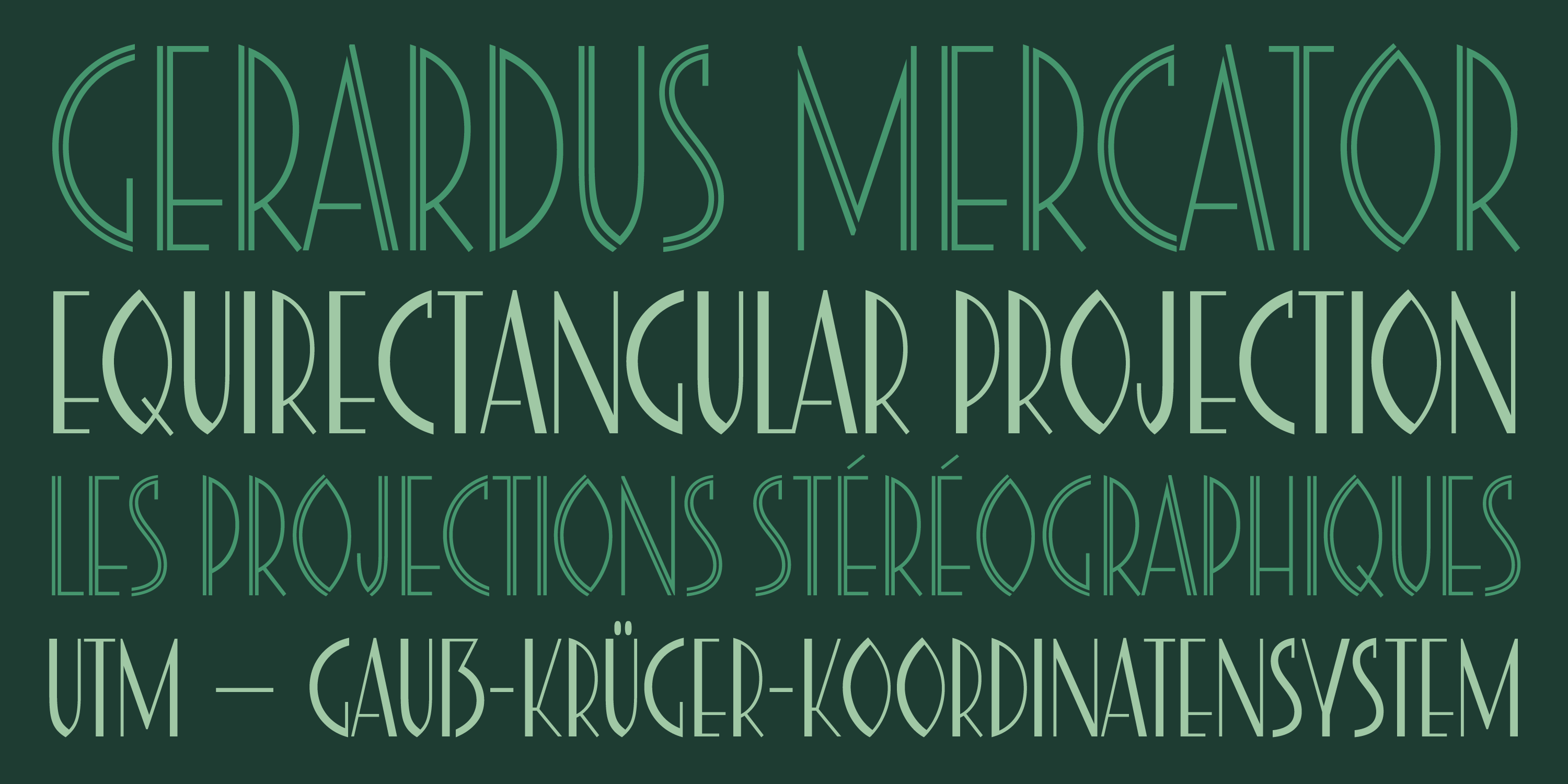
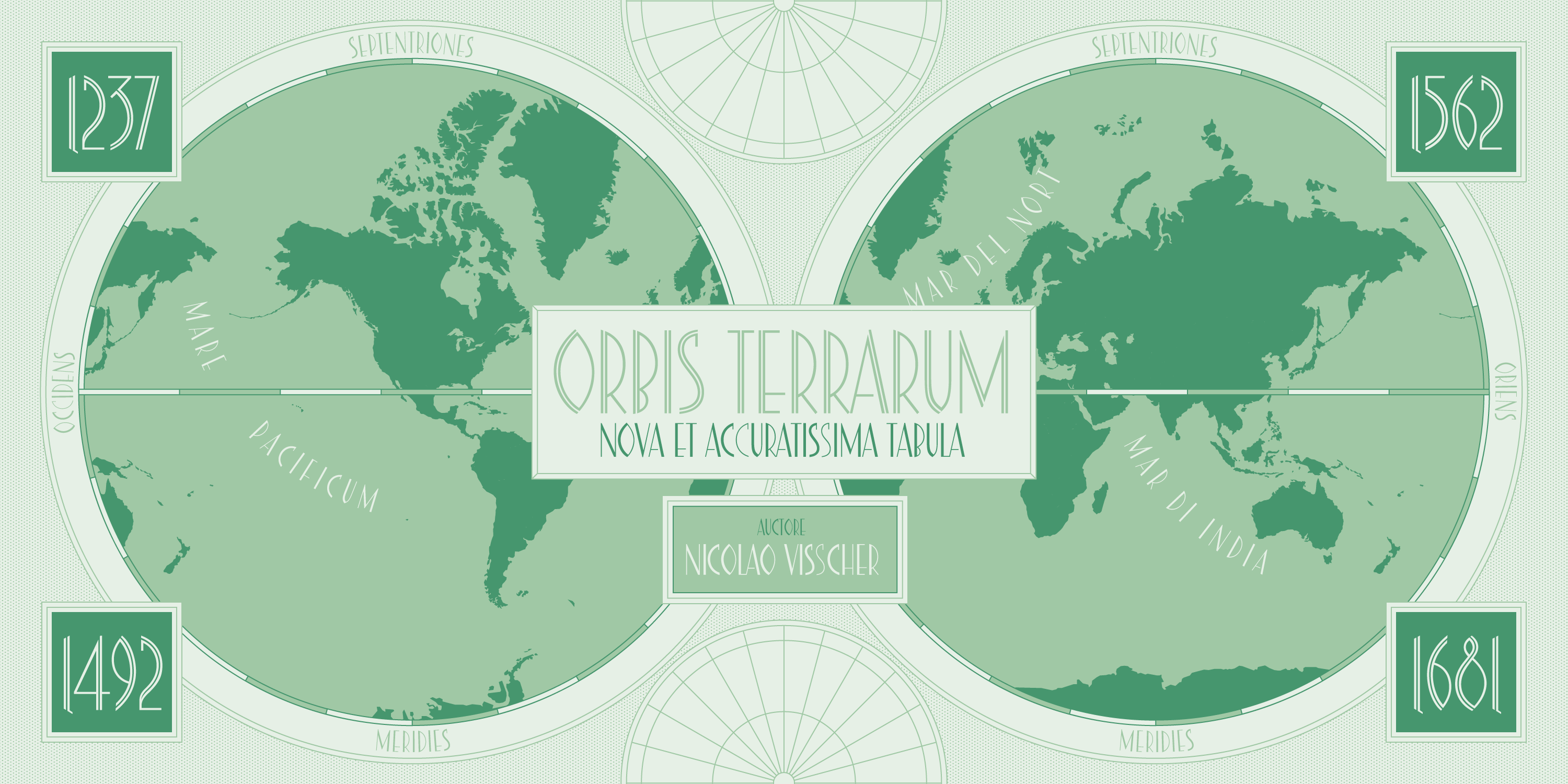
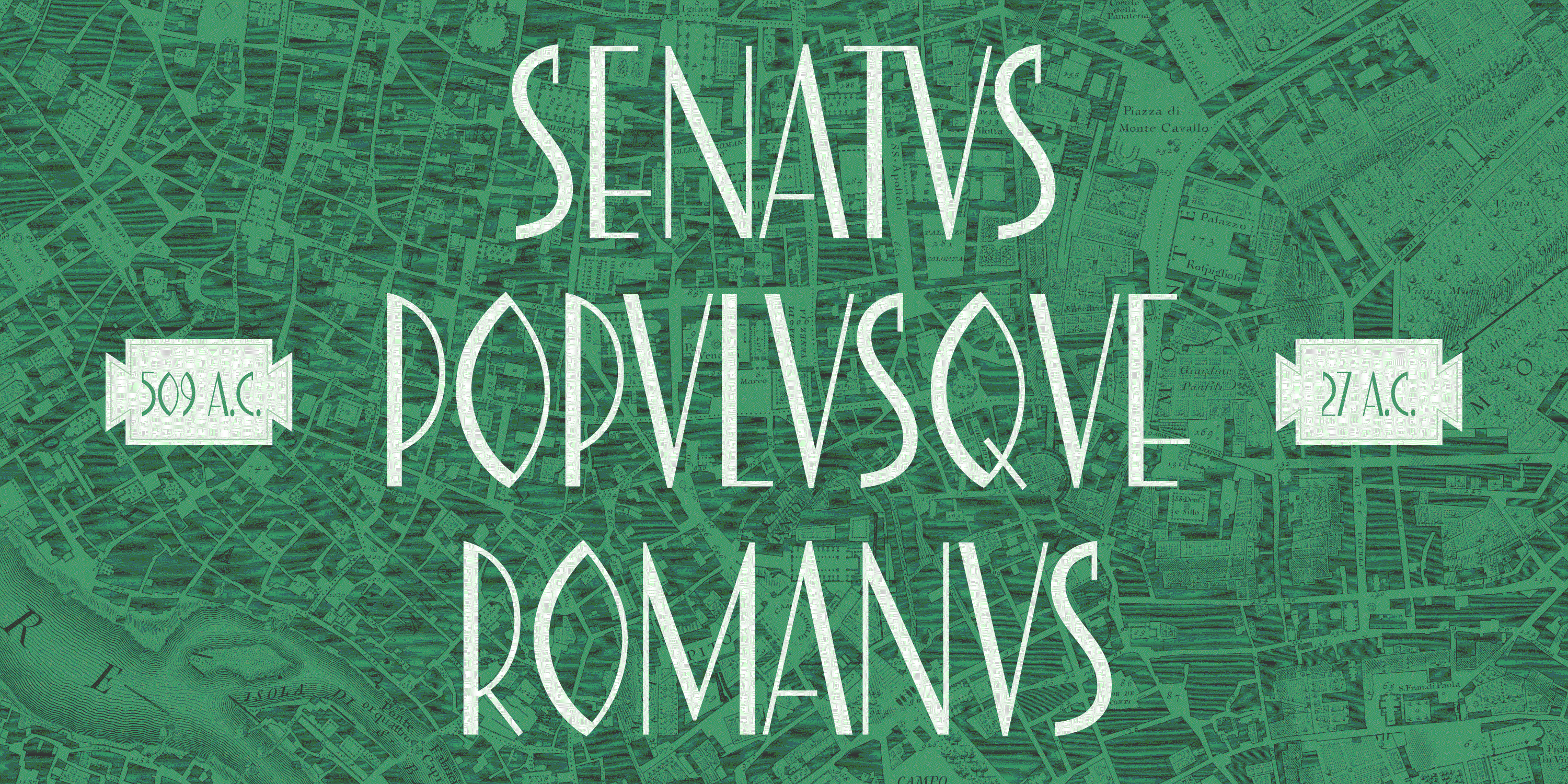
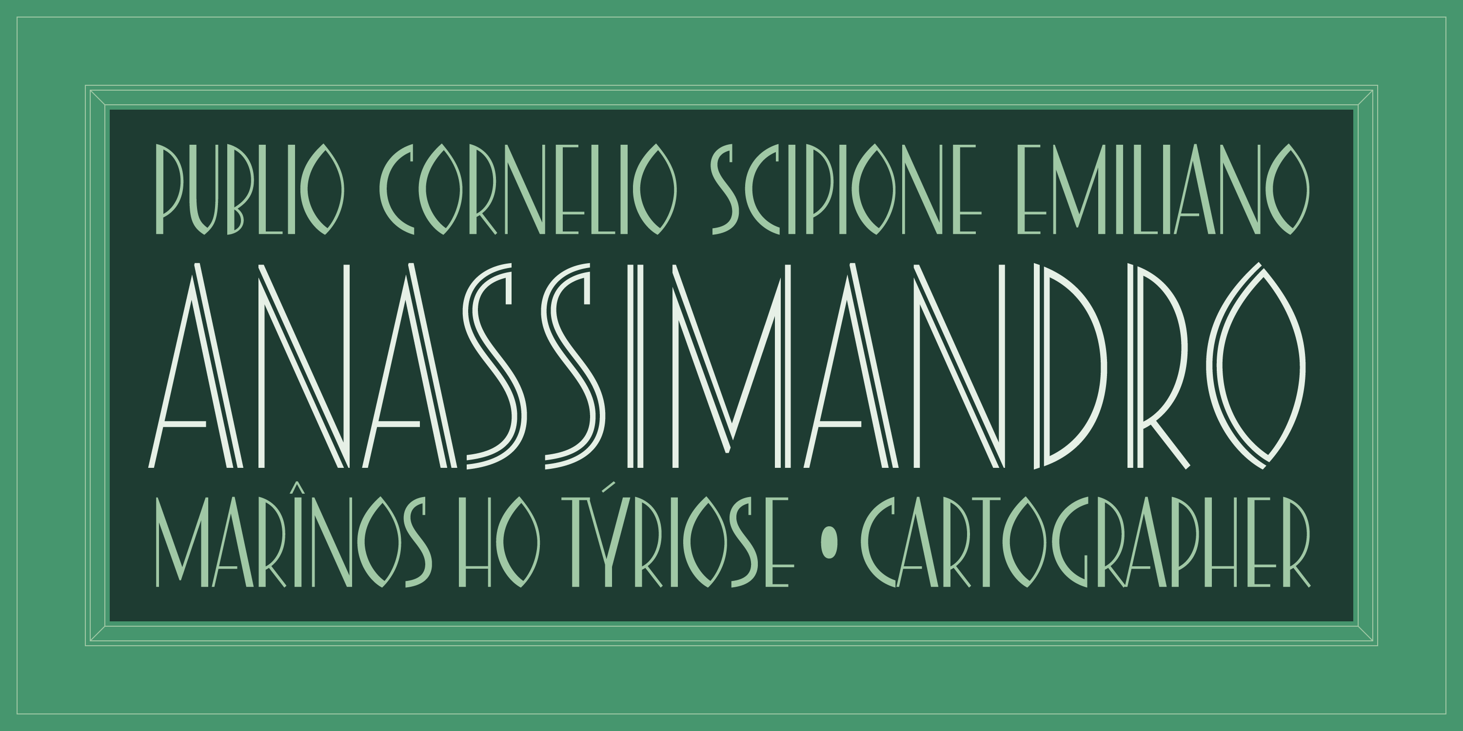
The original Vittoria was cast in metal around 1940 by the Fonderia Tipografica Meridionale Armando de Luca of Naples. Inspiration likely came from Guido Modiano’s Triennale (Fonderia Reggiani, 1932) which was ubiquitous at the time. However, unlike Triennale’s alternates for O and Q, Vittoria sticks to the almond shape for these letters.

Courtesy Archivio Luca Lattuga
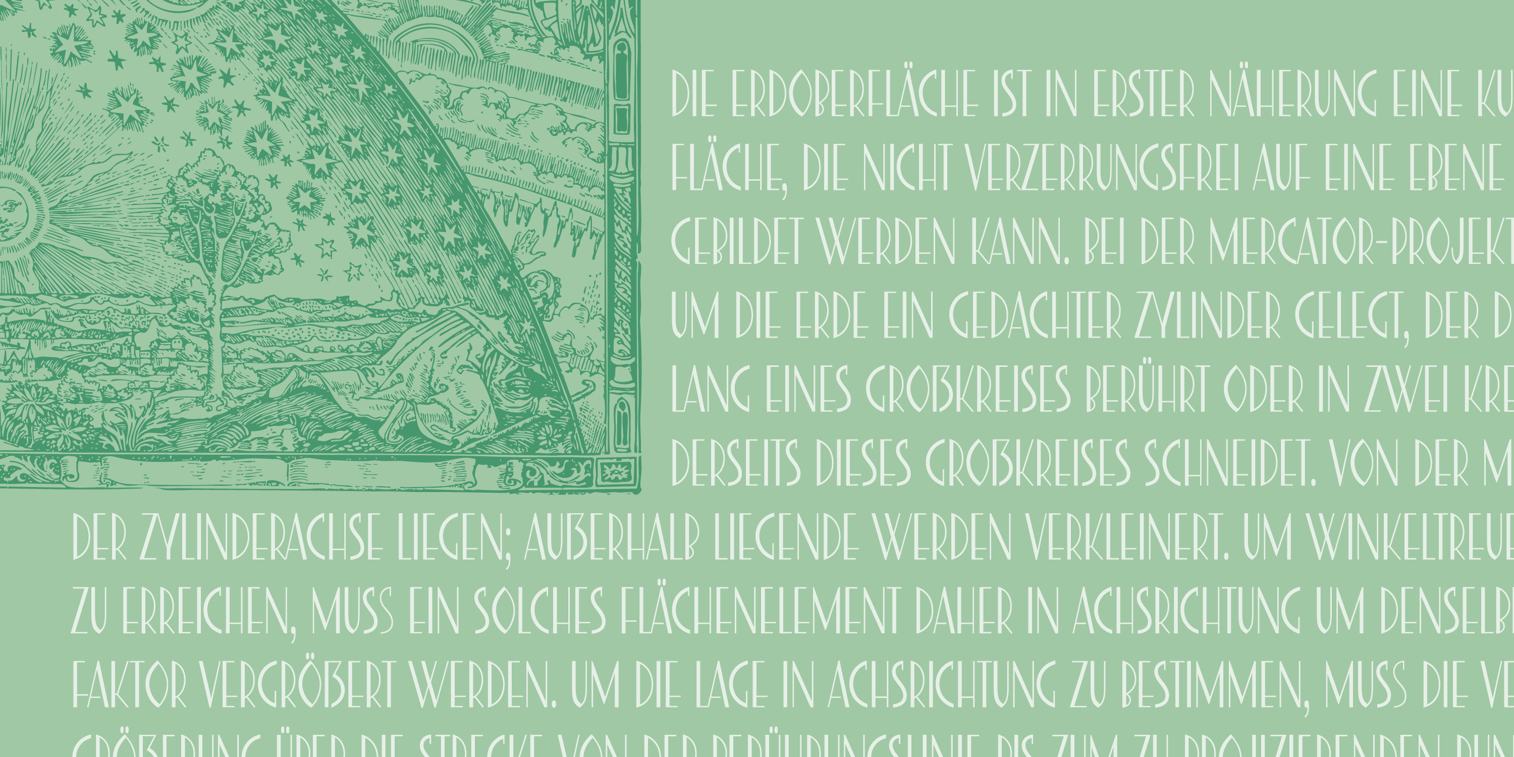
‘Some glyphs,’ explains designer Muk Monsalve, ‘were adjusted to achieve a greater overall consistency. Letterspacing has been optimised for large-scale applications such as posters, signage, and exhibitions. The contrast in letters such as A and M was redistributed to improve balance. Numerals were carefully redrawn while staying faithful to the original proportions, and diacritics were designed from scratch to better suit contemporary usage. At the same time, however, several design ideas were kept (see O for instance) to retain the spirit of the original design. Other characters, such as C and S, were refined to avoid inconsistencies caused by the lack of contrast, which made them appear disconnected from the other letters’.
Nonetheless, as it was not possible to completely solve the issue of the gap between these letters and some others, Monsalve opted for monolinear contextual alternates for letters S, C, and G, and these activate in typesetting combinations such as SS, GG, or CC.
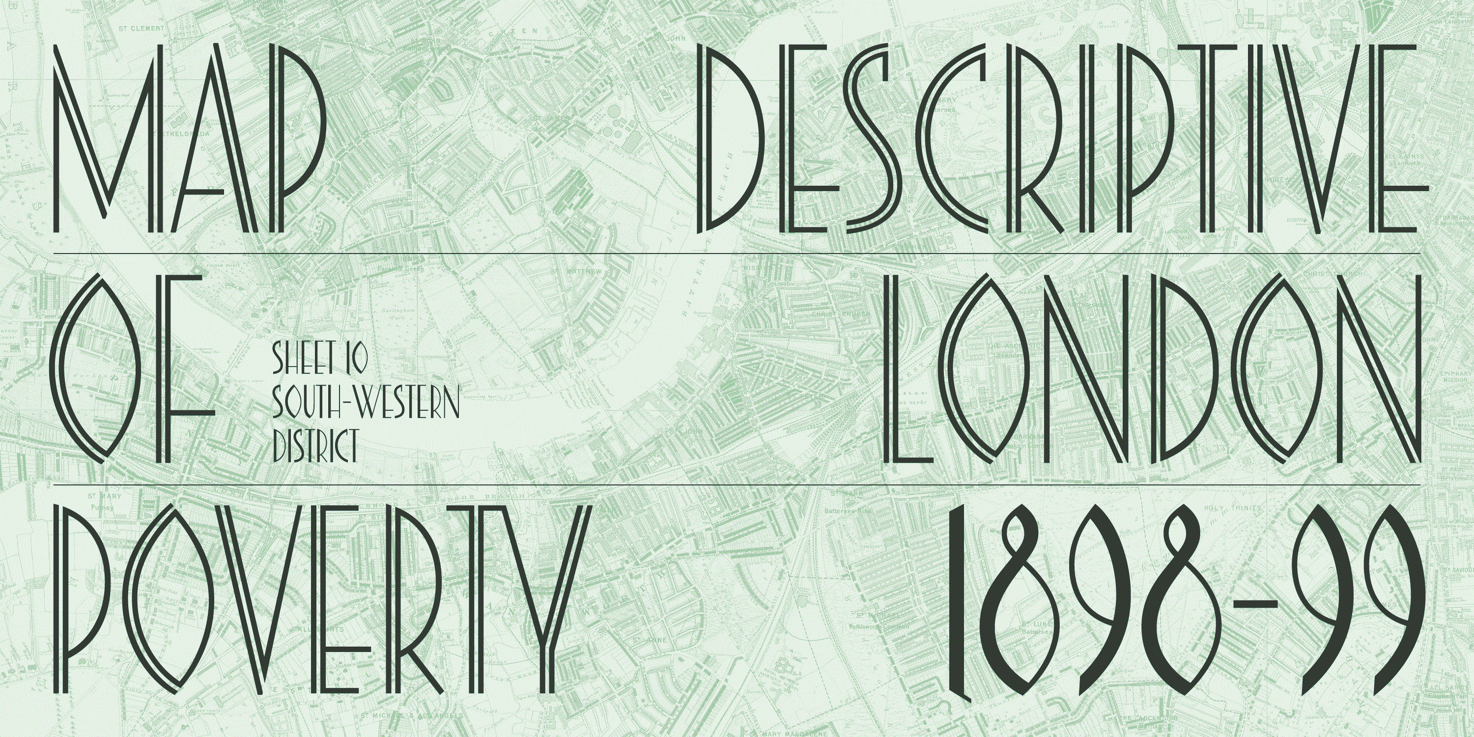
Like its source, the AM Vittoria digital revival includes an inline version of all letters and this is available as a stylistic set via the OpenType feature.
Inline (ss01)