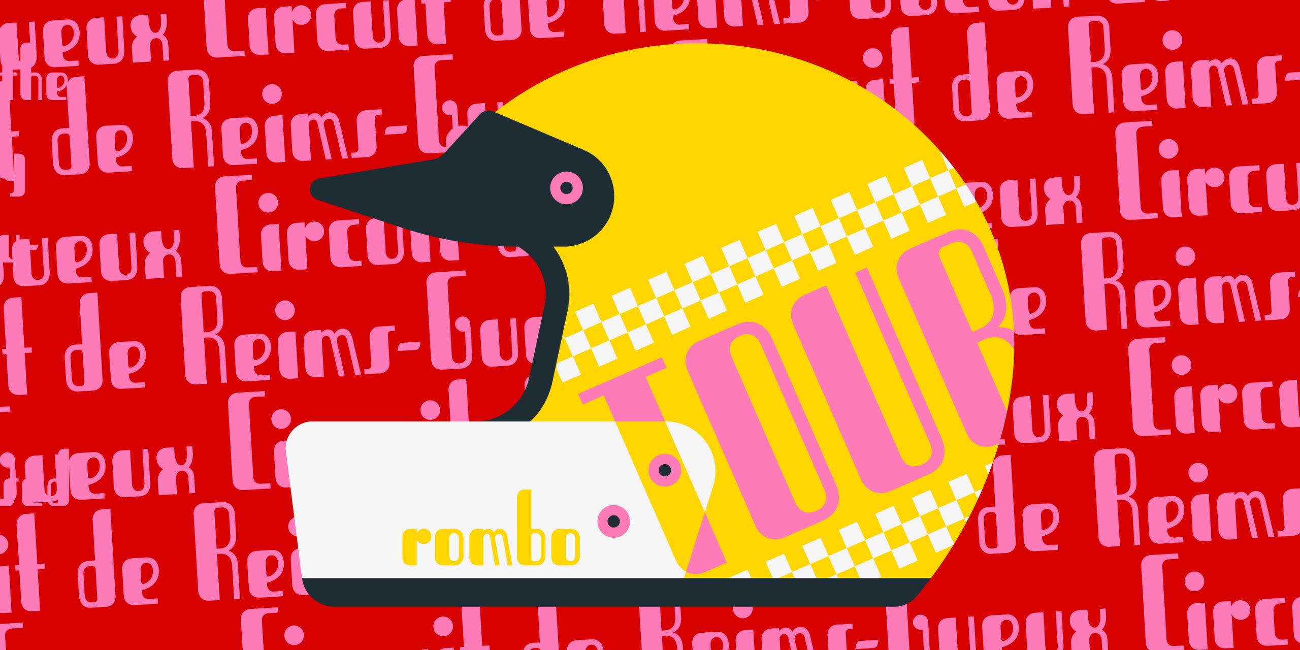
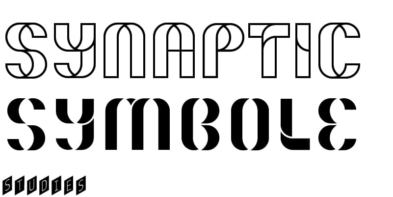
Tobruk is a condensed sanserif with rounded corners and an unusually strong thick/thin contrast with just one thick stroke for each character. The x-height is rather small, and the streamlined shapes of the letters clearly show an Art Deco influence, which is emphasised by some peculiar details. For example, see the vertical s and S; the ‘lowercase’ capital M and N with oblique thin stems (as m and n); and the stems of p and q rising above the x-height.
Tobruk


Font info
Supported languages
Production years
2025
Additional info
Tobruk was originally released as a wood type by Xilografia di Verona around 1940.

Courtesy Archive of Styles, Alberto Tallone Editore
‘In the AM Tobruk digital revival,’ says designer Andy Anzollitto, ‘Letterform construction was refined to better harmonise repeated geometrical elements; a consistent treatment of details such as terminals of thin strokes was also introduced. Individual glyphs were also redrawn to better fit the evolving character set. Some wilder inconsistencies of lowercase letters were ‘normalised’: the e now matches a; g has the lower bowl facing the ‘normal’ direction (the opening was on the right-hand side); o loses its mysterious ear, the ball terminal of r aligns with the x-height and the strokes of y change to a more logical construction; furthermore, the ampersand was redesigned to match uppercase letters.’
Styles
You may also like
Designer:
Designer:
Designer:


