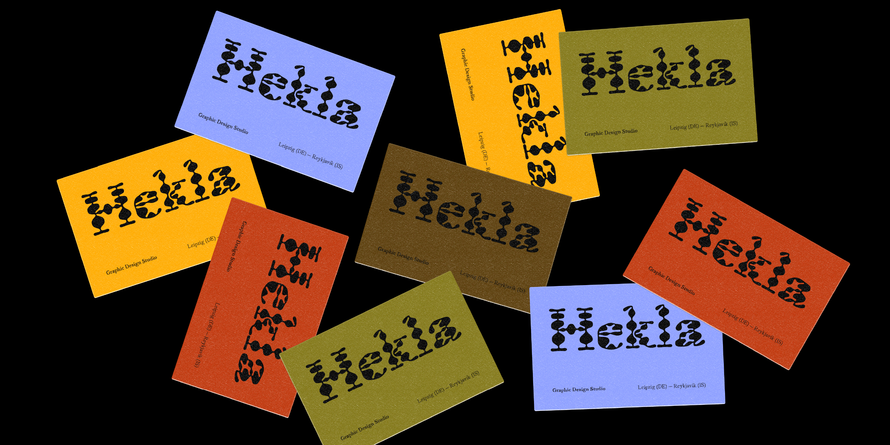
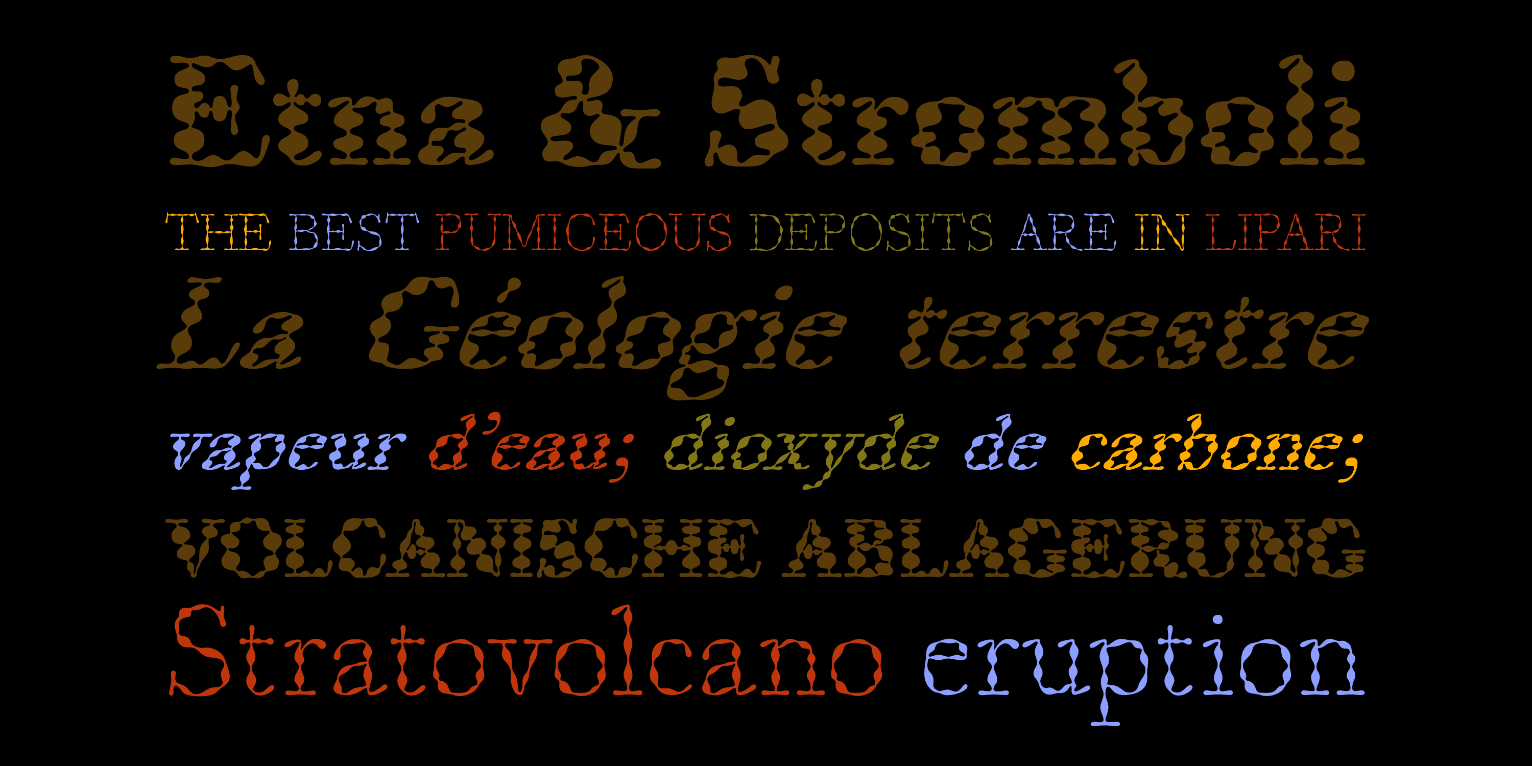
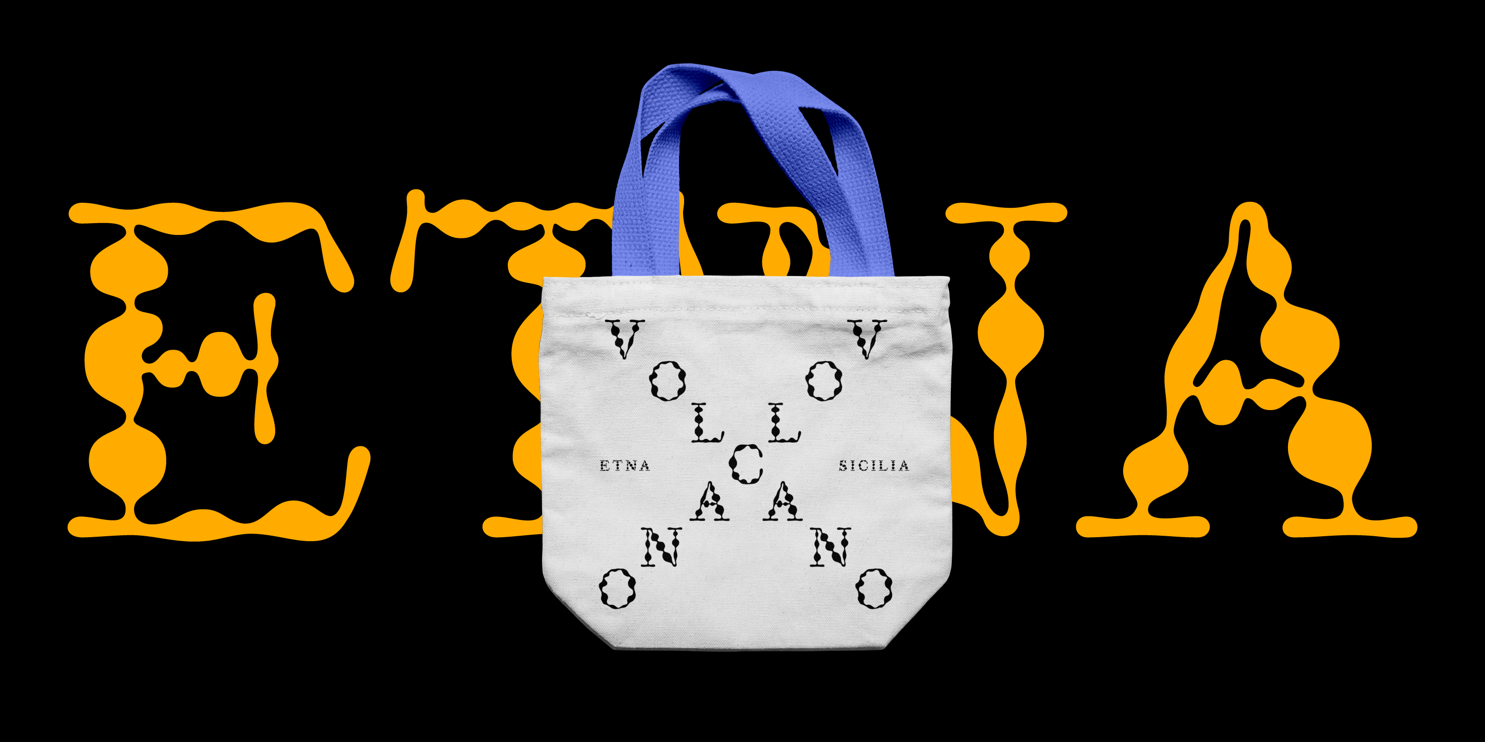
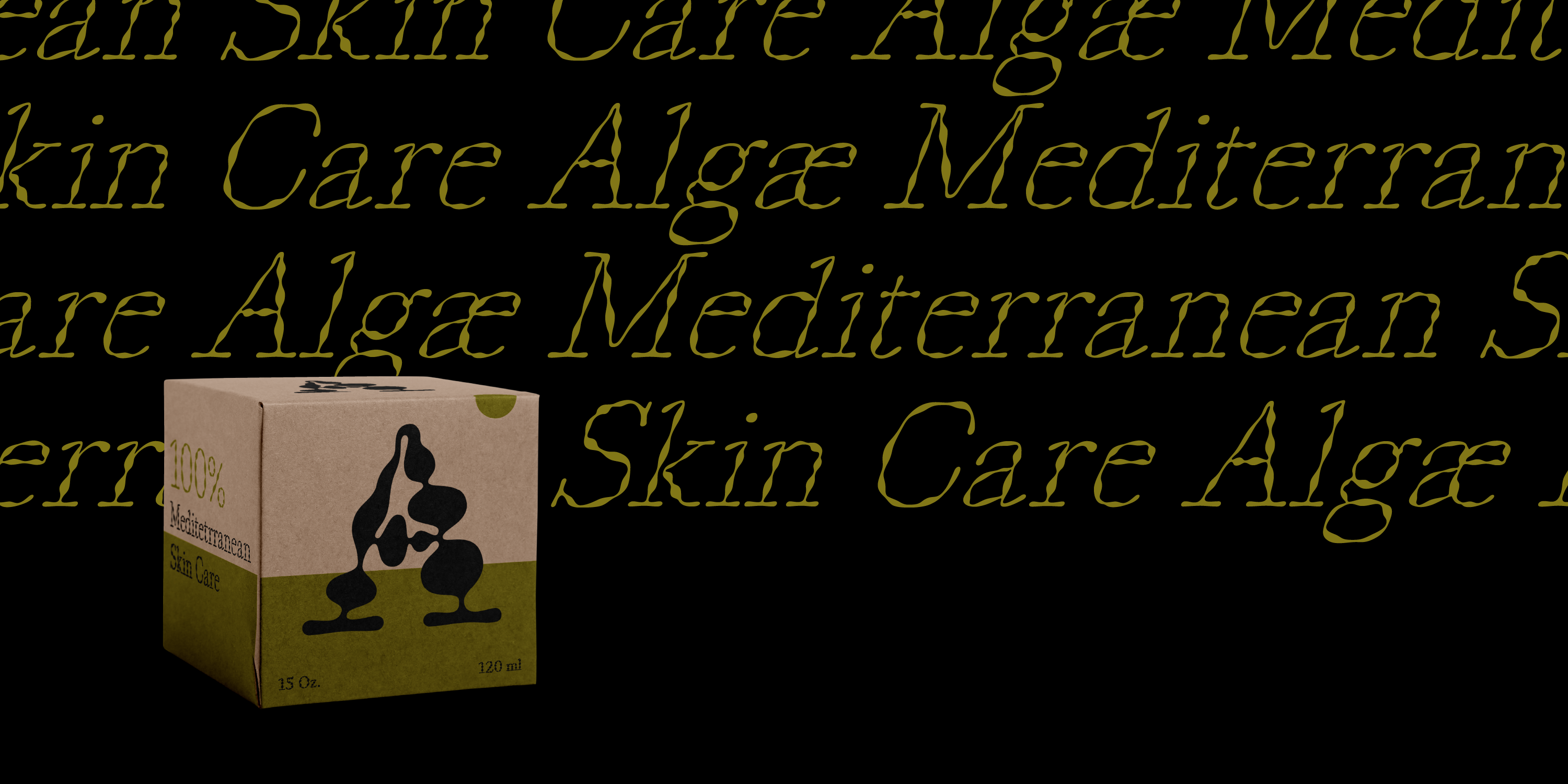
Magmo is a contemporary serif face with fluid and unusually irregular shapes. With its nine weights and their slanted versions, it works well for expressive headlines. But thanks to their classic proportions and details, the lighter weights are also effective for certain texts in small sizes.
Magmo

Font info
Supported languages
Afrikaans, Albanian, Asu, Basque, Bemba, Bena, Breton, Catalan, Chiga, Colognian, Cornish, Croatian, Czech, Danish, Dutch, Embu, English, Esperanto, Estonian, Faroese, Filipino, Finnish, French, Friulian, Galician, Ganda, German, Gusii, Hungarian, Icelandic, Inari Sami, Indonesian, Irish, Italian, Jola-Fonyi, Kabuverdianu, Kalaallisut, Kalenjin, Kamba, Kikuyu, Kinyarwanda, Latvian, Lithuanian, Lower Sorbian, Luo, Luxembourgish, Luyia, Machame, Makhuwa-Meetto, Makonde, Malagasy, Maltese, Manx, Meru, Morisyen, Northern Sami, North Ndebele, Norwegian Bokmål, Norwegian Nynorsk, Nyankole, Oromo, Polish, Portuguese, Quechua, Romanian, Romansh, Rombo, Rundi, Rwa, Samburu, Sango, Sangu, Scottish Gaelic, Sena, Serbian, Shambala, Shona, Slovak, Slovenian, Soga, Somali, Spanish, Swahili, Swedish, Swiss German, Taita, Teso, Turkish, Upper Sorbian, Uzbek (Latin), Volapük, Vunjo, Walser, Zulu
Production years
2024-2025
Additional info
Magmo’s organic shapes are based on experiments with burning pieces of paper which show up as swollen parts, or globules, in the strokes of the letters and other glyphs – and they swell with the increase of weight. Consequently, the bolder weights have a much greater thick/thin contrast than the lighter ones. The terminals are carefully rounded globules, and the connections between the stems and the arches are soft and fluid.
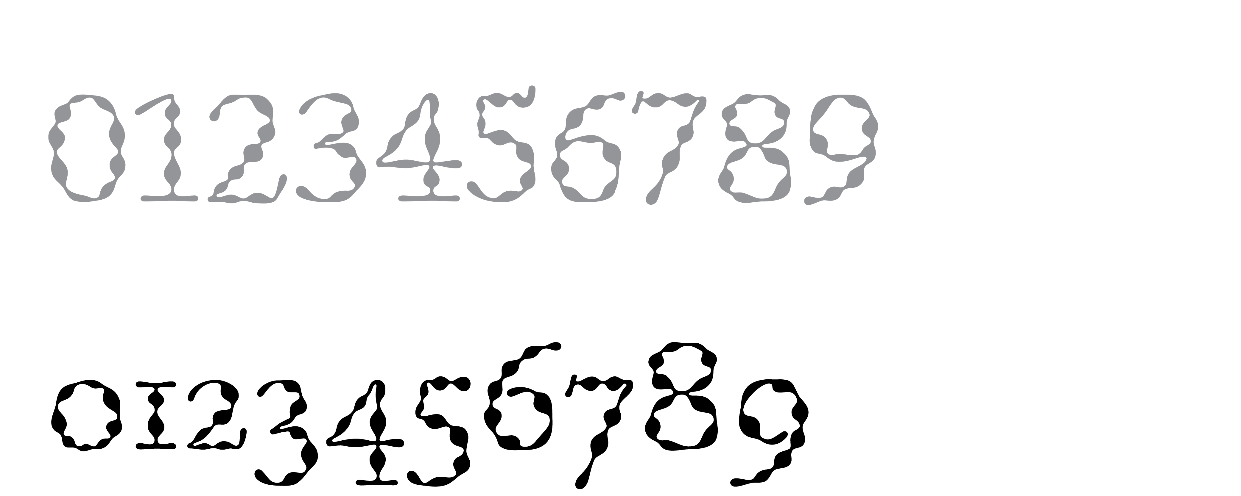
Magmo is a multi-functional typeface for both print and digital media. Its proportions and overall design are based on the original type cut by William Caslon – specifically the English and Great Primer body sizes as seen in Caslon’s famous 1727 type specimen. Magmo includes lining and old-style figures, as well as fractions.
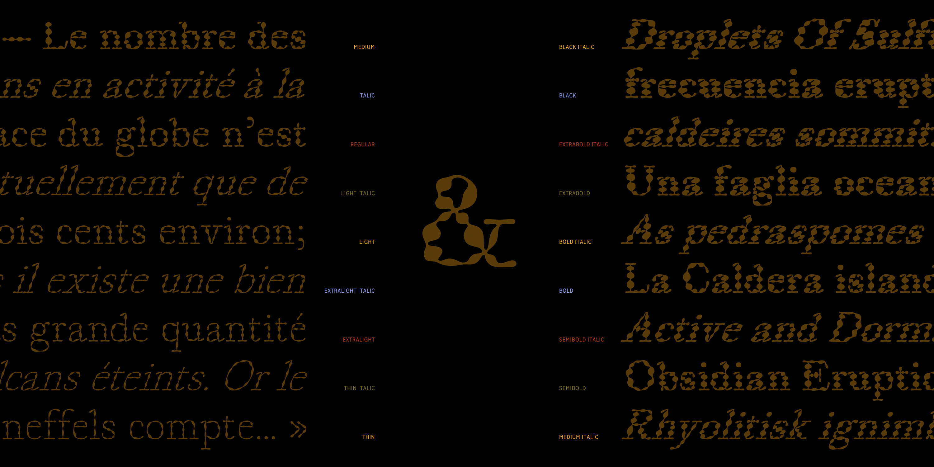
Styles
Thin, Thin Italic, ExtraLight, ExtraLight Italic, Light, Light Italic, Regular, Italic, Medium, Medium Italic, Bold, Bold Italic, ExtraBold, ExtraBold Italic, Black, Black Italic
OpenType Features
Oldstyle Figures
Small caps

Specimen
You may also like
Designer:
Designer:

Designer: