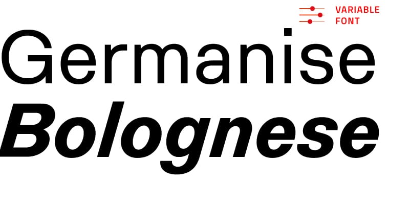
Baxos is a square sanserif variable font that explores the idea of ‘pure form’. With a large x-height, indented stems and open terminals, it works as an unexpectedly multipurpose typeface, for both display and text.
Baxos


Baxos: not recommended for branding pesticides
What is Baxos made of? Metal, ice, shortcrust pastry, maybe foam? Jennifer Lavia’s Baxos typeface looks like it’s been shot with a gun, had its DNA changed by a cloud of cosmic rays, or begun to melt from climate change. Perhaps it was dinner for some bugs? Did the designer leave Baxos out in her garden overnight and find in the morning that hungry caterpillars had chomped into its letterforms, nibbled at its stems and bit into its glyphs? (Of course, that would mean that Baxos could not be recommended for branding pesticides).
With a large x-height and wide apertures, Baxos is a square sanserif with vertical curves that are almost flat. A variable font that ranges from light to bold, it’s also surprisingly flexible. Baxos’s main feature is its indents, the bites on the stems, and each glyph has an alternate where the indents have a different position and slightly different shape. Using the Contextual Alternates OpenType feature, the two sets can be alternated in the same word or across a line.
Although it shows off its quirks best at big sizes, Baxos is fine for text use, creating a vibrant texture to attract your readers.

Is there any connection between hungry caterpillars and Baxos? It is a hypothesis being considered by the critics.
The ‘shape consistency’ brought into typeface design
Baxos was conceived during a short course Jennifer attended in Spring 2018: ‘The Suprematist process’, held by Luciano Perondi and Alessio D’Ellena at Scuola Open Source, Bari.
The fundamental principle of Suprematism, as defined by Kazimir S. Malevich (1879–1935), is that art should emancipate itself from depiction, from the baggage of representation, and develop its own abstract language. Once freed from the obligation of figuratively reproducing reality, art could find a new, original plasticity.
The course aimed to revisit Suprematist principles by exploring the notion of ‘pure form’. It began this through collective-working sessions based on analysing and experimenting with a large collection of plastic items and everyday tools. The starting point was the concept of ‘shape consistency’ and participants were encouraged in their explorations and discussion. Subsequently, their shapes were translated into a typographic system for the Latin alphabet and students started designing digital typefaces.

A corner of the main room of the ‘Last Futurist Exhibition of Paintings 0,10’ (Saint Petersburg, 1915) which actually was the first Suprematist exhibition, with Malevich’s Black Square on top.
Malevich’s Black Square and the bundle of representation
In 1915, the first Suprematist exhibition displayed 39 canvases that few at the time would have called paintings. Simple geometric shapes, black or other colours on a white background, either alone or in small compositions. The main piece was Malevich’s Black Square, a black square on a white background, provocatively displayed in a top corner of the main room: a spot reserved in traditional Russian homes for holy images and icons.
The Black Square is the manifesto of Suprematism and where we can see the beginning of speculative explorations of visual perception: the use of geometric shapes – their positions and their shape in relation to their colour – to communicate while carefully avoiding representation. With Malevich we begin to see the power of the concept of limits, of contours – of the full that is always in contrast to the void.
The Suprematists’ revolutionary ideas for the arts, along with their development of a system of abstract forms as communicative systems, are powerful when applied to the design of typefaces.
Indents on the strokes
In the early stages of Baxos’s design process the letterforms were quite different, with wobbly stencil shapes and reversed contrast. But from the beginning they included Baxos’s signature indentation of the strokes.
Lavia recently reconstructed their development: the indents (‘the biting of the strokes’) captured her interest because they generated weird and unexpected patterns. And because, as she admitted later, they reminded her of the Rorschach test’s ink blots and of types created for legibility experiments (like Phil Baines’s ‘Can you read me’), types for which she has a passion.
As it developed, Baxos became more squarish, more stable and solid, thick and thin contrast disappeared and, notes Lavia, ‘the design development stopped just before becoming a geometric grotesk’.

Tom Friedman, Untitled, 1992, wooden school chair, 86.5 x 56 x 66 cm. Right: close-up showing the holes drilled by the artist.
Creating a new swing
Baxos’s pattern of indents interferes with the shape of words, of lines, of paragraphs. They create a new rhythm, somehow a new language we could say. They puzzle the reader, baffle our system of signs and the Latin script; and create new flows, a new swing which can be bolstered by the variable fonts feature.
Although the hard work of biting the strokes was done by bugs (‘caterpillars, to be precise’), Lavia had to train them before they would create consistent and harmonious arrangements. We asked the designer to explain how:

‘Initial tests showed that placing indents on both vertical and horizontal strokes was too disturbing, so I went for the former. In the first drafts there were two indents per stem, on both the inner and outer sides of the stems (and arches), placed at the same height. But when typing words, they created a visual trick that was somehow boring, like two horizontal lines were cutting (or better, squeezing) all the strokes. So I started placing the indents at different heights, and I also did it in the alternate letters: avoiding an alignment of indents in favour of a constant alternation. Finally, the depth and the shape of the indents was fine tuned, so that they are all slightly different, not cookie-cutter holes.’
Baxos: a multi-perception typeface
With fine-tuned solutions enabled by the variable fonts feature, Lavia’s typeface is intended for a great variety of uses: branding, display, magazines, contemporary events. In the dadaist tradition, its name was created by mixing up the first bunch of letters sketched on paper (‘It sounded good and appropriate’ said the designer). In a similar way, Baxos looks good and feels appropriate when you’re searching for a new typographic perception.
Tabular figures

Oldstyle figures

Oldstyle tabular figures

Superscript and subscript

Fractions