
Interview by Massimo Gonzato
Founded in 1880, Nebiolo was one of the biggest manufacturing companies and the most important type foundry in 20th-century Italy. From the mid 1920s the company started producing original type designs and in 1933 an in-house office to design and brand new typefaces was set up. It was called the Studio Artistico and Giulio da Milano was appointed its director. The Studio lasted for almost 40 years and Neon was one of the most successful typefaces produced during those early years.

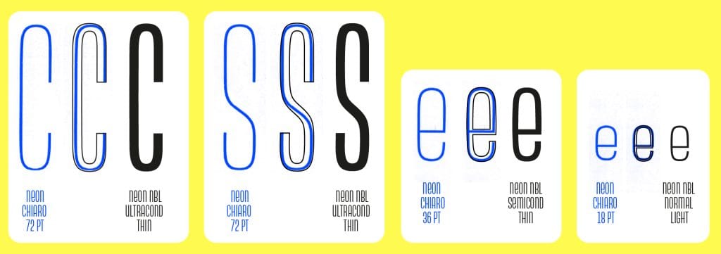
Giulio da Milano’s Neon is a geometric monocase sans with each type size having a different width: the smaller the size, the wider the letter. Besides this, it features some peculiar letterforms with only a few letters displaying oblique strokes (V, W, Z), as those of A, K, X, Y are replaced with straight stems connected by arches; some letters follow a lowercase construction and, in typical Art Deco fashion, letters exhibit a low central bar (see A, B, H, K, R, S, X, Y, and also 3, 6, 8).
Neon Nbl was designed in 2019-2020 by Alessandro Colizzi (after a long incubation that started in 2006) and was eventually revised and completed in 2022–2024, with the addition of the shaded version Ombra.
‘The main motivation behind this new, expanded release of Neon Nbl,’ says Colizzi, ‘was to bring to fruition the key features of Da Milano’s original design – exhibiting different proportions for each body from 6 to 72 points. While, for obvious economic and technological reasons, in the 1930s the typeface had been produced in only two series, chiaro (light) and nero (bold), matching a given proportion to a specific type size, today the possibilities offered by digital tools allow for these characteristics to be fully implemented in a systematic and flexible typographic system. The first version of Neon Nbl was modelled on the more compact variants, equivalent to bodies 72 to 48, but the idea of digitising the other variants was already there. It must be said that, due to the discontinuity in carrying out the project, the digitisation of the new Neon Nbl required a different planning of the digital master framework, which in turn implied a thorough revision of the previous files. And finally, starting from the bold weights of each variant, the corresponding shaded Ombra versions were produced.’
In just a few words, how would you classify Neon Nbl? Is it a revival, redesign or anything else? What does Nbl mean?
Neon Nbl is a faithful redesign of the original monocase sans designed by Da Milano and released by Nebiolo in 1936. It is a modernist geometric sans, but not quite the usual type: it is a monocase face, that is a combination of upper and lowercase forms within a single alphabet. In many respects it belongs to the experimental sanserif designs that flourished in the 1930s alongside the well-known Futura, Kabel, Metro and the like. On the other hand, Neon also strikes a very different note by displaying different proportions from size to size, from wide to narrow. These unique features place it more on the ‘funky/display’ side of the typographic range, although it can be interesting for use in text settings too. Not surprisingly, it was a popular typeface widely used in advertising in those days.
Like many Nebiolo typefaces, Neon has been digitised over the years, especially as no one apparently owns the copyright to their catalogue. Yet, in general the designers have failed to either understand or successfully implement these features into the digital format, while taking quite a few liberties along the way too. So my interpretation is a revival that strives to translate the spirit and the details of the original face taking advantage of the OpenType standard. The acronym NBL stands for Nebiolo, and means that it’s an historical revival of the original face.

Why did you design Neon Nbl? What is it suitable for?
Obviously I was intrigued by its shapes. While I was investigating Italian modernism for my PhD, I came across many period advertisements using Neon. That must have sparked the idea: when asked by an art collector to design his logo, I played around with some letters and drew a few matching ligatures. The project languished for a long time, though, as I was only able to work on the font on and off, which is not helpful if you look for consistency. Often a decision taken at some point had unexpected consequences later in related weights or variants.
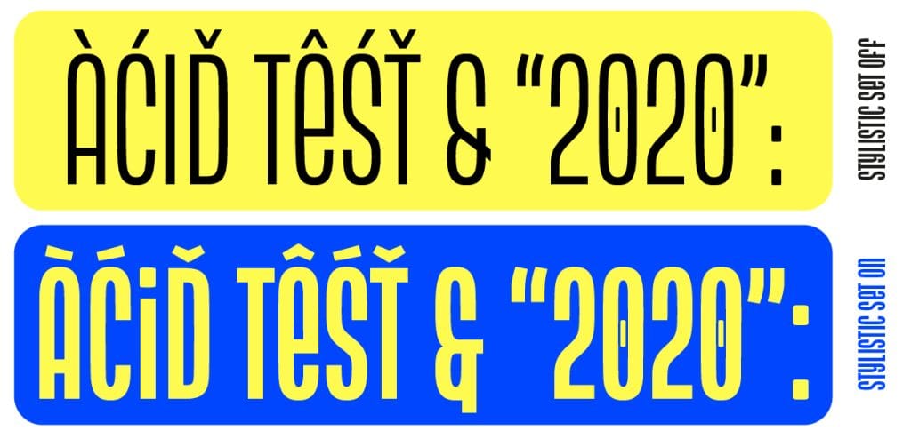
In terms of styles I looked at large families such as BureauGrotesk or Knockout, while trying to strike a balance between the original sizes/proportions/weight ratios. As usual nowadays, the Latin character set has been significantly expanded (each font has over 730 glyphs) with several stylistic features added. As such it lends itself to being used creatively for identities, book cover/poster designs, web and even signage design.
You said that Neon Nbl is revival and a close imitation of the original typeface. On the other hand you have certainly made some design choices regarding the conversion from metal to digital. Is there any difference between the two designs you would like to mention?
Any revival (even more so across different media) always implies some degree of translation, in other words taking a number of decisions that are inevitably arbitrary. It is the designer’s responsibility to make sure that the outcome renders the original look and feel, while being suitable for contemporary use in terms of users’ expectations. As I said, I carefully examined the proportions of each size, and tried to understand the inherent logic of the original alphabet, before selecting some ‘key’ steps to build the interpolation space.
I also tried to soften the stiffness of the geometric module on which the letters were clearly drawn by slightly rounding the straight parts of round letters and the terminals, in a sense trying to make these shapes somewhat organic. Let me add that Nebiolo specimens show only the basic letters, so I had to figure out many subsets of letters that were not even part of the original typeface.
What are the main features of Neon Nbl?
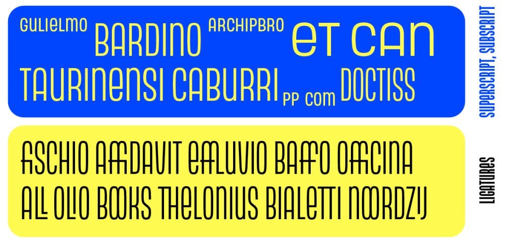
Next to offering an expanded Latin character set, Neon Nbl offers superscript/subscript, fractions, tabular figures, mathematical symbols, alternate forms and accents, discretionary ligatures and an arrow set. The family comprises four styles, from UltraCondensed to Condensed, to SemiCondensed to Normal; the range of weights stretches the basic light/bold contrast of the original and includes Thin, Light, Regular, Medium and Bold, plus a shaded version (Ombra). Overall 24 fonts: enough to play with, I guess!
How and when did you begin to work on this typeface?

The small booklet featuring Beatrice Warde’s Il calice di cristallo was attached to «Progetto grafico» 8, giugno 2006. Graphic design and translation by Alessandro Colizzi.
I started sometime in 2006, when I designed a booklet featuring my Italian translation of Beatrice Warde’s The Crystal goblet for «Progetto Grafico» 8. That booklet just gave me an early opportunity to test my Neon in a real project. By that time I had joined academia at UQAM in Montreal and started a PhD at Leiden, so my time was almost exclusively devoted to teaching and research… It took me several years to complete the first version and develop the font. Nonetheless, the family grew slowly but surely, until in 2019 I revised the ‘family planning’ and from then on rushed to complete the family.
Why did you choose to get it produced and released by CAST?
I’ve known several of the founding members for years, and I admired what they were doing as typeface designers, nationally and internationally. We would more or less regularly meet at typography conferences, you know. So, it was only logical to think of their cooperative foundry (another idea I very much liked) as the most suitable platform to release the font. And I knew I could rely on their technical skills and commercial expertise.

Last question: you teach in Milan, but you live in Turin, hometown of the defunct Società Nebiolo. Is that a way to keep on getting inspired?
Yes, when I joined Milan’s Politecnico last year, I decided to settle in Turin in order to carry out research. Together with other researchers I’m part of a group called the Nebiolo History Project investigating the history of the Turin-based foundry. Despite the difficult times we’re experiencing, we are trying to collect – for lack of the original company archives – all surviving information, ranging from archival documents to oral history interviews. The aim is to retrace and – based on the available evidence – to present the so far neglected story of the largest Italian type foundry of the 20th-century. We’re organising a symposium next year here in Turin, that will bring together scholars and experts with a common focus on Nebiolo: that will be our first major effort to help shed new light on the foundry.
