
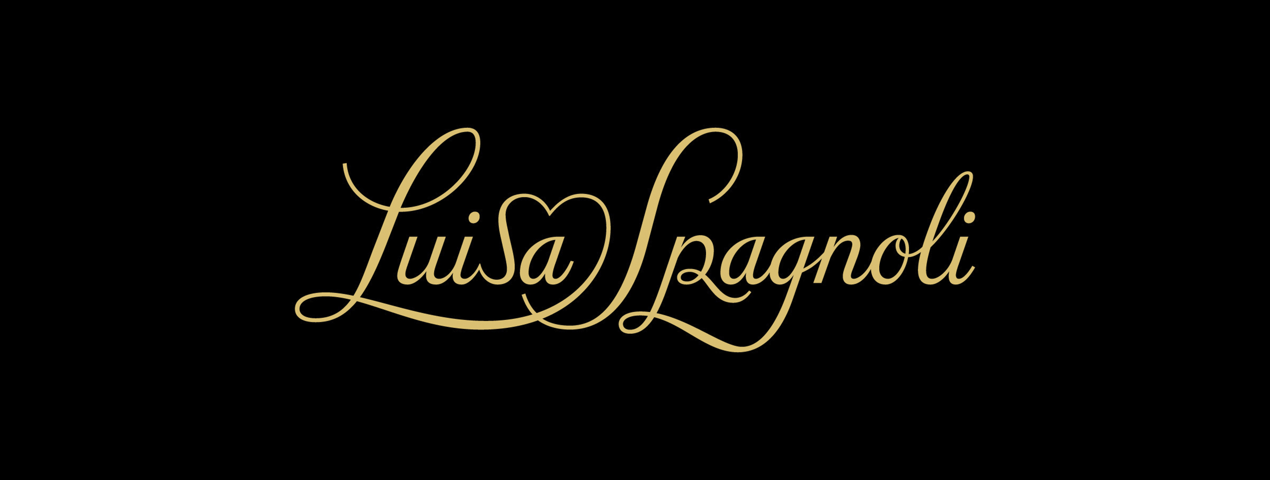
Since its origins, Luisa Spagnoli has embodied a model of Italian craftsmanship built on material quality, continuity, and attention to detail. Redesign of its wordmark and monogram was necessary to preserve this visual heritage while updating the brand tools to ensure greater consistency, legibility, and performance across the many applications of contemporary fashion.

It’s all about the heart
The first step was exploring two approaches: one conservative and the other more radical, but still rooted in copperplate origins. One unshakable dogma was given to us: ‘Keep the heart shape, alongside the big capital L and S in the wordmark.’ The new wordmark updates the previous copperplate style, interpreting the calligraphic tradition through a rigorous design approach. In parallel, the LS monogram introduces a key symbolic element.
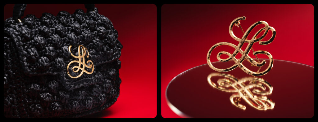

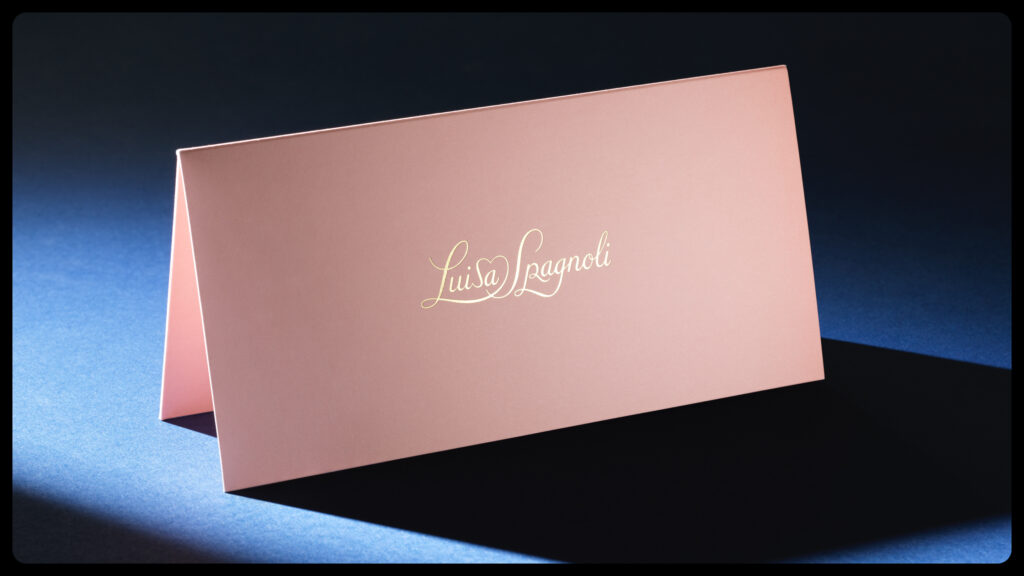

Strokes, curves, and connections have been reconsidered to function at different scales to optimize performance in print, embroidery, and engraving: from micro applications on metal accessories to repeated patterns for fabrics and jacquard without compromising the brand’s longstanding recognizability. Its controlled strokes ensure structural solidity while retaining the fluid character typical of its calligraphic reference.
For both the logotype and the monogram, several iterative versions were designed. They were comprehensive of weight and optical size variations to ensure maximum adaptability throughout different supports.


Agency: Macsiotti
Art Director: Dario Verrengia
Chief Designer: Valentina Casali
Designer: Stefano Baldassari, Luciano Perondi
Designer: Stefano Baldassari, Luciano Perondi
Photographer: Davide Farabegoli