
Interview by Massimo Gonzato
Luciano Perondi, CAST chief designer, took part in the design process of Divenire just a year before CAST was founded. And when the foundry started up, Divenire was among the first typefaces in the library. Recently Perondi opened up the Divenire family by adding the monospaced and variable versions.

Divenire it’s a display sans with a well defined personality. How did you manage its main design features in order to come up with Divenire Mono and Divenire Variable Font?
Divenire Mono is a low-contrast monospaced sans for coding, typesetting and print. Along with the Macho family, Iki Mono and Xanti Typewriter, Divenire Mono offers a wider choice of modular-spaced faces.
Divenire Mono has a humanistic imprint which is quite rare for monospaced faces. Despite its modular design, it stays true to Divenire’s main features: low contrast, vertical strokes with slanted terminations for letters i, j, and l, some variations of the axes of letters g, o, d, and c, and slightly organic, asymmetrical, squarish shapes. It is simply more strained, angular, informal.


Divenire Variable Font is the interpolated version of Divenire. Most CAST fonts come from interpolations, but they aren’t completely interpolated. Since some years we have been converting them all. The process is not immediate, because it implies corrections and redesign in order to optimise each step of the interpolation.
Are there any design references for Divenire?
I drew the first letters starting from some scans of types cut by Fleischmann in Enschedé specimens. This can be recognised by the somewhat irregular aspect of Divenire, even though all was reworked to conform to the parameters of today’s sans serifs.
Divenire is not related to the broad-nibbed pen. Eighteenth-century proportions and details are applied to a contemporary sans serif.
Like Dic Sans and Macho, the letterforms of Divenire’s are squarish, with horizontal terminals and angular junctures that are organically irregular and discontinuous; there are variations of stem widths, alternating curved and straight strokes and plenty of intermediate variations. In this way Divenire demonstrates how a lack of uniformity can produce consistent results. And this is why it also performs well for setting texts.

The lack of uniformity seems to remain a constant in your approach to typeface design. On this topic, in a previous interview on Sole Sans, you hinted at the work of Anne Treisman and Arnold J. Wilkins …
In a nutshell, their research shows how it is easier to identify an ‘irregular’ element in a regular set than vice versa. I always thought this might have something to do with typefaces, but while the scope of research of Treisman and Wilkins has literally exploded over the last thirty years, so far I’ve failed to find any publications that specifically deal with how their research can be applied to typography.
For my part, I noticed how ‘irregular’ typefaces display a more interesting texture on the page, as if the irregularities were absorbed by the irregularities themselves. In fact, since my early years of professional activity I have always tried to apply the idea of irregularity to typeface design, especially to seriffed faces.
We have a typeface in our collection that allows us to better understand this matter: Riccardo De Franceschi’s Valnera. This face has a couple of variable axes linked precisely to randomisation and introduction of irregularities. Generally I have observed several times that if a degree of irregularity is applied, the overall appearance of the page is not compromised. Indeed, from my point of view, the text is enriched with depth and nuances, it is less ‘gray’ and less flat.
Not all typefaces necessarily had to be related to the broad-nib in 2005 and not all typefaces need to be Swiss grotesque today in 2022. At CAST we have always kept some distance from the mainstream: long live biodiversity!

In a previous interview on Macho Modular – another monospaced typeface of yours – you quoted Stefan Themerson as a source of inspiration. Does Divenire Mono share the same inspiration?
Stefan Themerson was a Polish artist, filmmaker, poet, writer and publisher. He was the inventor of ‘semantic poetry’. Years ago Michele Patanè and I published an essay in the magazine «Experience» discussing the translation of a Chinese poem included in Themerson’s Bayamus, a novel published for the first time in book form in 1949. In that novel he defines semantic typography as a graphic form of semantic poetry. Semantic typography implies the use of internal justifications and alignments to render the non-linearity of the written text. In addition to poems, Themerson also produced several essays in which he uses his system of internal justifications to effectively discuss various topics, including semantic typography.
This leaning for internal alignments is a hallmark of Divenire Mono as well as Macho Modular and monospaced typefaces in general, and is well suited to coding.
Could you please tell us more about Divenire?
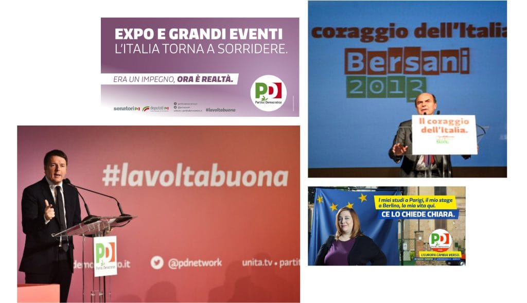
Divenire was designed in 2012 as a display face for a part of the new identity of the Partito Democratico (PD, the Democratic Party in Italy) and it was selected for the ADI design index for 2013 under the brand category. Divenire was developed together with Alessandro Tartaglia within a wider project coordinated by his design agency FF3300 and Eugenio Iorio. Some co-planning strategies were adopted with the party leadership in order to identify a series of political ideas, aspirations and ideals. Starting from this data, the new identity of the party was devised and designed. Divenire was part of this process and was one of the outcomes: its various aesthetic features (see the cuts on the vertical stems, or the particular shape of the terminations) and its various sets of additional glyphs are the result of a shared elaboration process.


With over twenty different ampersands in the glyph list, Divenire is also CAST’s first typeface with a complete set of expressive punctuation marks.

Please explain what you mean by ‘a complete set of expressive punctuation marks’.
First came Martin K. Speckter, president of Martin K. Speckter Associates Inc., which handled promotion for The Wall Street Journal, The National Observer, Barron’s weekly and the Dow Jones News Service in New York. In 1962, he invented the interrobang, a new glyph to convey surprised rhetorical questions using a single glyph made with both the question mark and the exclamation mark.
Some years later, in 1966, the French writer Hervé Bazin in his work Plumons l’oiseau introduced the use of six punctuation marks: love point, certitude point, authority point, irony point, acclamation point, doubt point.
I thought that all these punctuation marks would have worked perfectly in a display face as more sophisticated emoticons. By coincidence I discovered that in the early 2010s the International Organization for Standardization was reviewing a proposal to encode Bazin’s six punctuation characters in the UCS. So I decided to design Speckter’s interrobang as well as Bazin’s creations.

Divenire was released by CAST in 2014 along with your Dic Sans. Macho Modular and Sole Serif followed in 2015 and 2016 respectively. Before being released by the foundry, all these faces were designed on commission. What about you, CAST, and custom typeface design?
Custom typeface design is a very important part of our business. We designed and produced Loacker script, the Guardian Media Group opted for a customisation of Sole Serif to revamp The Observer, and soon after we were commissioned by the Italian financial daily Il Sole 24 Ore to design Sole Sans. And these are just the few we can talk about without breaking any NDAs.
By the way, not all custom faces have to be brand new designs with a lot of weights, styles, glyphs and tricks like Divenire. You can also commission a type refinement and/or modification in order to build a consistent identity or design an appropriate logotype.