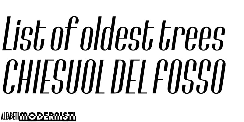
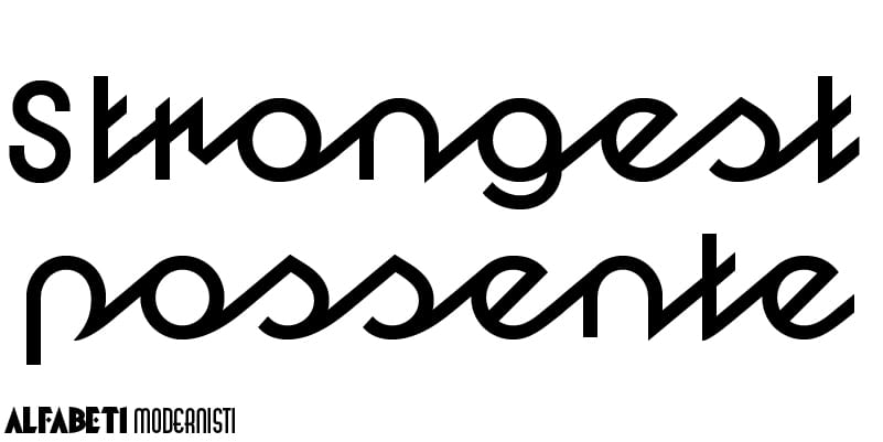
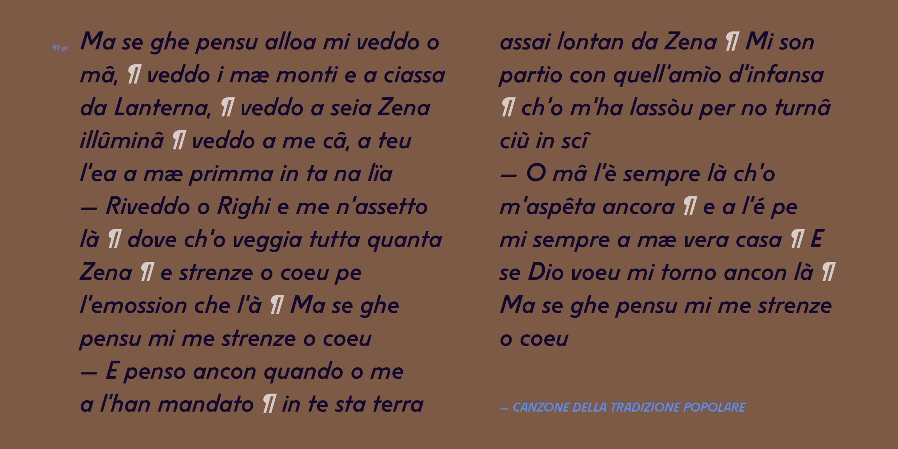
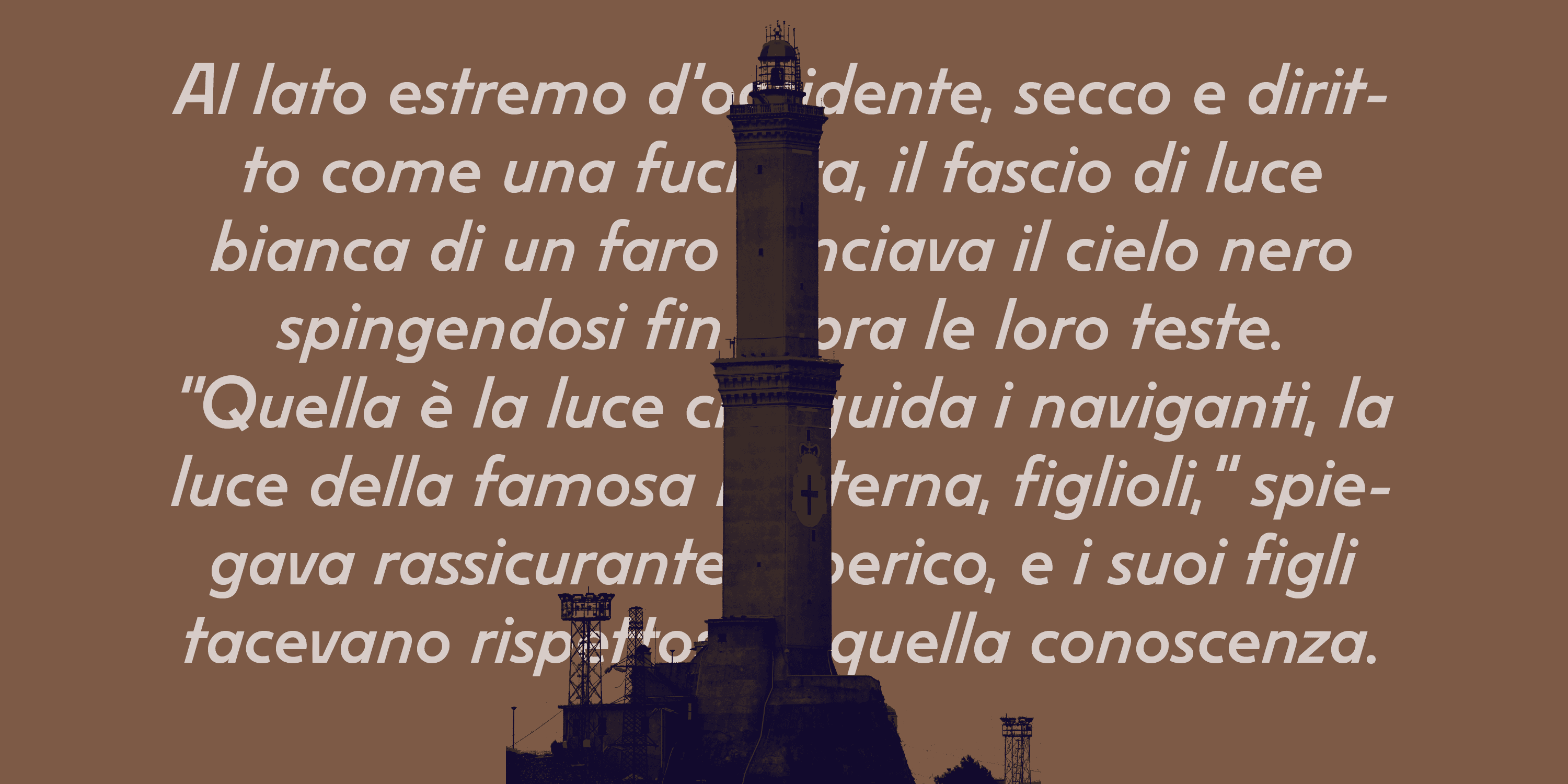
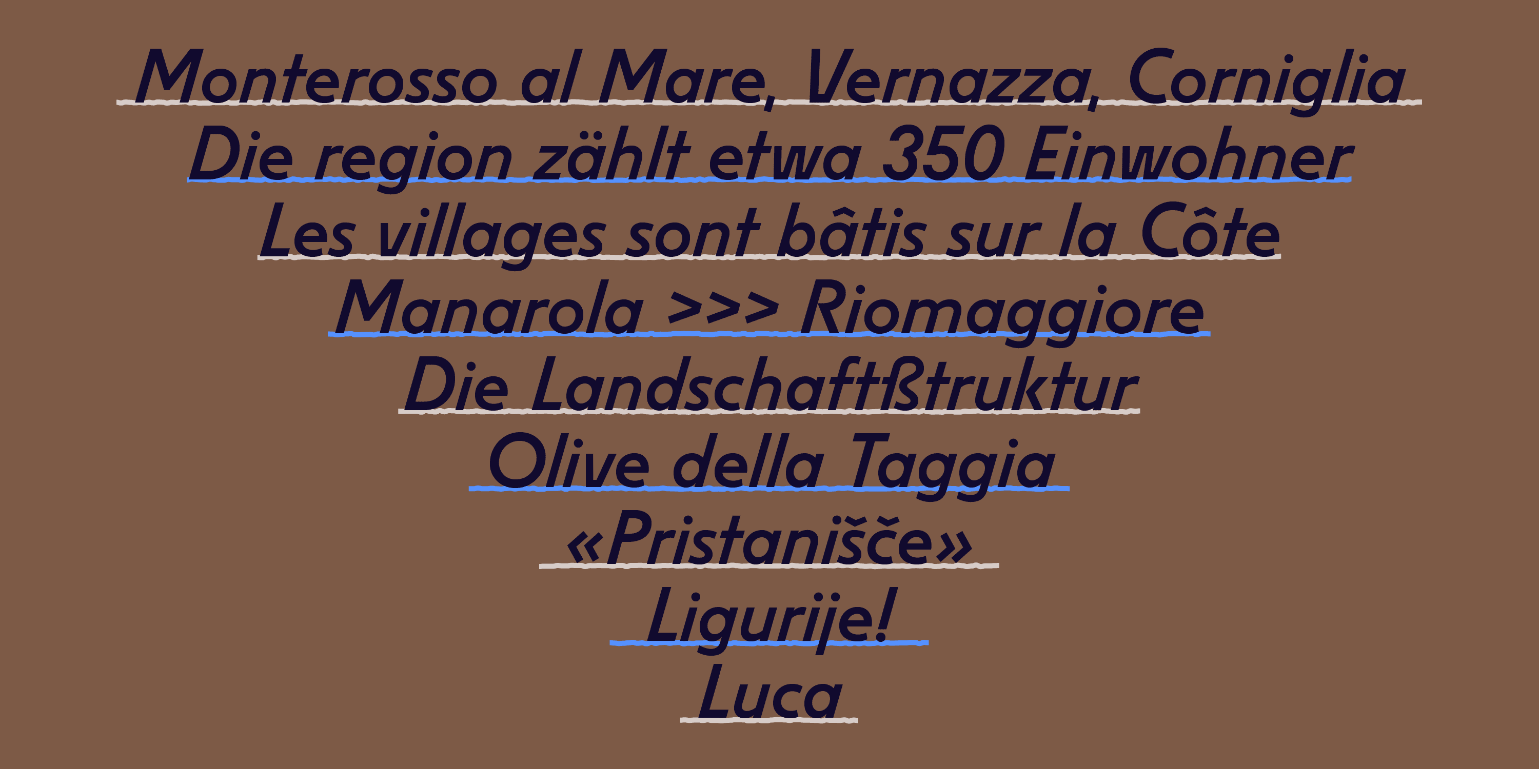
Liguria is a slanted monolinear sans with a raw but straightforward appearance. Its utilitarian design evokes a mechanical aesthetic, vaguely reminiscent of German geometric sanserifs of the 1920s such as Futura.
Liguria


Courtesy of Luca Lattuga
Cut by the Xilografia Verona around 1938, Liguria was available as a wood type in five sizes: 4, 5, 6, 8, 12 lines (50–150 points). Liguria is an italic sans paired with slanted capitals of classical proportions, with narrow B, E, S and wide O. Its main feature is the flat base and flat top of the oblique letters (A, V and W as well as v and w) — a design solution that minimises the need for kerning.
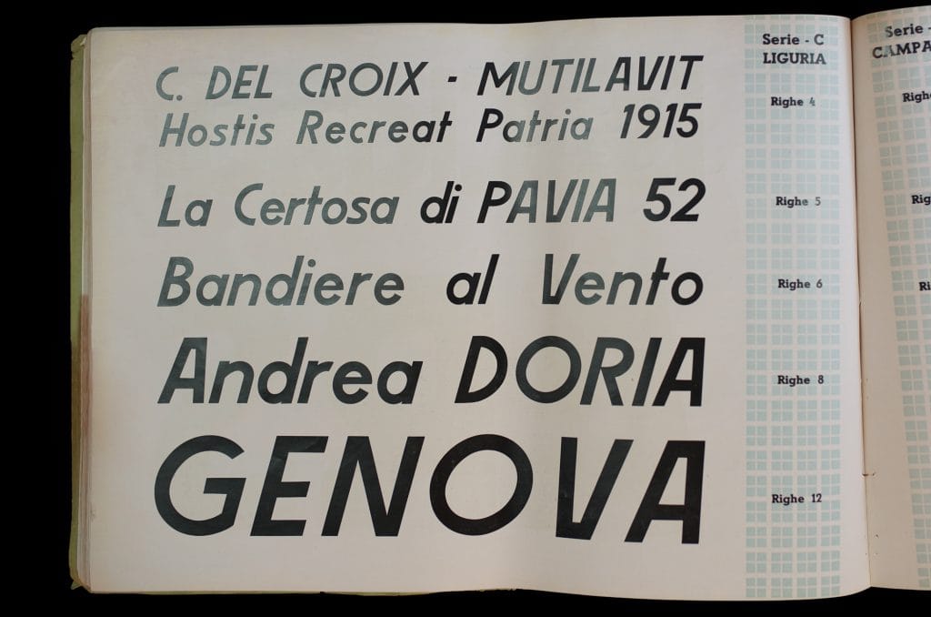
Courtesy of ACSG Associazione Culturale Studi Grafici – Milano
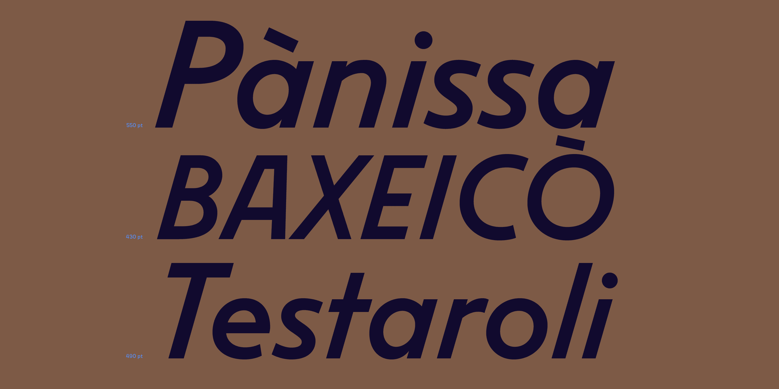
The AM Liguria digital revival is faithful to the original, but ‘it was necessary to adjust the proportions and contrast’ in order to retain its original roughness and spontaneity, explains the designer Beatrice D’Agostino. ‘The counters of the letters a, d, p, and q have been refined, and the terminals of c, f, and s made more consistent with one another, while the punctuation has been completely redesigned.’