Bissaboa Outline
TTT
Hi, I’m Bissaboa
Bissaboa is a maverick unicase display face that frames your words in fluid typesetting. Always ready to wrap up your message in ribbon-like letterforms, it puts a spell on your communication and brings a touch of magic to the waves of your imagination


Bissaboa, the stream of ‘ribboness’
Did you always think of yourself as a non-believer? Are folk tales for children? With the power of its flowing letterforms, Alessandro Bombieri’s Bissaboa will rid you of your scepticism! The energy of its twisting and turning design is reflected by its Venetian name. Evoking an animal that’s half snake (bissa), half ox (boa) and brings ‘whirlwind, storm, chaos, disorder’, Bissaboa originates in the Middle Ages. After the wild Bissaboa vanished in the 19th century, the word’s meaning shifted: ’zigzag, winding line, serpentine’.
With its snakelike look and naming, Bissaboa hints to its hidden nature, reveals an organic soul and recalls the idea of a living flow, a flow that follows the stream of reading.
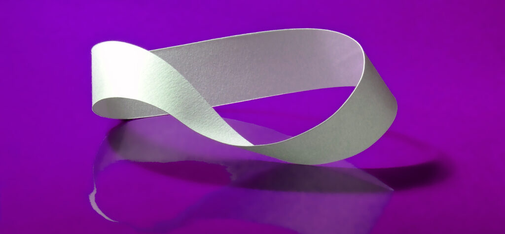
Bissaboa unrolls ribbon-like letterforms and waves them across a line of text. Its letterforms follow a strict geometrical construction and its high thick and thin contrast is produced by the bending of its strokes. These features give Bissaboa a peculiar strip aspect reminiscent of coiling symbols: the double helix of DNA, the Möbius strip and the Ouroboros.
Bissaboa shares this intriguing imagery and is itself ancient and contemporary, rigorous and fabulous, yin and yang.

The dwarf in optimistic German philosopher Nietzsche’s Thus Spoke Zarathustra suggests Bissaboa’s combination of insouciance and integrity when he declares, ‘Everything straight lies. All truth is crooked, time itself is a circle.’ The dwarf also evokes ancient ideas about cycles, repetition and revolution long used by societies and their mystics to explain time. Some, taking the seasons as a lead, viewed it as an infinitely repeating loop. Everything would always, reassuringly, return to its beginnings before starting again. As ancient nomads and merchants set out on journeys, a different conception took hold: time as a linear thing. An endless scale used to mark progress towards a journey’s end. A compromise can be seen in how some priests visualise liturgical calendars: time as a spiral. Similar events with different iterations, repetition and change.

With its decisive curves and straight lines, Bissaboa’s visualisation is inherently syncretic. Moving along the line, it repeats its forms in infinite combinations and starts every sentence afresh.
Bissaboa is a display face with OpenType features for accessing alternative forms. Along with alternates for some letters, such as E, F, L, T, the whole character set is provided in two versions: the outlined glyphs as default, and the filled glyphs accessible as a stylistic set. The two sets can be used together for multicolour lettering. Filled and outlined, transparent and opaque, visible and invisible, this arcane typeface is ready to inspire.
With its outlined and filled glyphs, Bissaboa can play with every nuance and facet of reality.

Are you a student? You can get our Educational Licences saving 90% on the full price of our fonts!
Do you want to try our fonts? Fill this form and test all CAST typefaces free of charge – including some still work-in-progress original typedesigns of ours!