Subiaco Regular
TTT
Hi, I’m Subiaco!
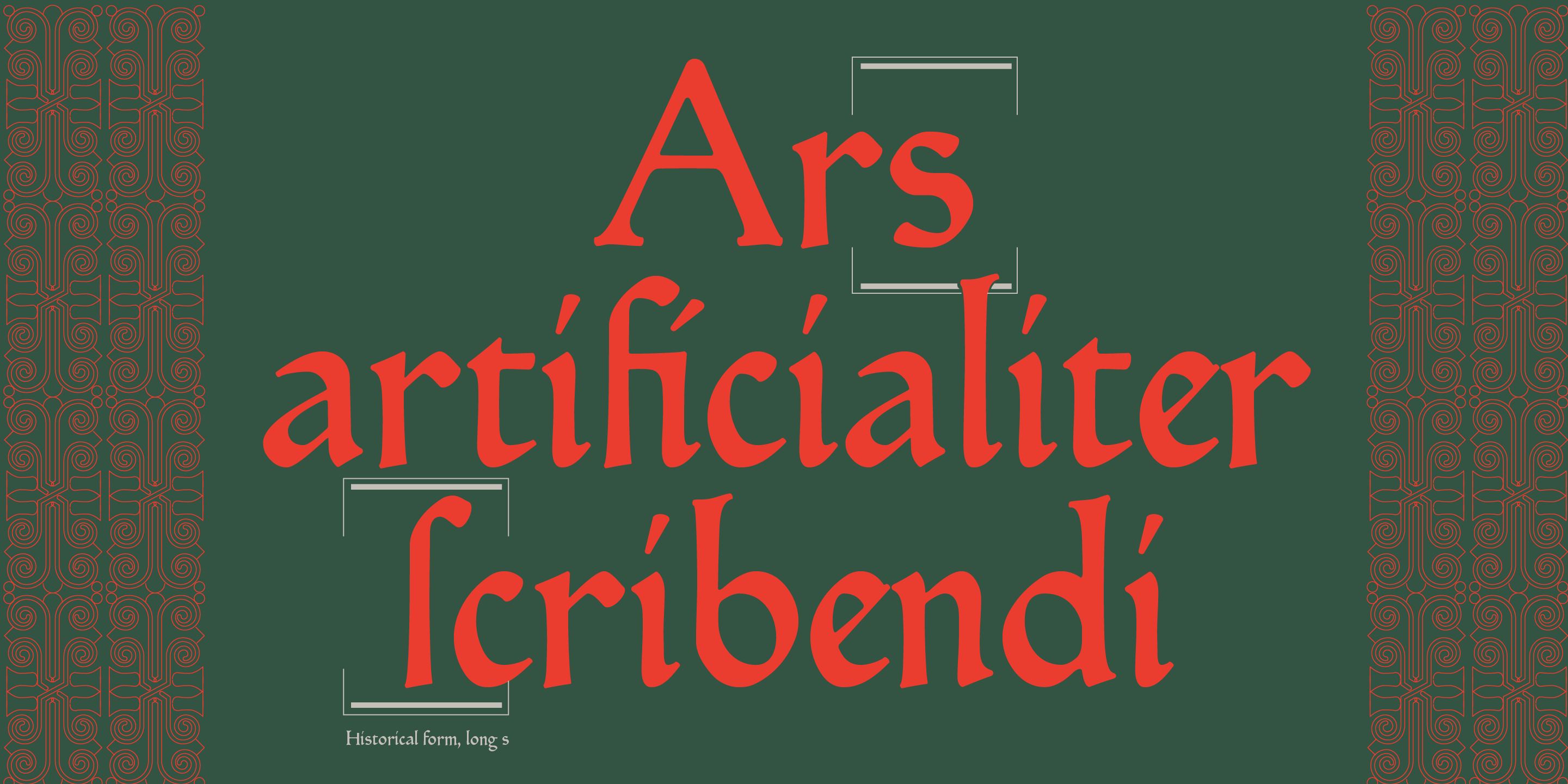
A revival of the type of the Ashendene Press, which was a masterful revival of the hybrid, proto-roman book face employed by Sweynheym and Pannartz in the first books printed in Italy (1465), Subiaco is back. A celebrated book face from history now fully adapted to our digital environment


Subiaco: the revival of a revival programmed with Metafont
Claudio Vincoletto’s Subiaco for CAST Studies has low contrast, long ascenders and descenders, and lowercase letters that terminate in blunt strokes reminiscent of calligraphers’ exit strokes. Both primitive and smooth, it’s named after the Subiaco type cut around 1900 for the London-based private press Ashendene, a type which masterfully revived an early printing type used by Sweynheym and Pannartz. A revival of a revival; it’s not by chance it bears a mirror name: Subiaco.
Vincoletto added to the mirroring references of his early-book face an unusual methodology: producing an accurate revival with the help of Metafont. More than a century after the first revival, the result is a new Subiaco typeface and a quiet masterpiece which successfully negotiates the calligraphic and typographic aspects of the original Renaissance model.
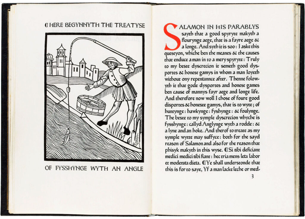
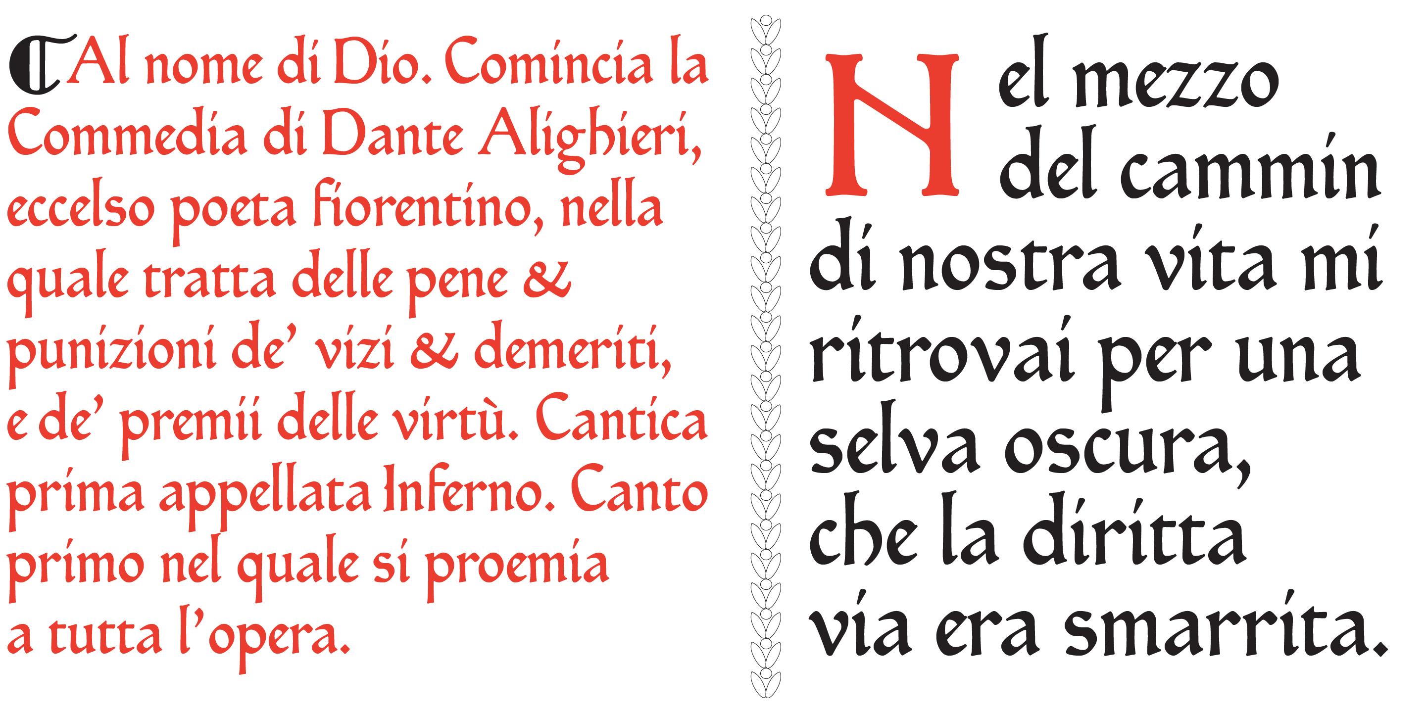
As mentioned, the face is a revival of the Subiaco type of the Ashendene Press (1895–1935), a private press of C. H. St John Hornby, a prominent figure in English business. Renowned for its revival of fine printing, Ashendene Press was highly successful in capturing the essence of the best 15th-century printing and type.
When Hornby’s private press needed a book face for exclusive editions printed with a hand press, inspiration was sought from the types of the early-printing age. To printers like Hornby, those pioneering printers embodied ideals of hand-craftsmanship that had been eroded by industrialisation. Advised by Emery Walker, Hornby had a type cut by Edward Prince on the model of the type used at the Benedictine abbey of Subiaco by Konrad Sweynheym and Arnold Pannartz, two German monks who opened the first press in Italy in the mid-1460s.
The makers of Ashendene Press’s Subiaco cleaned up the original letterforms, giving its proportions a lighter and more regular touch and the type a more relaxed fitting than the original. In other words, they adapted a rough Renaissance face to the standards of craftsmanship and typographic taste of the turn of the 20th century.
The established narrative holds that the Subiaco type was designed by Sydney Cockerell and Emery Walker, but this is likely incorrect.
James Mosley, who is currently investigating Walker’s enlargements of printed types, has kindly outlined what can be safely claimed. Walker made photographs of a book printed by Sweynheym and Pannartz possessed by William Morris (1834–1896); and from a surviving photo it seems that Morris drew the lowercase letters modelled on these images. There may also have been some trial punches cut for it. After Morris’s death, the type was completed by Prince and sold to Hornby, but there is no evidence that Walker and Cockerell designed anything. The type may have been cut by Prince with no other preparatory drawings other than those done by Morris himself.
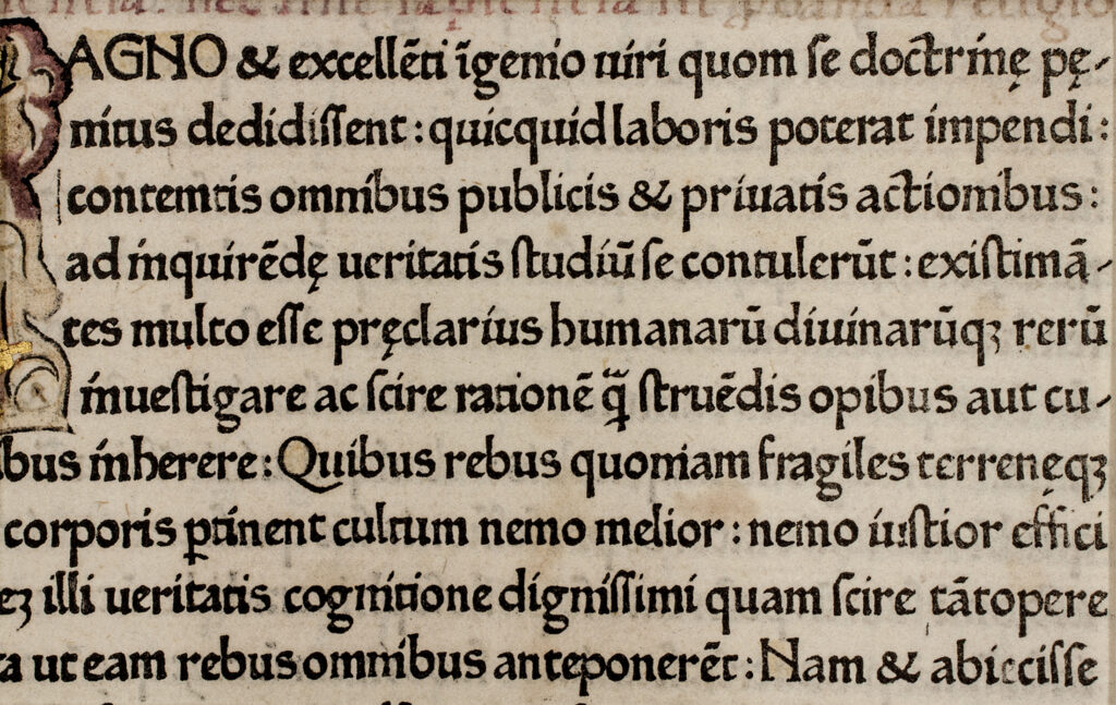
Konrad Sweynheym and Arnold Pannartz were two expert printers who likely worked with Johannes Gutenberg before setting up their own business. It is not clear why they settled in Subiaco. What is certain is that the local Abbey of Saint Scholastica contained a rich library, full of manuscripts that would have been prized by early printers who needed sources to transfer texts into print. Three editions printed in Subiaco survive, all set in a type which isn’t seen elsewhere. The two monks later moved their printing office to Rome.
The type employed in Subiaco was most likely the work of Sweynheym, who seems to have been an experienced punchcutter. The type is often considered a semi-gothic, mainly because its compactness and dark colour are reminiscent of gothic types. However, the design of the type itself has more in common with the formal humanist script of Florence – the script of Poggio Bracciolini, Antonio di Mario and their colleagues – than with any gothic type.
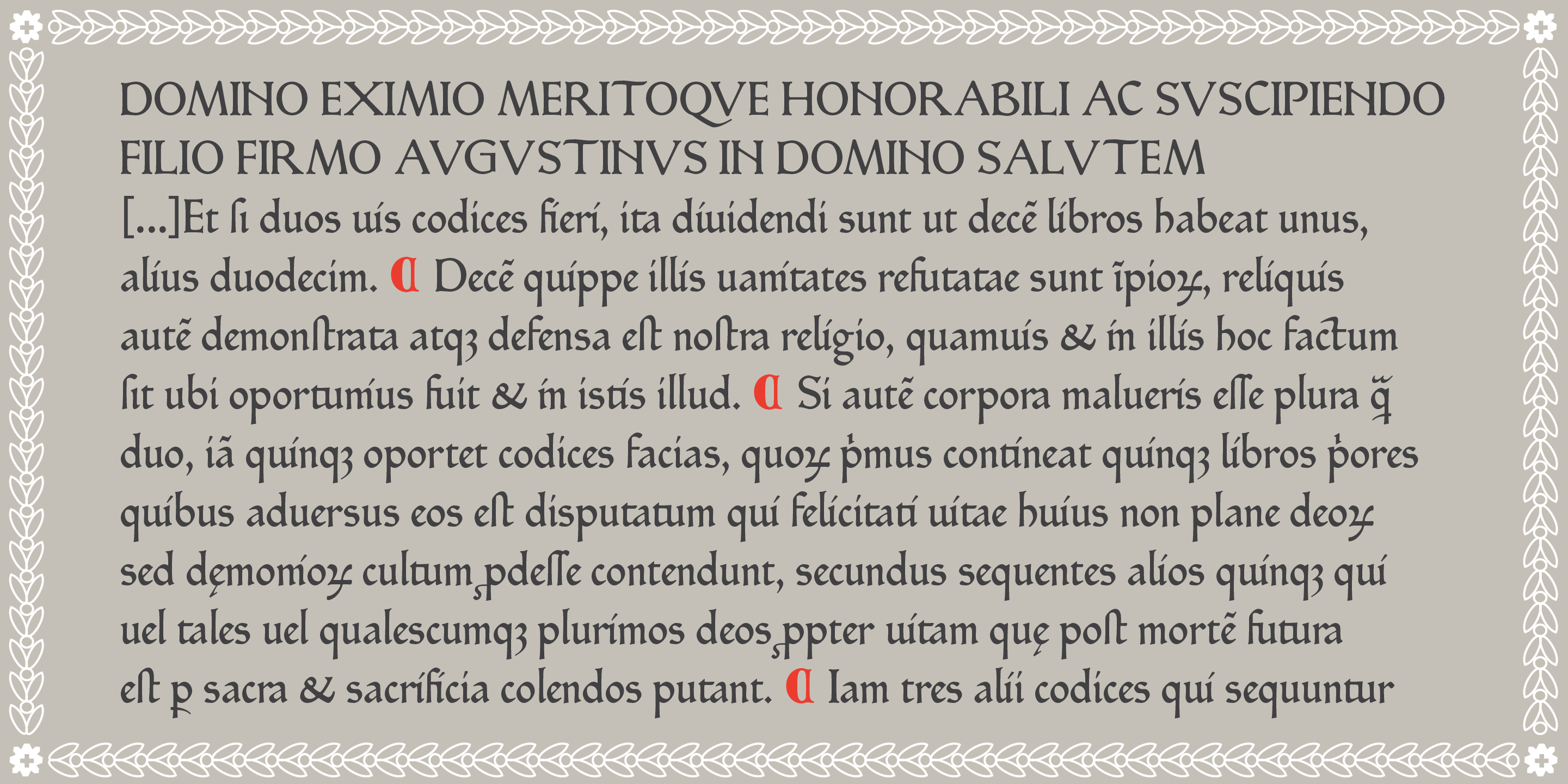
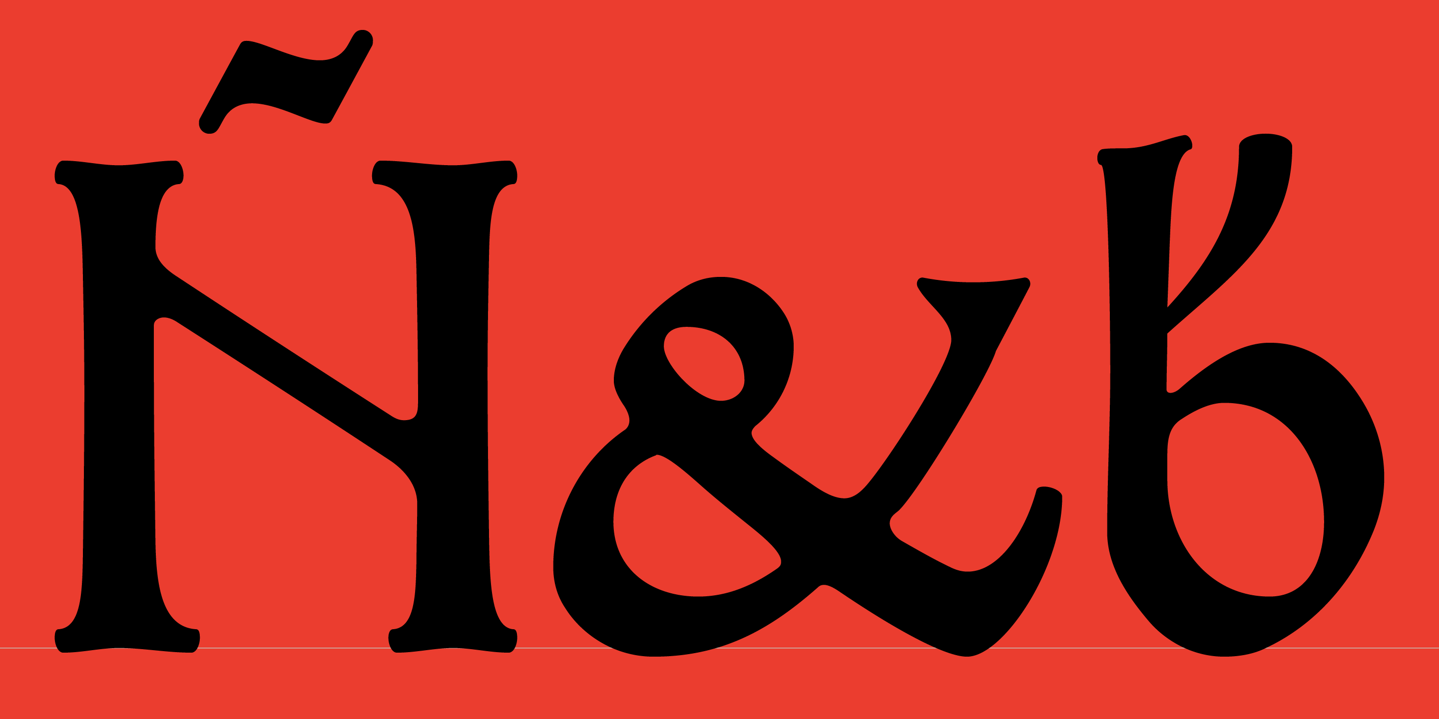
Its uppercase is made up of square capitals that are very similar to those of Poggio, but more heavily seriffed. Many shapes display a Romanesque origin, such as G, M, N, R, and H, which is unique in the history of type, with its left stem taller than the right; this particular H is however found in the work of professional scribes of 15th-century Florence and Rome and it is reproduced in both revivals. The lowercase of the Subiaco type displays a similar combination of formality and flow that is seen in the Florentine humanistic minuscules; its fitting is rather close and letters like a, d, g, r follow the shape used by many professional scribes of the time.
Subiaco faithfully revives the beautiful letters of the Ashendene press by making use of one of the earliest technologies in digital typeface design: Metafont. As is well-known, Metafont is the description language developed in Stanford by Donald Knuth to define digital fonts. It is not user-friendly. It lacks a graphical user interface and so you either write lines of code or forget it.

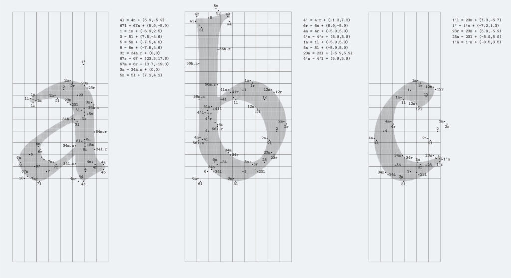
Before he started programming in Metafont, Claudio Vincoletto analysed the Subiaco type, overlaying a grid on photographic enlargements of printed pages – not dissimilar to what Renaissance painters did to identify the pivotal points when drawing real models in perspective. He was looking for the points through which the ductus of a virtual pen, tracing the letterforms, would flow. The idea in the background was similar to what Noordzij postulated in The Stroke. Then Vincoletto employed Metafont in a different way to Knuth. Instead of defining parametric equations for processing all the possible design variables from a single source, he employed parametrisation to create homogeneity between the letterforms.
Setting up a peculiar workflow on Metafont, he employed a virtual pen for establishing the framework of each letter, then he built the type’s contours on that framework in a kind of interpolation.
Vincoletto is not a professional designer, but he delights in bookbinding, reproducing vintage layouts and reviving old typefaces in Metafont. His humanistic background has driven him to some peculiar research on Renaissance letterforms. He studied Felice Feliciano’s Alphabetum Romanum (1463) and other famous manuals for designing capitals according to mathematical models, including Sigismondo Fanti’s little-known 1514 treatise that turns the calligraphic strokes of rotunda lowercase into geometric coordinates. As a result, Vincoletto’s approach to type design plays with the hypothesis that Renaissance punchcutting, monumental lettering and fine calligraphy all followed geometric patterns. The same patterns which the ductus of his Metafont virtual pen had to flow through when tracing the letterforms of Subiaco.
Vincoletto’s design practice is heterogeneous and multiform, a synergy of different tools that somehow reflects the hybrid background of the Ashendene Press revival, where modern technology (photographic enlargements of printed letters) were mixed with traditional practice (cutting steel punches of letters).
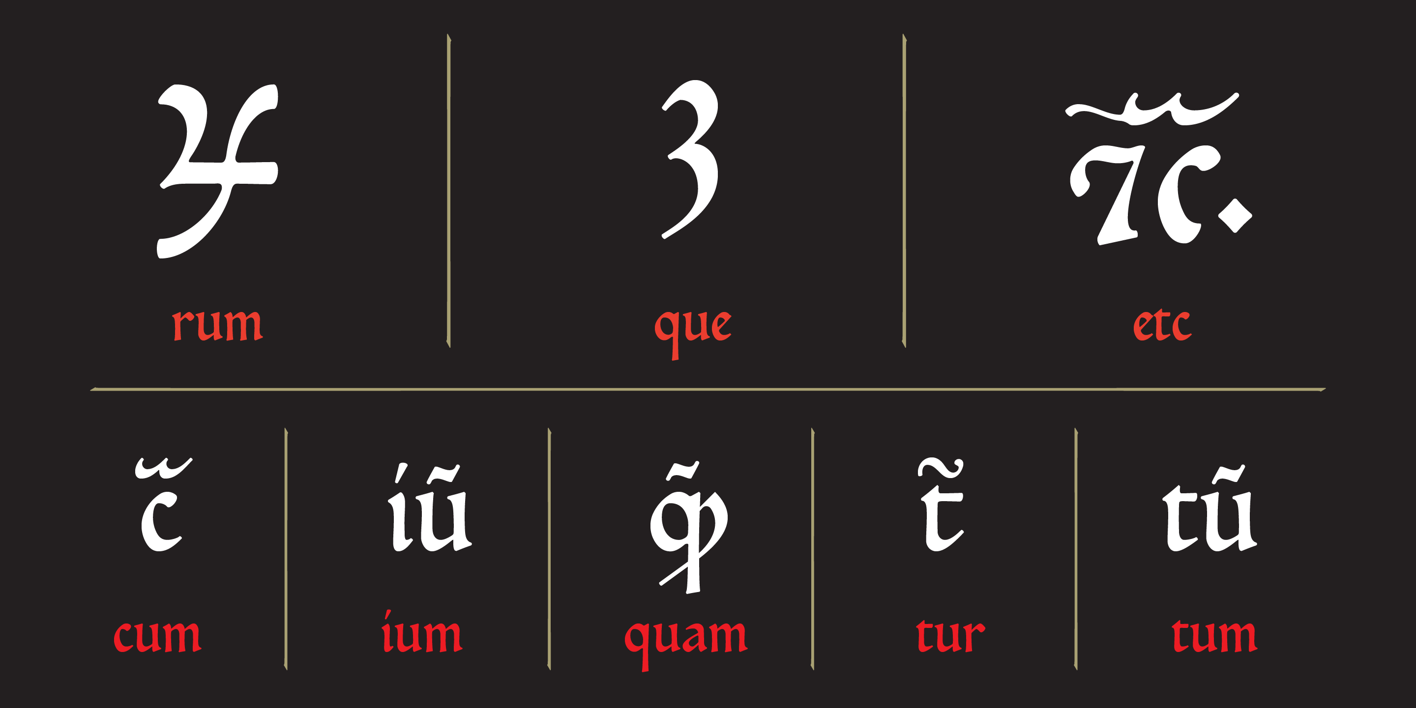
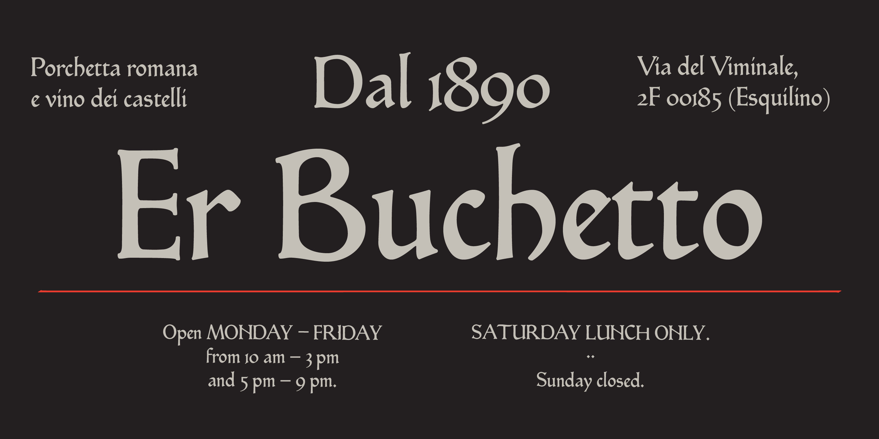
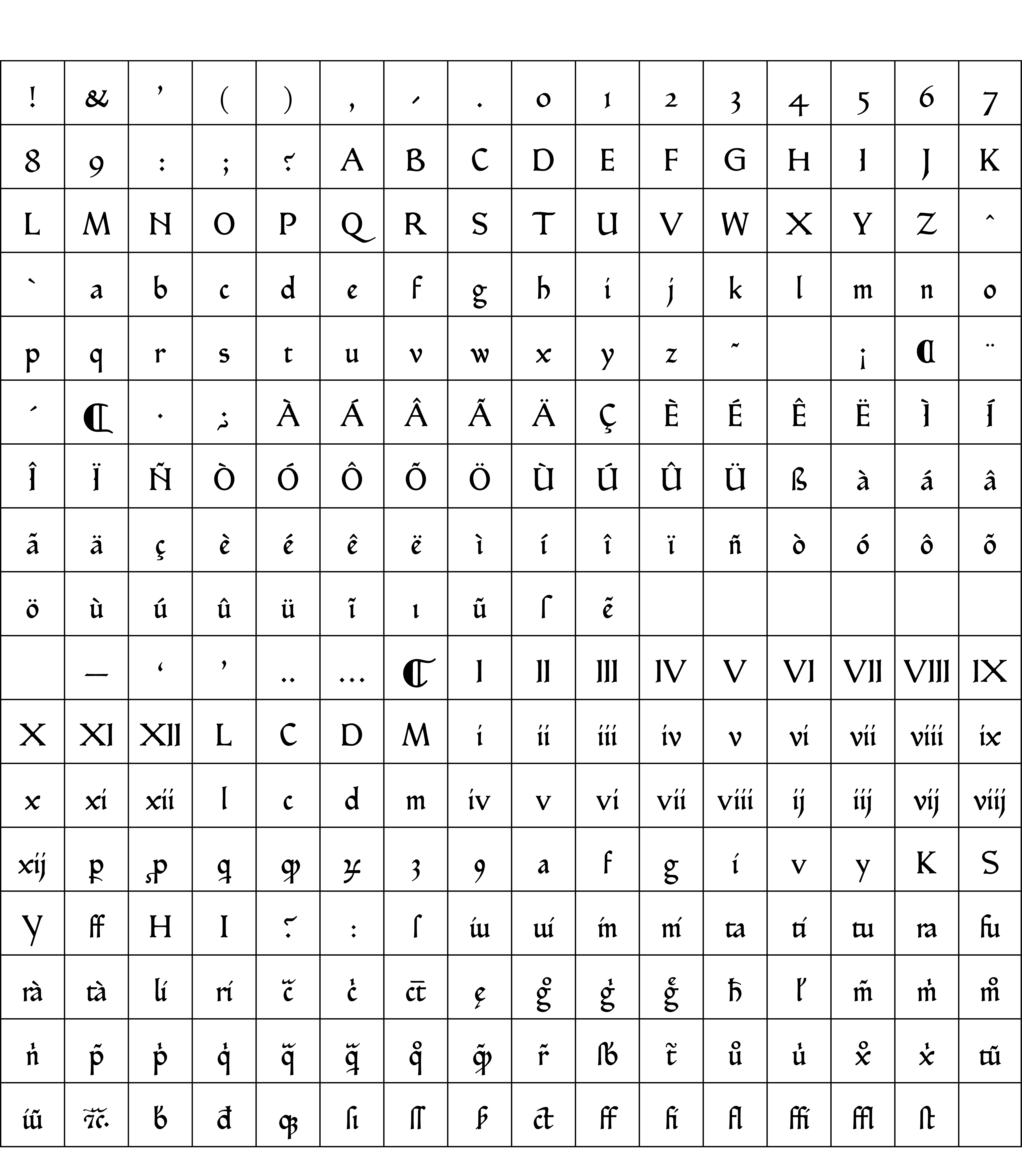
Suitable for print and screen, Subiaco is a meticulously crafted revival of a celebrated book face. Its hybrid letterforms combine traits from the Middle Ages and the Renaissance, including ligatures and historical substitutions. To mimic the behaviour of both the Sweynheym and Pannartz type, and the Ashendene press revival, Vincoletto added a large set of OpenType features, designed in a modular way, to give typographers great freedom. Besides the long s, the features include substitutions for ligatures, for scribal abbreviations (common in Renaissance books) and alternative shapes for letters that change between the original Subiaco type and the Ashendene revival.
Are you a student? You can get our Educational Licences saving 90% on the full price of our fonts!
Do you want to try our fonts? Fill this form and test all CAST typefaces free of charge – including some still work-in-progress original typedesigns of ours!