Hi, I’m Rotunda Veneta!
Rotunda Veneta by Riccardo Olocco
Rotunda Veneta is a learned revival of a Renaissance type renowned printer Nicolas Jenson employed from 1474. Its details have been carefully treated to make it suitable for small sizes and the most demanding display purposes. A faithful adaptation for the digital environment, it’s a stylish face which brings back to life a type which was also quite common beyond the Alps well into the 1520s


Rotunda Veneta: capturing the 15th-century mainstream
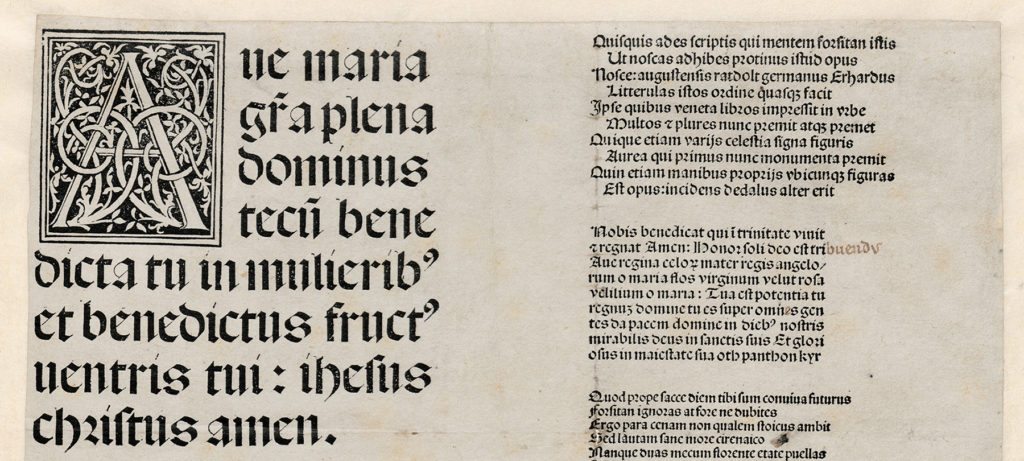
Where Textura was the formal book hand of central and northern Europe, Rotunda was the formal book hand of southern Europe. Developed in Italy, the rotunda script became known all over Europe in the 14th century thanks to the popularity of glossed treatises on canon and civil law produced by the universities of Bologna and Padua. In 15th-century Italy the humanist script – which gave rise to the Jenson roman and consequently to all the roman types up to our time – was the handwriting style of the political and cultural elite. But it was a snobbish style of writing, employed by people who had time to spend in slavishly copying classical authors – its traditional usage. Called ‘litterae venetae’ in northern Europe as well as in Rome, the most common book hand at the time was the style that palaeographers call Southern Textualis, or Littera Bononiensis, or more simply Rotunda.

Nicolas Jenson and the success of his rotunda type
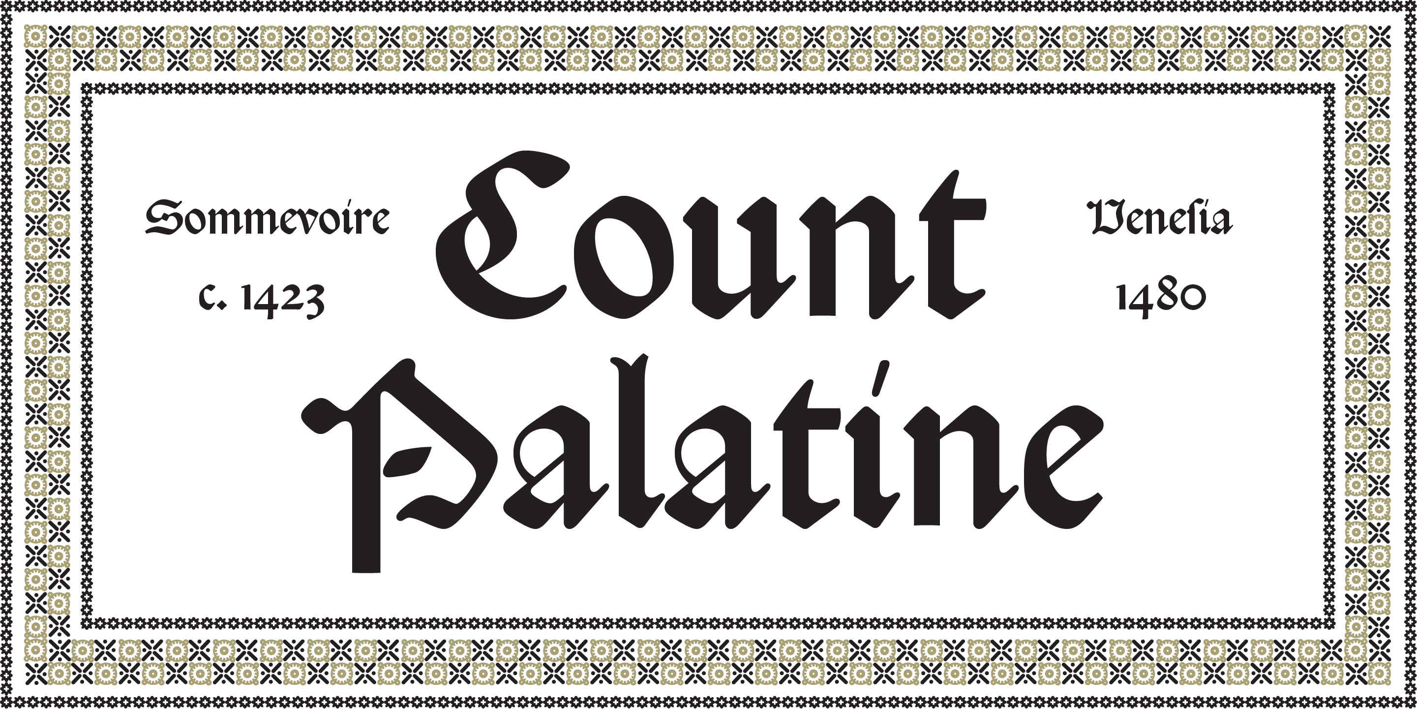
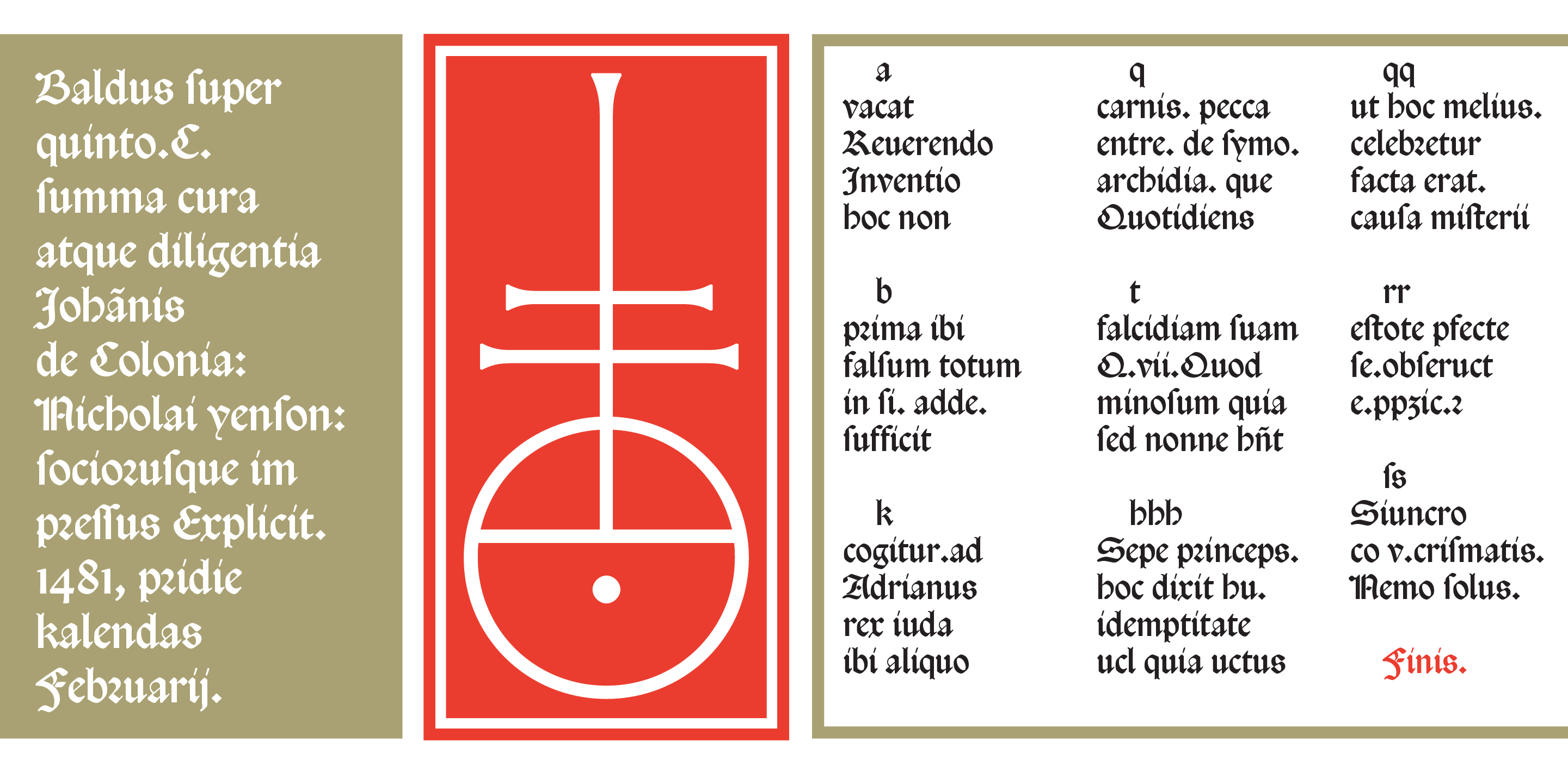
Jenson wasn’t the first to cut a rotunda type, but when his two sizes were introduced in 1474 they eclipsed all the others. They appear to have offered a definitive model to his peers, just as his roman types had. In Italy many more editions were printed in rotunda than in roman.
Rotunda crossed the Alps with Erhard Ratdolt (who employed his Venetian rotunda types in hundreds of admired editions) and was the most common style of type for theological, legal and scholastic texts well into the 1520s.
But by the 1530s or 1540s rotunda had vanished from German editions, leaving space for schwabacher or fraktur (for German texts) and roman (for Latin). More or less at the same time rotunda gradually disappeared from editions printed in Italy too, save a few religious and legal works where it stayed in use for centuries to follow.
Rotunda Veneta: chiselling a Renaissance masterpiece
Designing Rotunda Veneta, Riccardo Olocco took the larger of Jenson’s two sizes as a model. The original type of about 15 pt displayed only the lowercase and uppercase letters necessary to print Latin. In order to complete the alphabet, the shapes of letters k, v, w and the corresponding capitals of Rotunda Veneta were taken from a Jensonian rotunda employed by Ratdolt in Augsburg. The numerals come from another of Ratdolt’s types from the first part of his career in Venice (he was one of the first printers to display Arabic numerals, extremely rare in printing before the 1490s).
The typeface also includes a few additional characters that Jenson extensively employed in his books. The shapes of long s and its ligatures (sb, sl, ss, st) as well as the round r – to be mixed together with default r – are included as contextual alternates. Finally, the old Latin shape of the Tironian r is employed in place of &, as was customary in gothic types.

A pioneering search for the uppercase letters
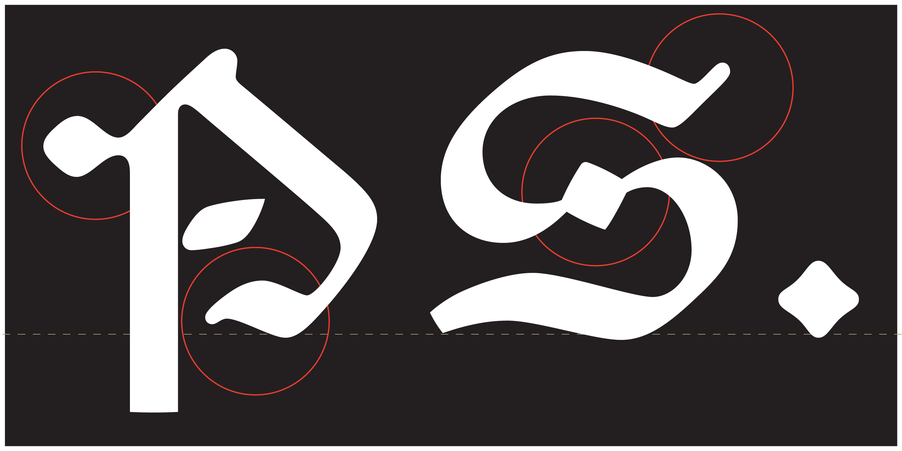
Rotunda, textura and fraktur uppercase letters are denser than their lowercase companions, their increased number of strokes reflecting their greater size and calligraphic origins. Gothic capitals are not well covered by paleographers, literature on them is almost non-existent, but we know that they evolved together with their minuscules and so better integrate with them. Unlike the capitals of humanistic script (and roman type), they do not represent the brutal addition of epigraphic shapes into writing. Aware of their long history, the capitals of Rotunda Veneta display a fine-tuned mix of styles – uncial script, romanesque lettering and other shapes of uncertain origin – that perfectly fit their minuscules and faithfully reproduce Jenson’s original letterforms.
Only a few subtle changes were made to increase their inner consistency at bigger sizes.

No kerning required
Finally, a technical note. Rotunda Veneta does not include a single kerning pair. Today, we can hardly look at a roman typeface that doesn’t have kerning. The subtraction and addition of space between specific characters is particularly required by roman capitals: they were not originally meant to be used in writing, least of all in typography where letters have predefined spacing. By contrast, due to their slow development within calligraphic practice, gothic capitals are more effective in occupying space and thus do not need kerning.
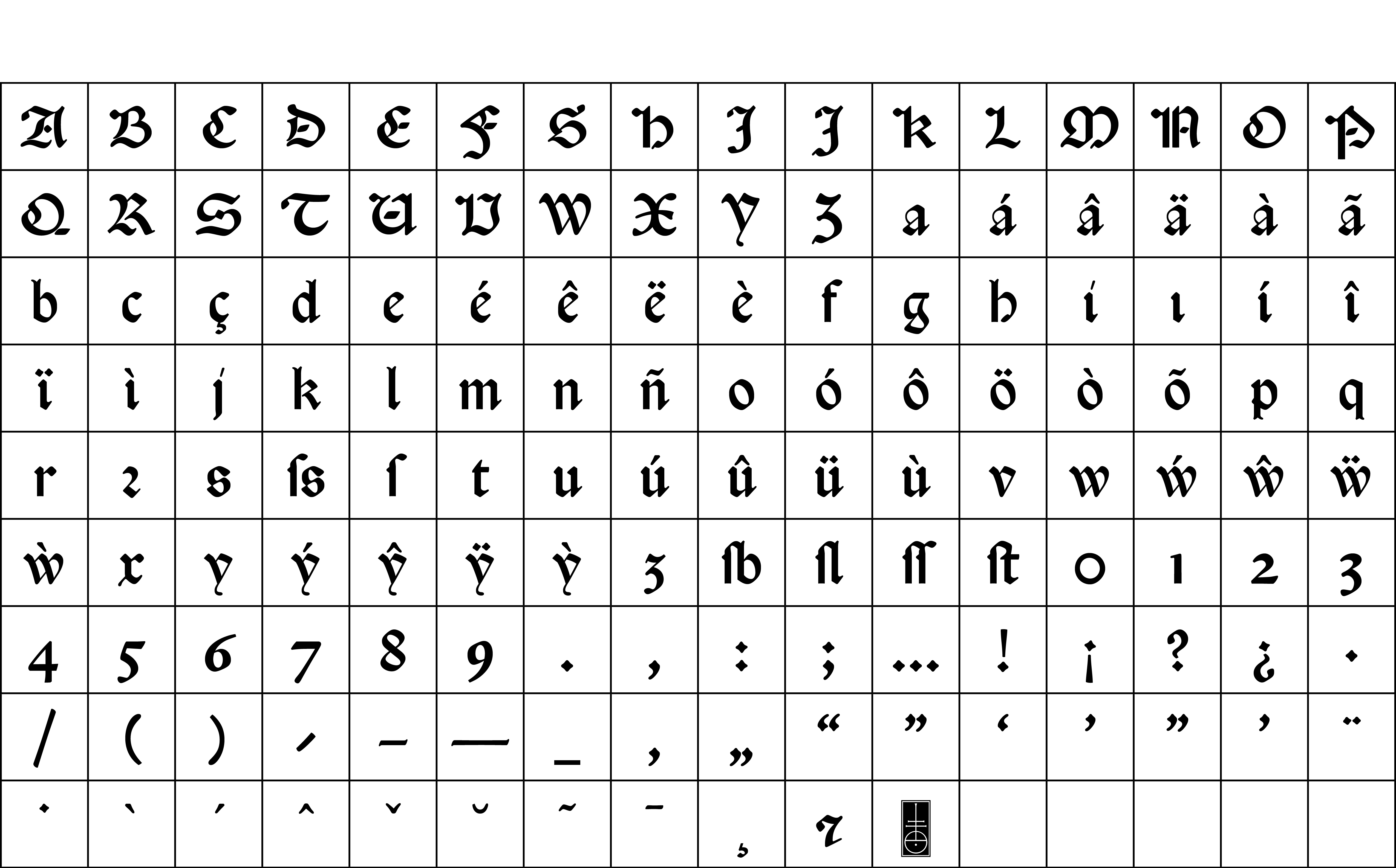
Character set
Buy
Are you a student? You can get our Educational Licences saving 90% on the full price of our fonts!
Do you want to try our fonts? Fill this form and test all CAST typefaces free of charge – including some still work-in-progress original typedesigns of ours!