Ebano Regular
TTT
Hi, I’m Ebano!
Ebano is an extended spiky sanserif inspired by woodcuts and linocuts. Featuring funky uneven lines, a fairly big x-height and confident strokes, it’s almost fine for long texts but fully displays its personality in titles


Designed by Stefano Barel and first conceived during the Type Design Fundamentals course at the CFP Bauer in Milan, Ebano picks up the heritage of letters directly carved on wood and combines it with sanserif forms and an overall more contemporary style. In its structure it is not far away from a standard grotesque sans with a two-storey ‘a’ and ‘g’.
Ebano’s letterforms show extended widths and generous proportions. This feature can be traced back to seminal sanserifs such as Adrian Frutiger’s Univers, famous for its abundant weights and widths, and several ‘extended’ fonts – originally a purely functional feature that has recently gained popularity throughout various media.
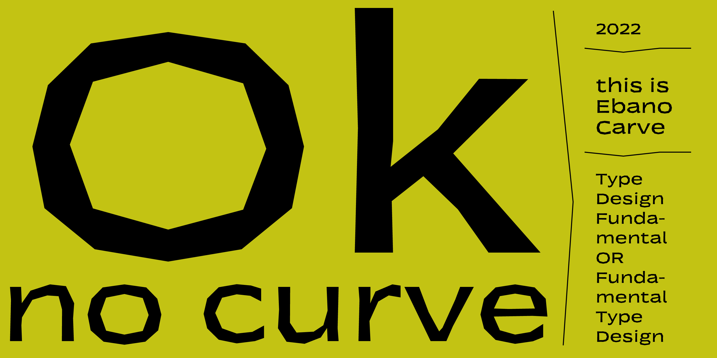
Another of Ebano’s attributes is the curves built up of many short straight lines. These are evident in display sizes and softened in small sizes where they get close to resembling real curves. Ebano’s ‘imperfections’ match the action of the woodcutter’s chisel.
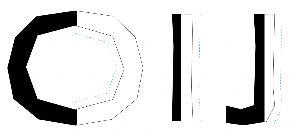
This is clearly visible in curved letters such as ‘O’ – which is more like a dodecagon than a circle – as well as ‘D’ and ‘C’. ‘Flaws’ produced by the chisel are also clear in straight letters like ‘I’ or ‘J’ that appear slightly tapered at the centre.

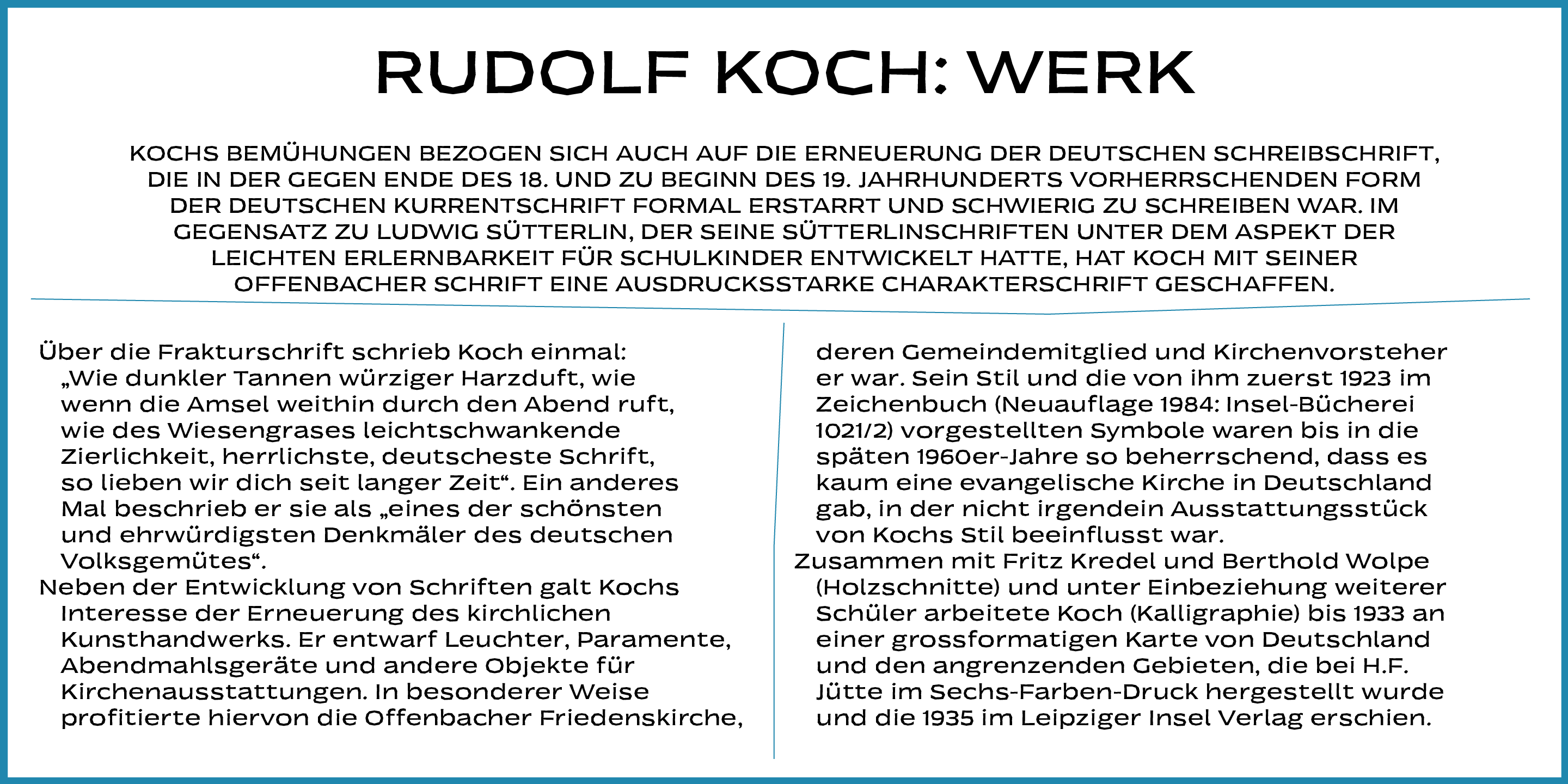
Ebano was inspired by the German calligrapher and illustrator Rudolf Koch and the Czech Expressionist artist Vojtěch Preissig. Koch’s Neuland (issued by Klingspor, Offenbach, 1922–1923) is an example of a typeface made by direct carving. From its early versions it is clear how the various letterforms of Neuland are well thought out and somewhat inconsistent, with different instances of the same letter differing slightly from one size to another – a feature fundamental to this typeface’s ‘primitive’ and rough.

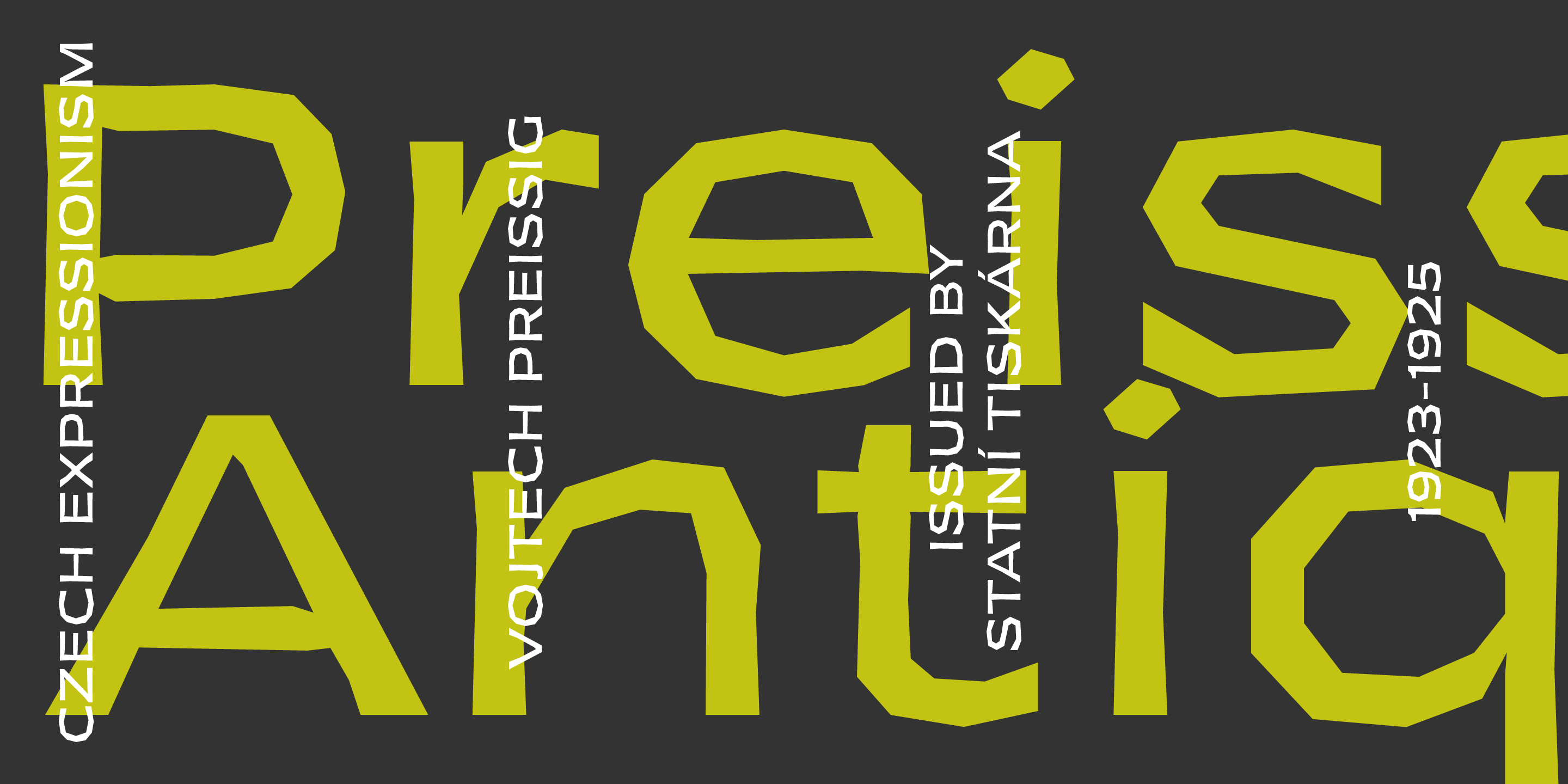
The Neuland style of letterforms can also be seen in the work of Vojtěch Preissig, a contemporary of Koch. This Czech artist experimented in various areas, including illustration and lettering, with several techniques, but with a special attention to linocuts and woodcuts. He cut many of his typefaces directly into wood or metal, without preparatory drawings. However inspiration from carved letterforms is also seen in Preissig Antiqua (issued by Statní tiskárna, Prague, 1923–1925), a high-contrast seriffed face drawn with pen and pencil on paper, that features curves built up by short wedge-shaped lines.

Ebano brings you back the much-admired primitive look of those carved-letters of the 1920s. Don’t miss the opportunity to enjoy Ebano’s taste in your next projects. With its noteable width, Ebano is readable in long texts, even at small type sizes, while its carved essence emerges best at big sizes giving strength and personality to your titles, ads, logos.
Are you a student? You can get our Educational Licences saving 90% on the full price of our fonts!
Do you want to try our fonts? Fill this form and test all CAST typefaces free of charge – including some still work-in-progress original typedesigns of ours!