Hi, I’m Blueberry Pancakes
Blueberry Pancakes by Massimo Pitis
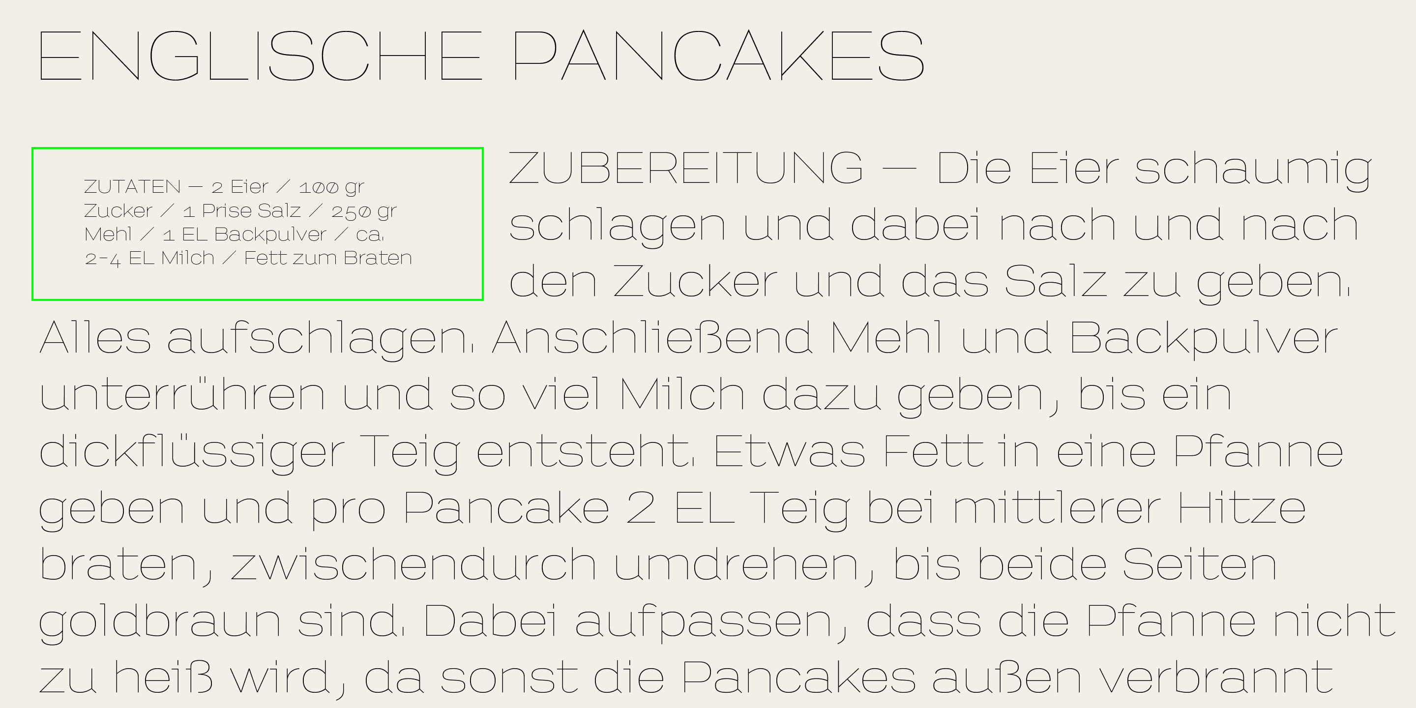
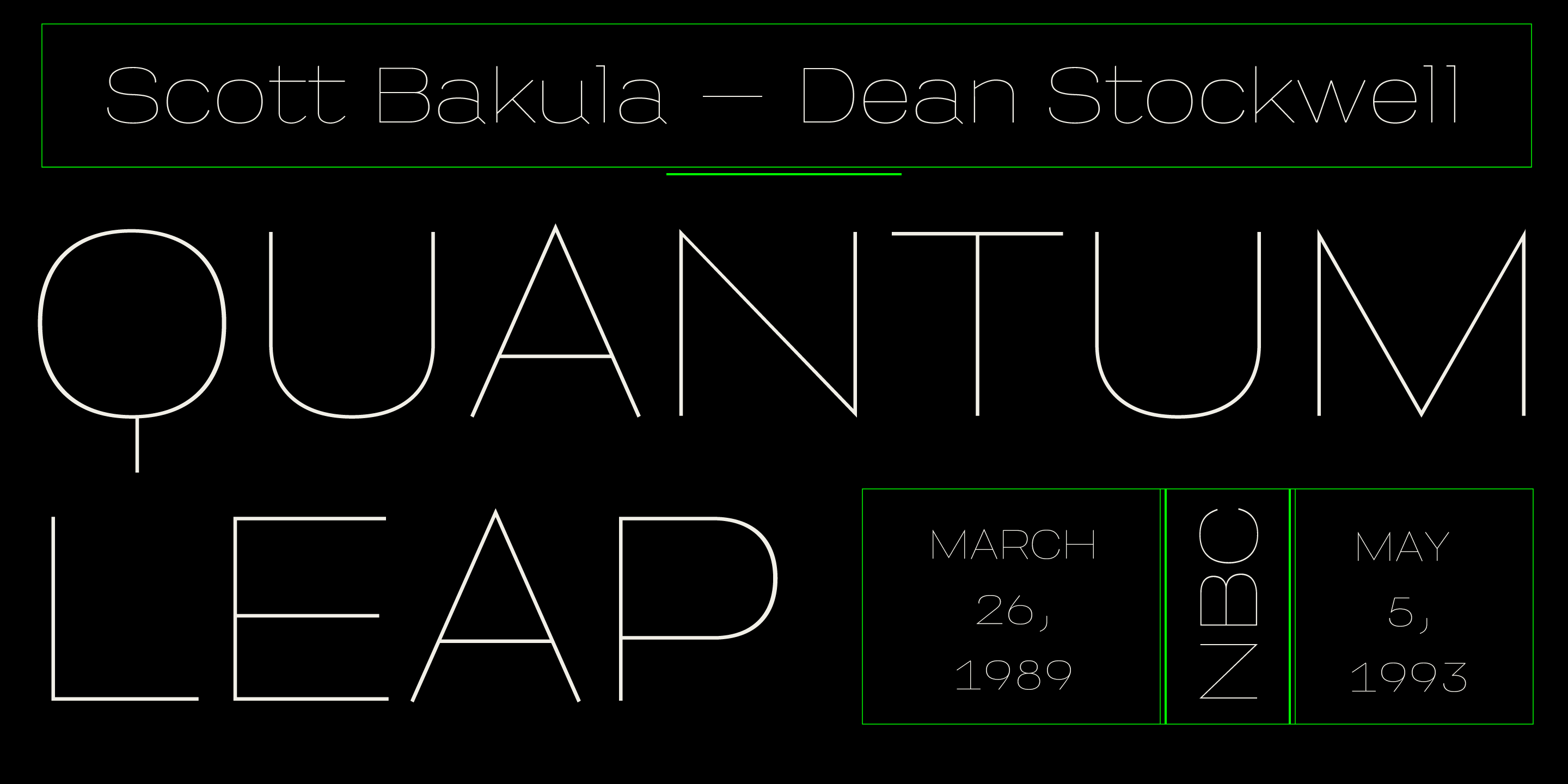
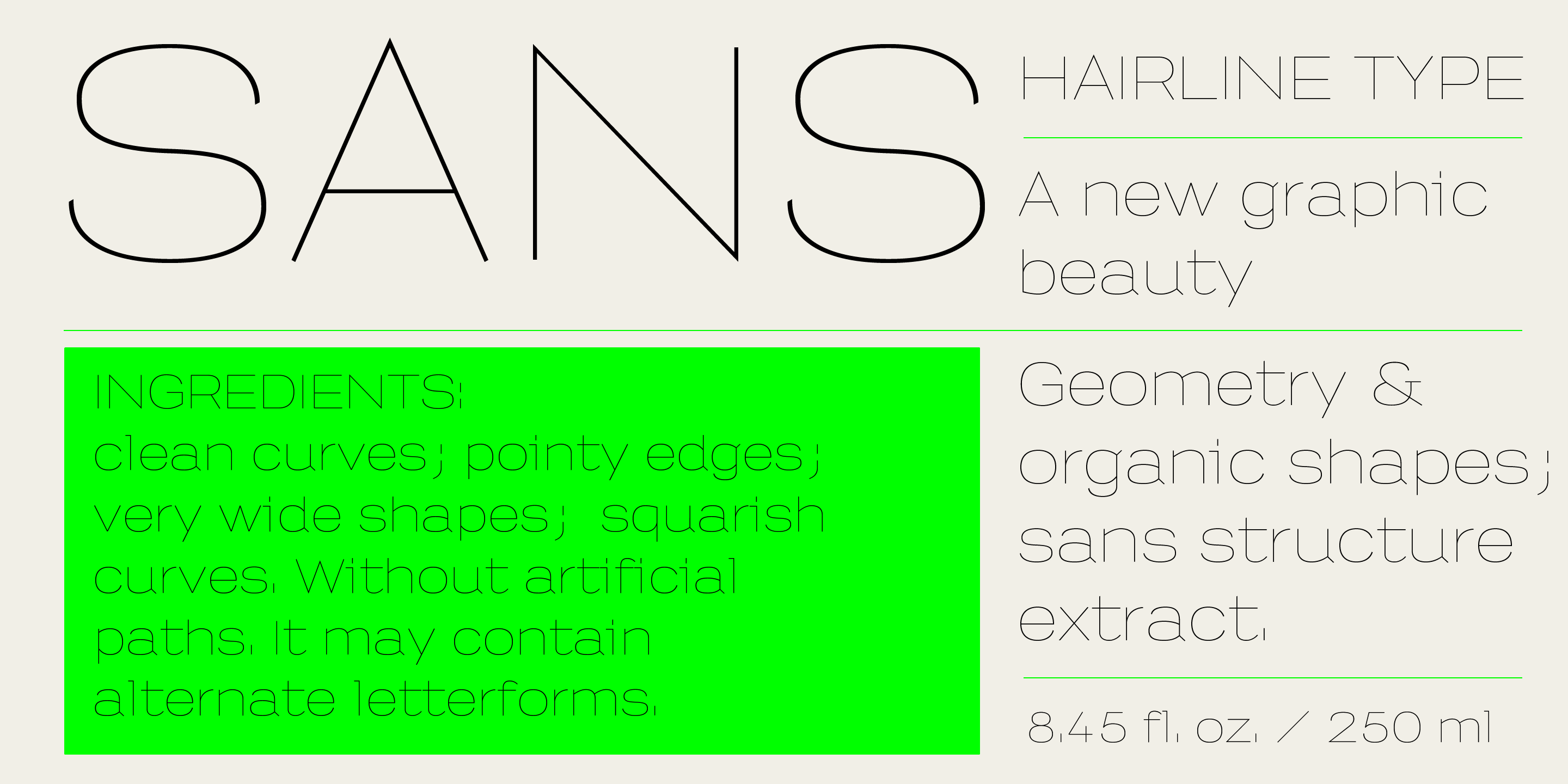
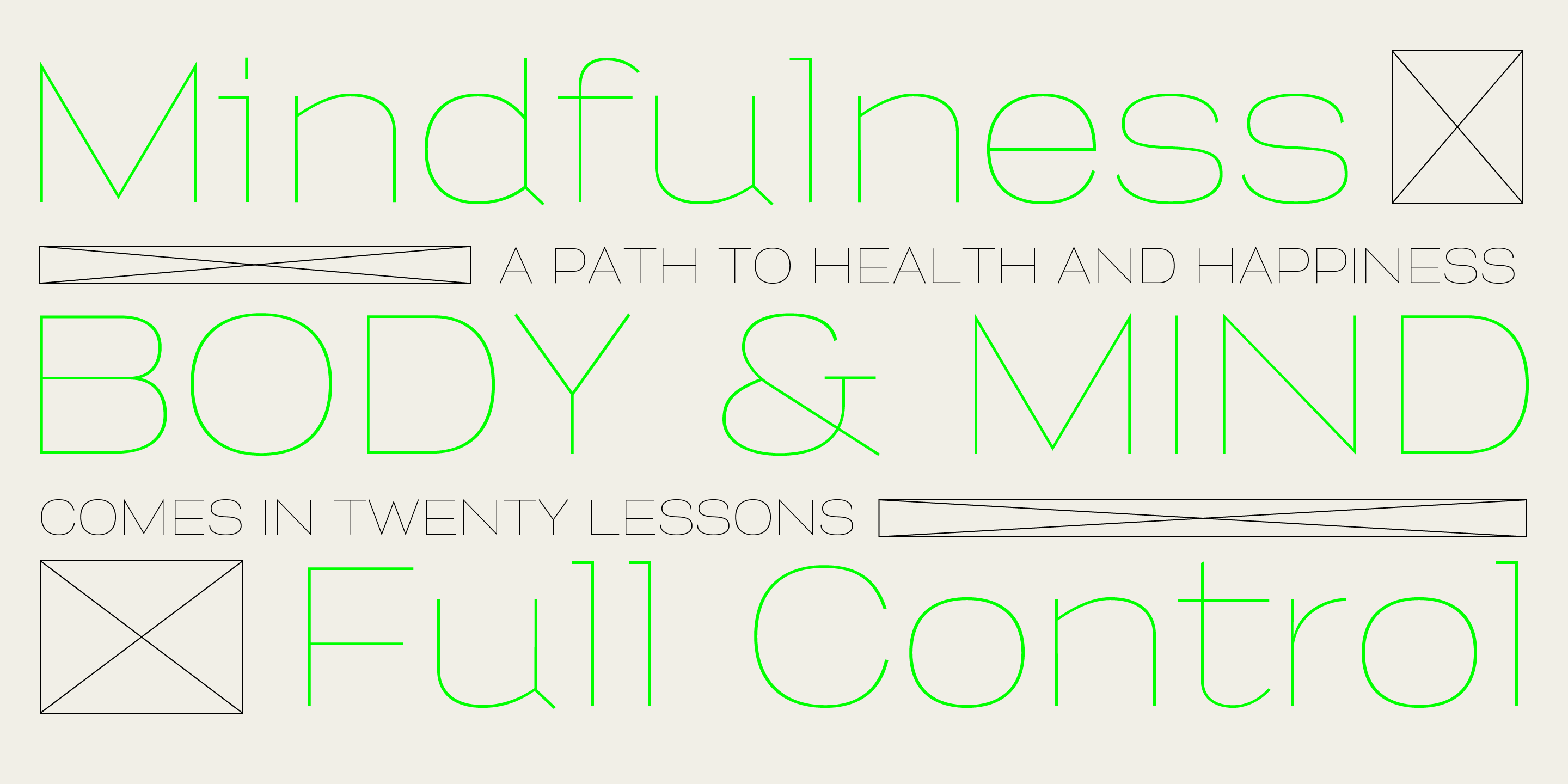
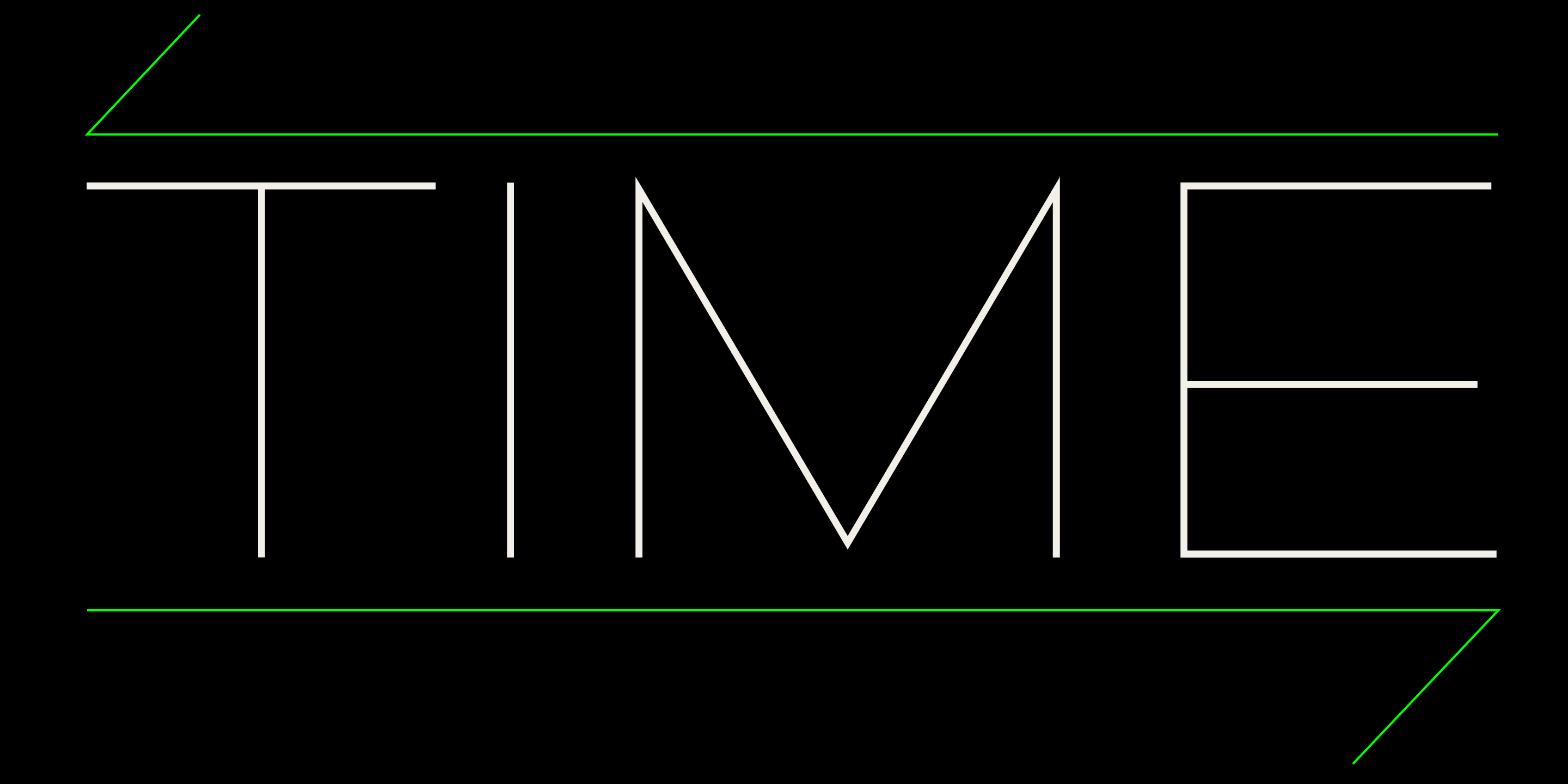
Here’s Blueberry Pancakes! A thin, squarish sans serif conceived for headlines, this almost geometric display typeface can’t wait to be put to use on book covers and magazine layouts

The underlying structure of Blueberry Pancakes
Conceived and designed by Massimo Pitis, provided with lower-case letters and fine-tuned by Tipiblu, Blueberry Pancakes is an ultra thin display sans serif with squarish letterforms and wide proportions. Art director of Wired Italia and founder of Pitis e Associati, Pitis is not a typeface designer but has long played with letterforms in his branding and publishing projects.
Where it all began
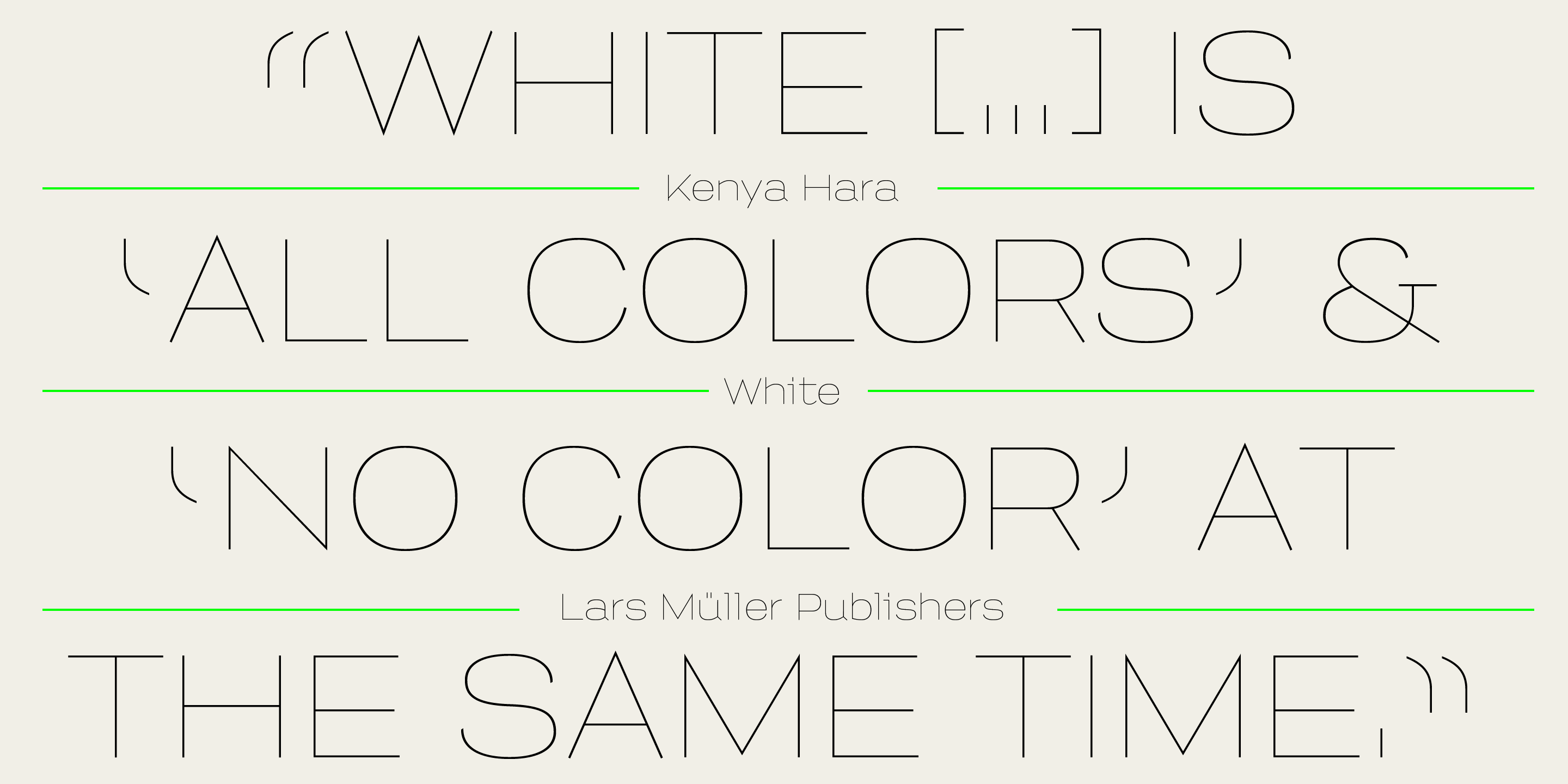
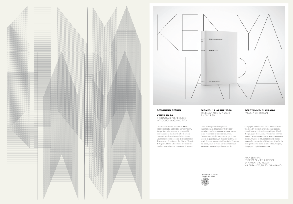
Inspiration for a very thin sans came around 2008, when Pitis was designing a poster for a talk by Kenya Hara at the Politecnico di Milano. In the poster, Pitis set the name of the Japanese designer with thin parallel lines and he went on to design a typeface out of a single line to match this lettering.
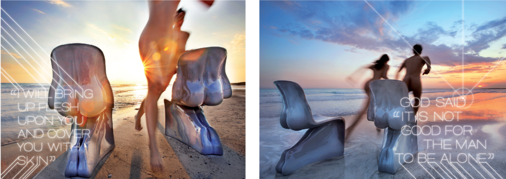
That typeface was first employed in a small catalogue of Casamania’s Him&Her chairs, by the Italian architect and designer Fabio Novembre. In order to enhance the Adam-Eve effect of the photoshoot by Settimio Benedusi, the type was used to set lines from the Old Testament.
A recurrent theme
Picking up the title of a 2007 song by the British musician Fink, the name Blueberry Pancakes suggests a certain nostalgia. The design of Blueberry Pancakes represents a topos, a recurrent theme in Pitis’s typographic work. He has long experimented with letterform skeletons: ‘I’m interested in the underlying structure of the letters, my aim with letters is always to first identify their skeleton, and from the skeleton I’m able to perceive the possible shapes of the letter. It doesn’t matter if I’m working on a serifed type or a sans serif, an extra bold or an ornamental type, what I’m always interested in is the structure.’
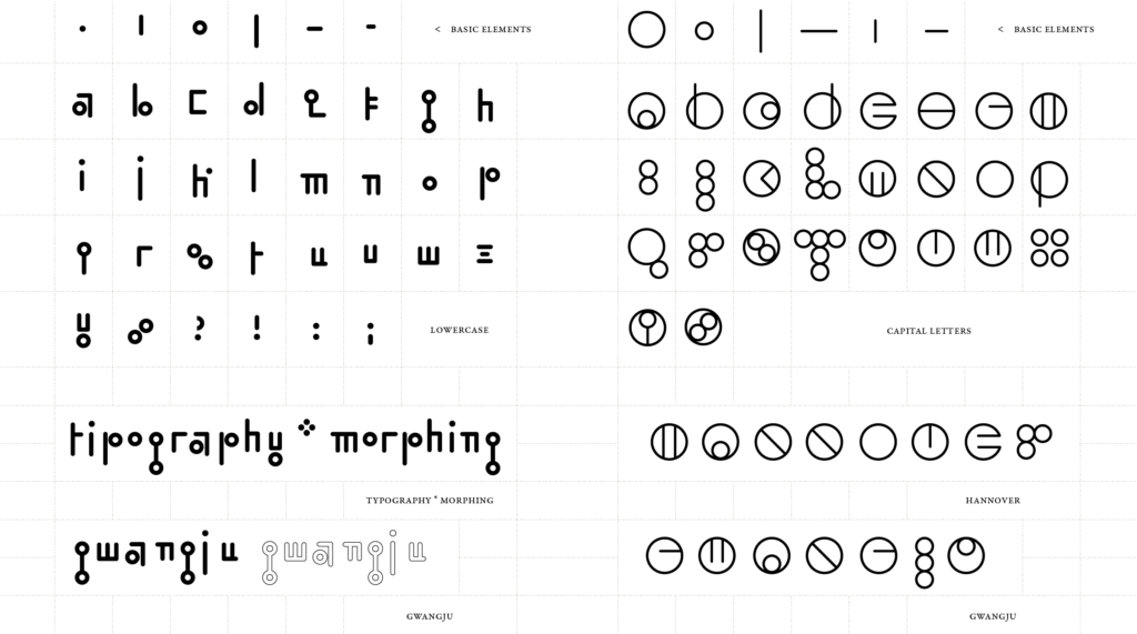
Following the design concept of Hangul
In his experimental lettering for magazines and brands, Pitis has often pared letters down until they are geometric constructions of austere lines. Although Blueberry Pancakes can hardly be labelled a geometric typeface, geometry influenced its construction. A love of geometric shapes is a recurring theme in Pitis’s work. It started long ago with a typeface that was never commercialised. Inspired by the concept of Hangul (the Korean writing system) that typeface was built with a few basic geometric signs. It was named Hannover Bridge, after a Japanese cargo ship registered in Panama under a German name, to reflect the idiosyncratic internationalism emerging in digital typography in the early 2000s.
The unparalleled Blueberry Pancakes
The design of Blueberry Pancakes started with its capitals, that were initially drawn in Illustrator with extremely thin single-line strokes. Once the single line was expanded into proper outlines, this procedure led to terminals made of single points (pinnacles) or by small lines that are parallel to the axis of the stroke, and not to the baseline. This detail was emphasised in the final design, and is matched by other details like the tail of a, which is a straight stroke at 45°.
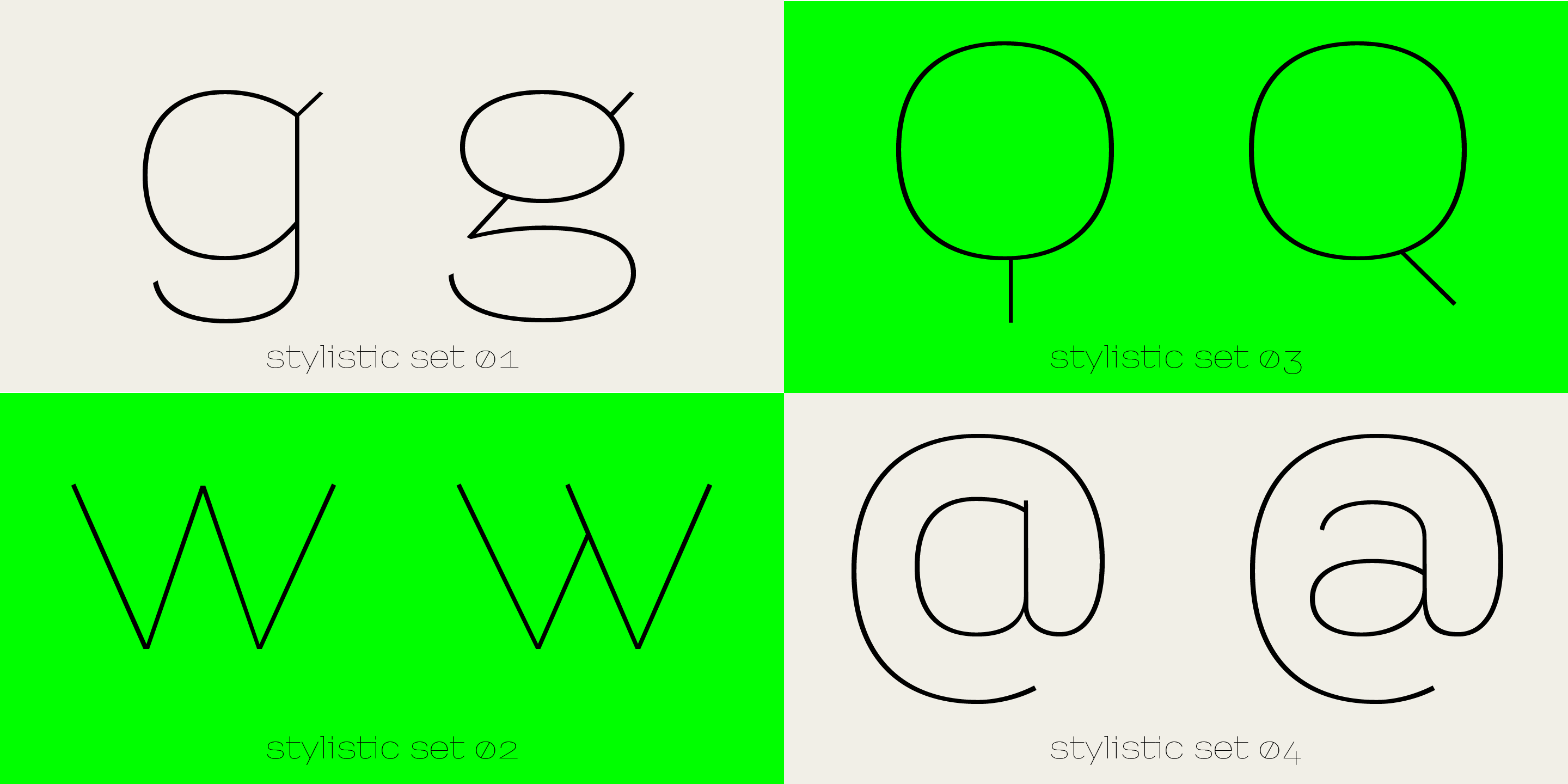
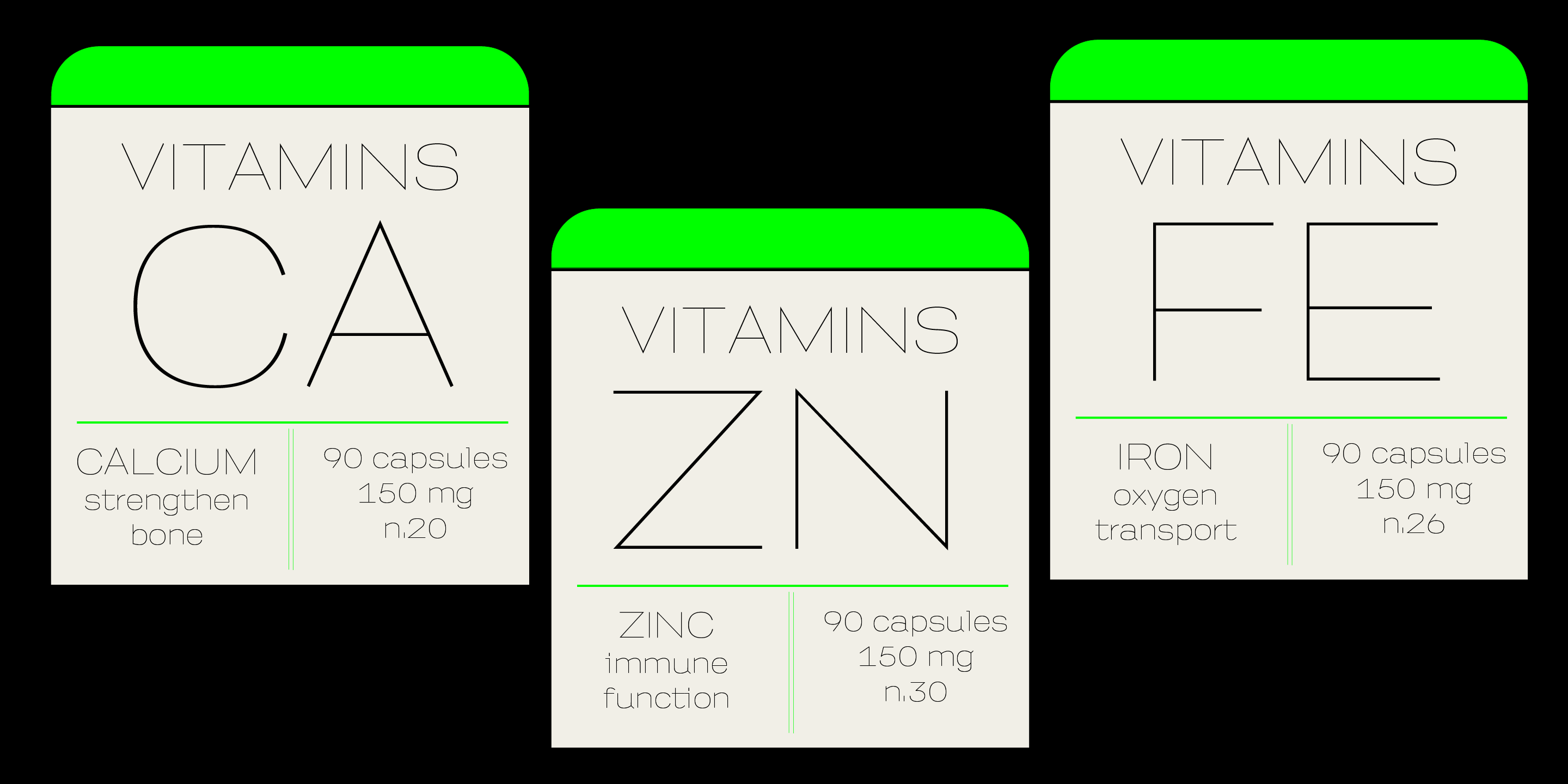
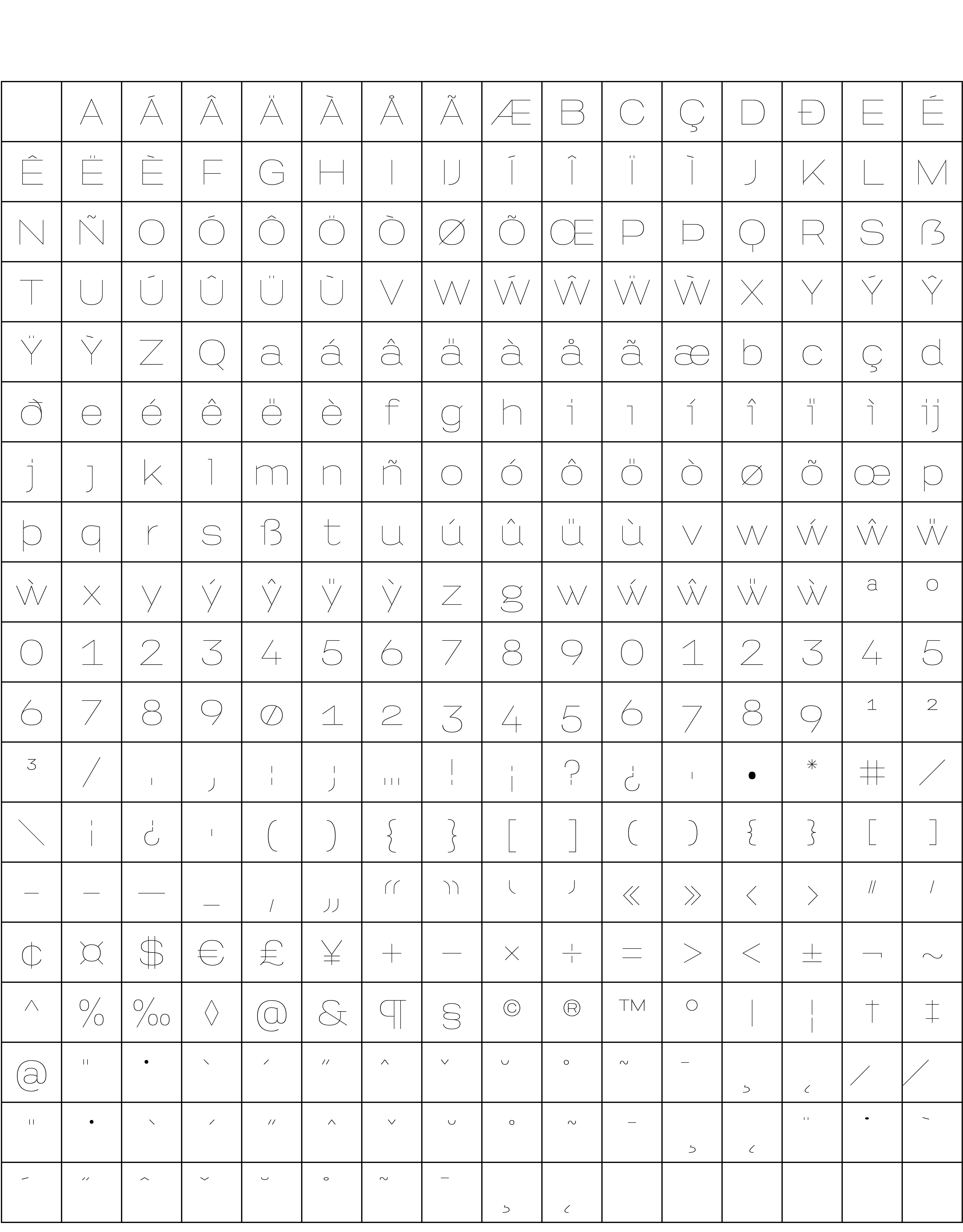
Moreover, the lowercase letters are rather wide and squarish, as well as the caps, and they include some alternates in letters g (one- and two-storey g), w, @ and Q. The Q with a vertical tail is a tribute to the geometric experiments of the earliest design stages of the typeface. A more ordinary Q, with an oblique tail, is also provided as an alternate. Along with an uppercase and lowercase, the typeface is equipped with a basic character set that includes lining and old-style numerals.
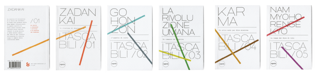
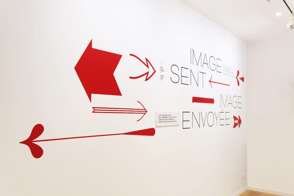
With its thin geometric look, Blueberry Pancakes adds clarity and polish to screen and printed matter when it’s time to set inspired titles. Some works shown here and more recently here are a fine sampling of its typographic virtues.
Character set
Buy
Are you a student? You can get our Educational Licences saving 90% on the full price of our fonts!
Do you want to try our fonts? Fill this form and test all CAST typefaces free of charge – including some still work-in-progress original typedesigns of ours!