The typescape of Valnera
This angular typeface design by Riccardo De Franceschi for CAST Foundry works nicely for both text and display. Design influences range from Alpine landscapes to Oldřich Menhart’s work and to a certain kind of 1970s photocomposition feel. Valnera comes in eight weights with matching italics as well as Valnera Monster – a rather special guest. Furthermore, in the random version of the type family, two ‘almost random’ procedures allow for dynamic patterns in the shaping of text
Text by Massimo Gonzato. Illustrations by Alessandro Cripsta
Riccardo De Franceschi is an Italian type designer based in London. He is creative director at typeface design studio Dalton Maag. He has a special interest for vernacular lettering and display typefaces used in printed ephemera and in public spaces.
The Valnera type family was developed and finalised with the contribution of CAST Foundry.
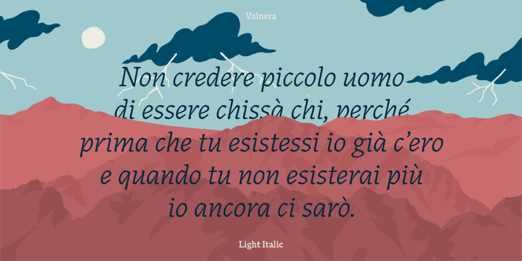
A low-contrast humanist serif in eight weights plus Valnera Monster
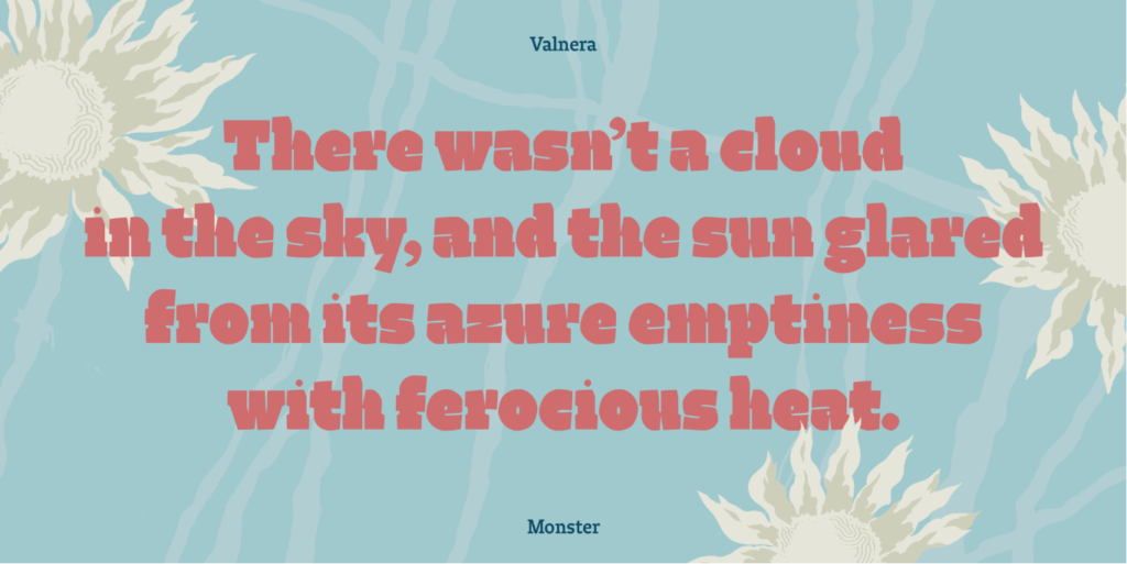
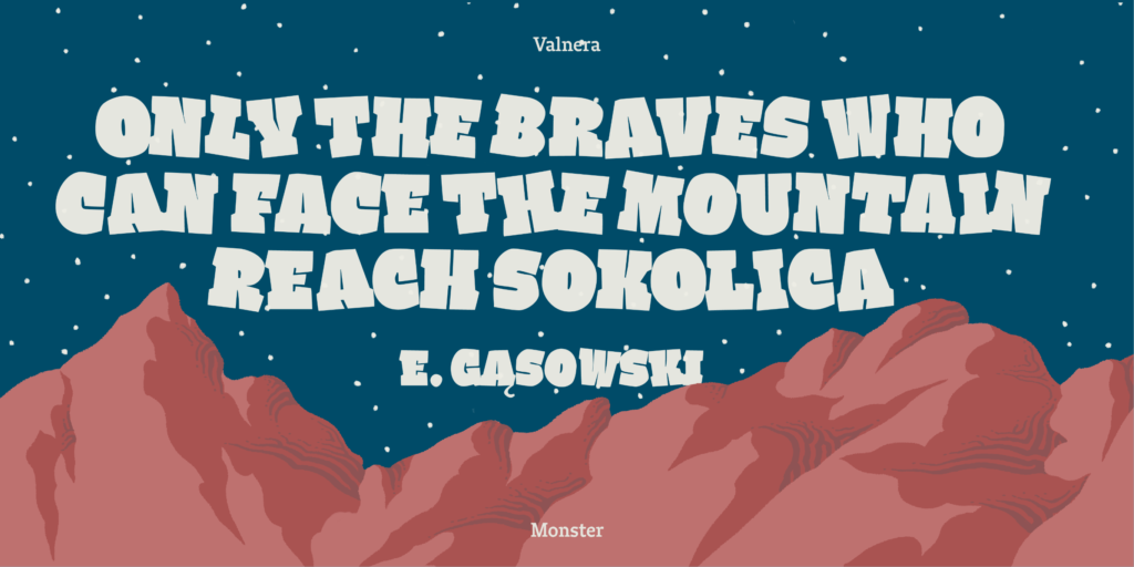
Valnera is a low-contrast humanist serif typeface. It is intended for setting texts in big and small sizes, as generally required by magazines. Eight weights from ExtraLight to Black provide a range of emotional shades to typesetting. But there’s also one more weight: the extremely heavy cut Valnera Monster – a headline font meant to attract attention, in the most typical tradition of display typography.

Low contrast doesn’t affect Valnera’s legibility at small sizes because of the sharp cuts to the lowercase joints. On the other hand, these cuts also work very well at big sizes, giving Valnera a peculiar, eye-catching touch. The proportions were initially rather uniform, but during the design process they were eventually crafted to a more organic set, in accordance with Luciano Perondi’s feedback.

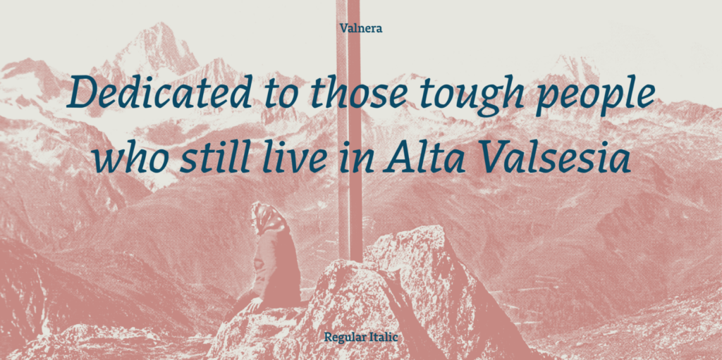
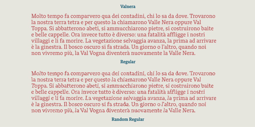
Each of the eight Valnera weights comes with matching italics. These true italics are completely different from their upright counterparts. They have neither ink-traps nor high contrast, but they are consistent with that ‘angular design’ which is Valnera’s main feature.
The mule track to the magazines
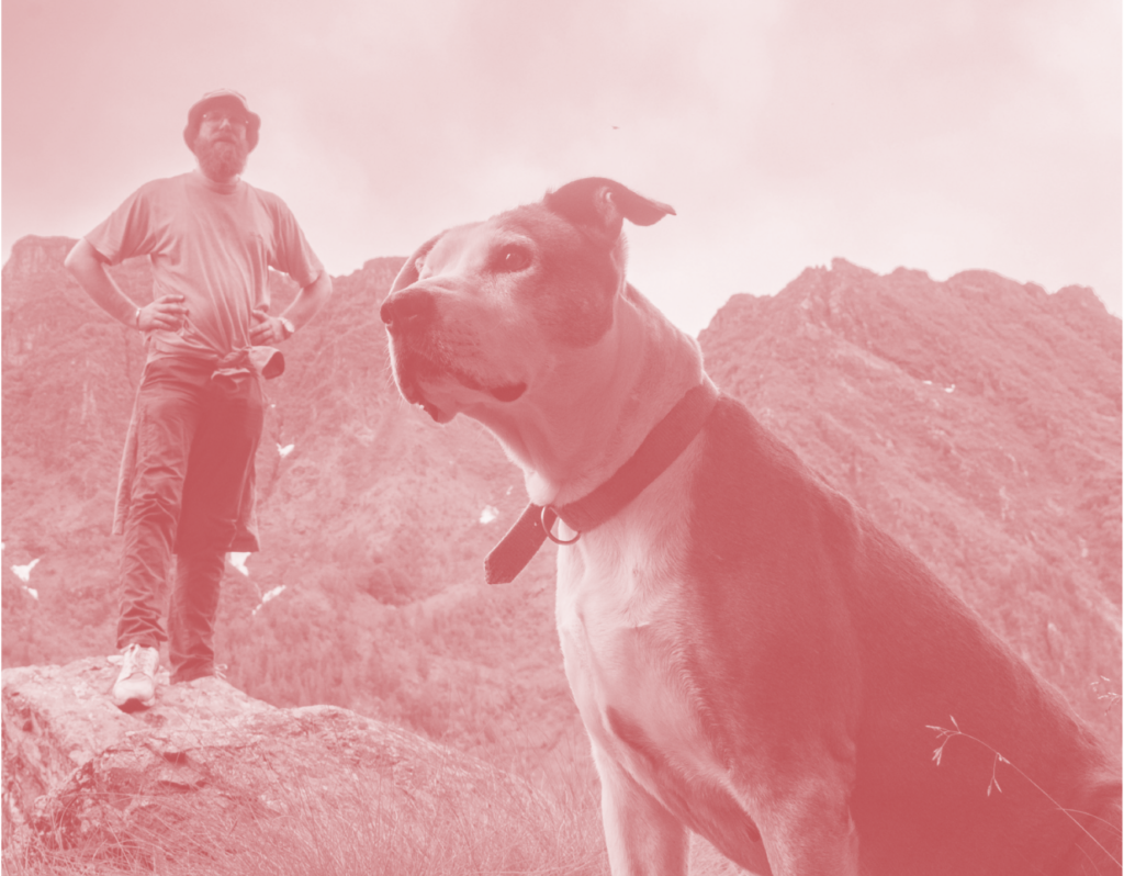
Valnera took its name after De Franceschi’s personal Brexit led him back to northern Italy at the turn of 2011. It is a contraction of Valle Nera, the local name for Val Vogna, a short lateral valley of the bigger Valsesia, an Alpine valley in the Piedmont region, close to Switzerland. Valnera – meaning Black Valley – was carved by the Vogna torrent. The mule track in this valley was a way to get from Valsesia to Valle d’Aosta and many generations used it to emigrate from Italy to France. It’s a tough valley and grim proof of that are the numerous casualties and fatalities that occurred on the track over the centuries.

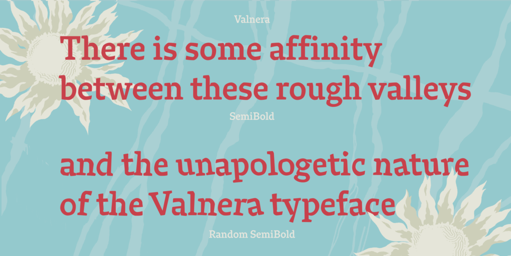
De Franceschi – who started sketching Valnera in late September 2010 while living and studying in Reading – found some affinity between these rough valleys where he used to hike with his dog Iole and the peculiar look of the Valnera typeface. So, while talking about an ideal application, the designer once said that Valnera should be used in a mountaineering magazine.
An uncompromising typeface
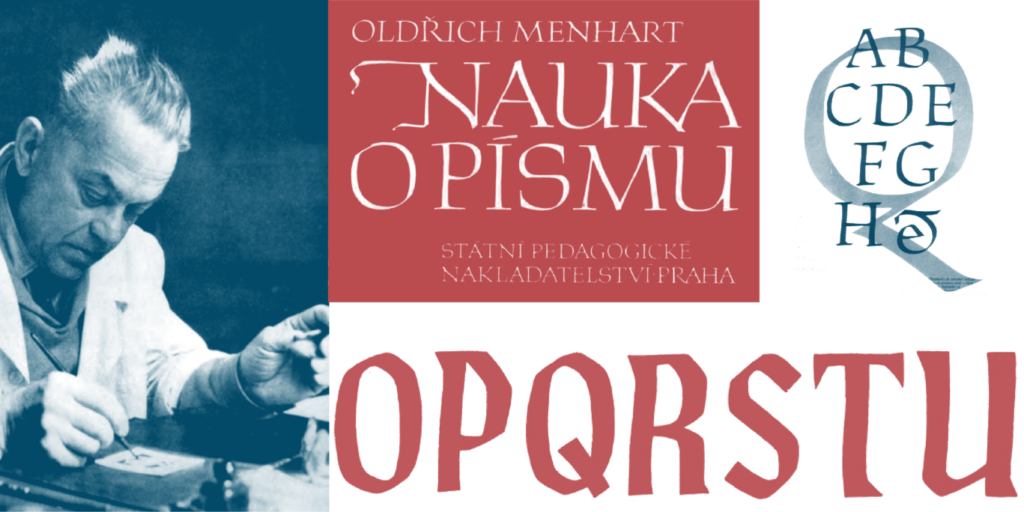
Valnera was an angular design from the beginning. You can notice the influence of the work of Oldřich Menhart while the counters of some round letters recall Dwiggins’ ‘m-formula’. But it was when the designer was working on it in Quarona (Valsesia, Italy) that the angularity took on a new meaning in relation to the rocky, tough, inhospitable landscape.
For effects Valnera stands out as a somewhat extreme typeface. When it was offered to a number of foundries in 2011, they would usually like the design, but none of them were interested in publishing it without some calming down of its features. Like a stubborn mountaineer reluctant to abandon a climb, De Franceschi would not compromise on this design… Until CAST agreed to publish Valnera as it was, without compromise.
The phototype allure
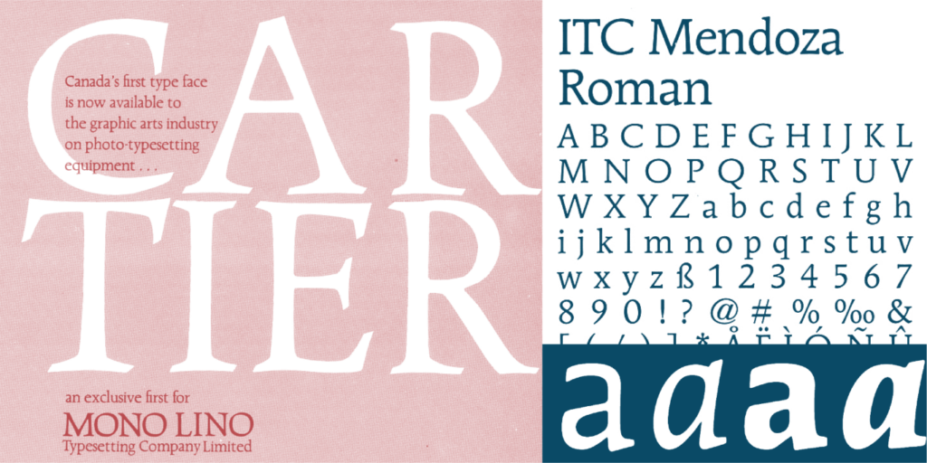
When De Franceschi started designing Valnera he also had in mind typefaces like ITC Mendoza (1975–1991, José Mendoza y Almeida) and Cartier (1967, Carl Dair) with their peculiar phototype allure.
As in these faces, Valnera’s horizontal terminals are strong, cut according to the pen angle (exit strokes of c and e, as well as entry stroke of a), and the connections between stems and arches are very sharp. Valnera is a low-contrast humanist face, yet it is not a revival. It has flat horizontal curves and open counters, while sharp cuts at crotches help resolve any darkening effects. It also features strong, slabbish serifs.
Capitalising on irregularity: Valnera Random
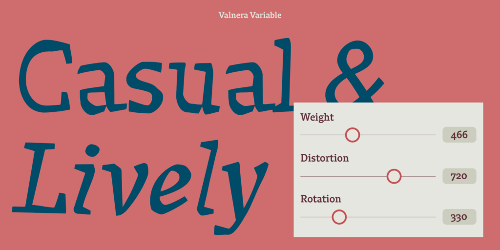
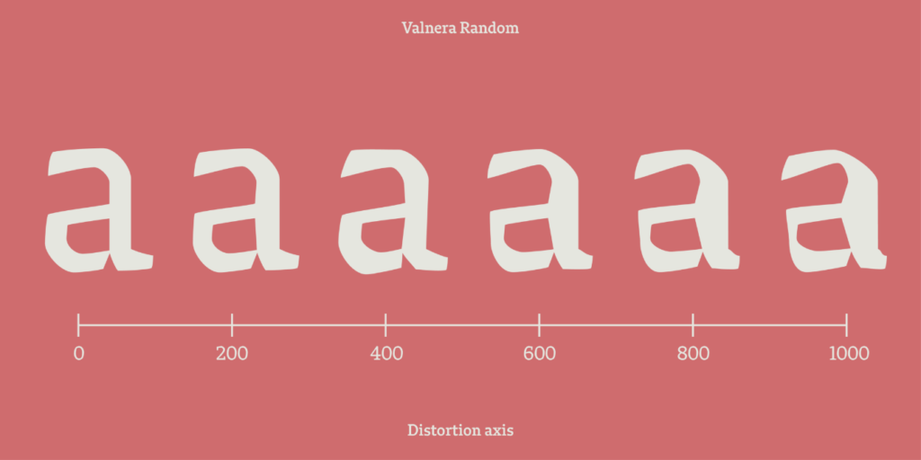
Last but not least, Valnera is also provided with a Random package that capitalises on the irregular nature of the letterforms, which are as such forgiving to alteration. This Random package is designed around the two principles of rotation and distortion. It is built on the idea that while digital typography relies on extreme regularity, previous technologies involved more irregular procedures and less predictable outputs; and that such irregularity can make a face unexpectedly lively. For example, texts in Valnera Random interact very well with informal illustration, while also maintaining comfortable readability.
Two different levels of irregularity are incorporated in Valnera Random, through the code developed by CAST’s Daniele Capo. The first level acts within each individual glyph: every outline has been modified through programming, its points being shifted both horizontally and vertically (distortion); secondly it has been rotated around its centre by a degree ranging between -15° and +15° (rotation). The second level operates across several glyphs, through an OpenType feature that pseudorandomly alternates between all the different character shapes available, resulting in unpredictable patterns in the shaping of text.

A whole new level of – variable – expression
This alternation happens behind the scenes as the user types on the keyboard, effortlessly giving the text a casual and lively appearance on the page. The desired degree of irregularity on the other hand, can – and should! – be manually controlled at the typesetting level: here Valnera Random opens up whole new levels of expression. Distortion and rotation can be adjusted dynamically on two separate axes: besides the traditional static OTF format in fact, Valnera is also available in the Variable Font format, the first of its kind in the CAST catalogue. The whole text weight range for both uprights and italics comes in weight, rotation and distortion axes (while the Monster cut only in the latter two).