Hi, I’m Rudolf Antiqua
Rudolf Antiqua by Claudio Rocha and Lucas Franco
Based on enlargements of the specimens of Koch-Antiqua, Rudolf Antiqua revives the allure and elegance of Klingspor’s original type with an accurate and effective redesign and the addition of a broad range of capital ligatures


The adroit letterforms of Rudolf Antiqua
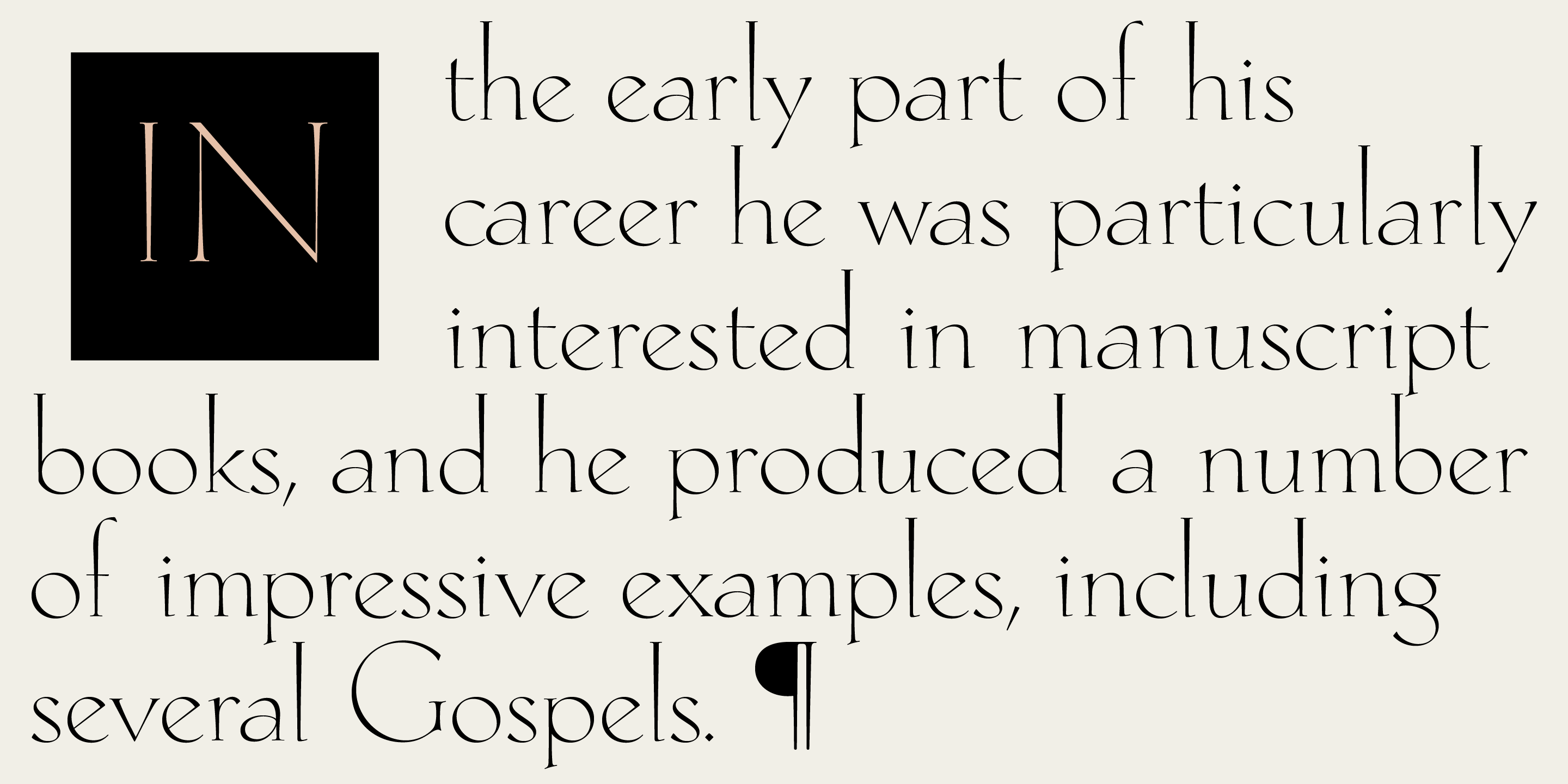
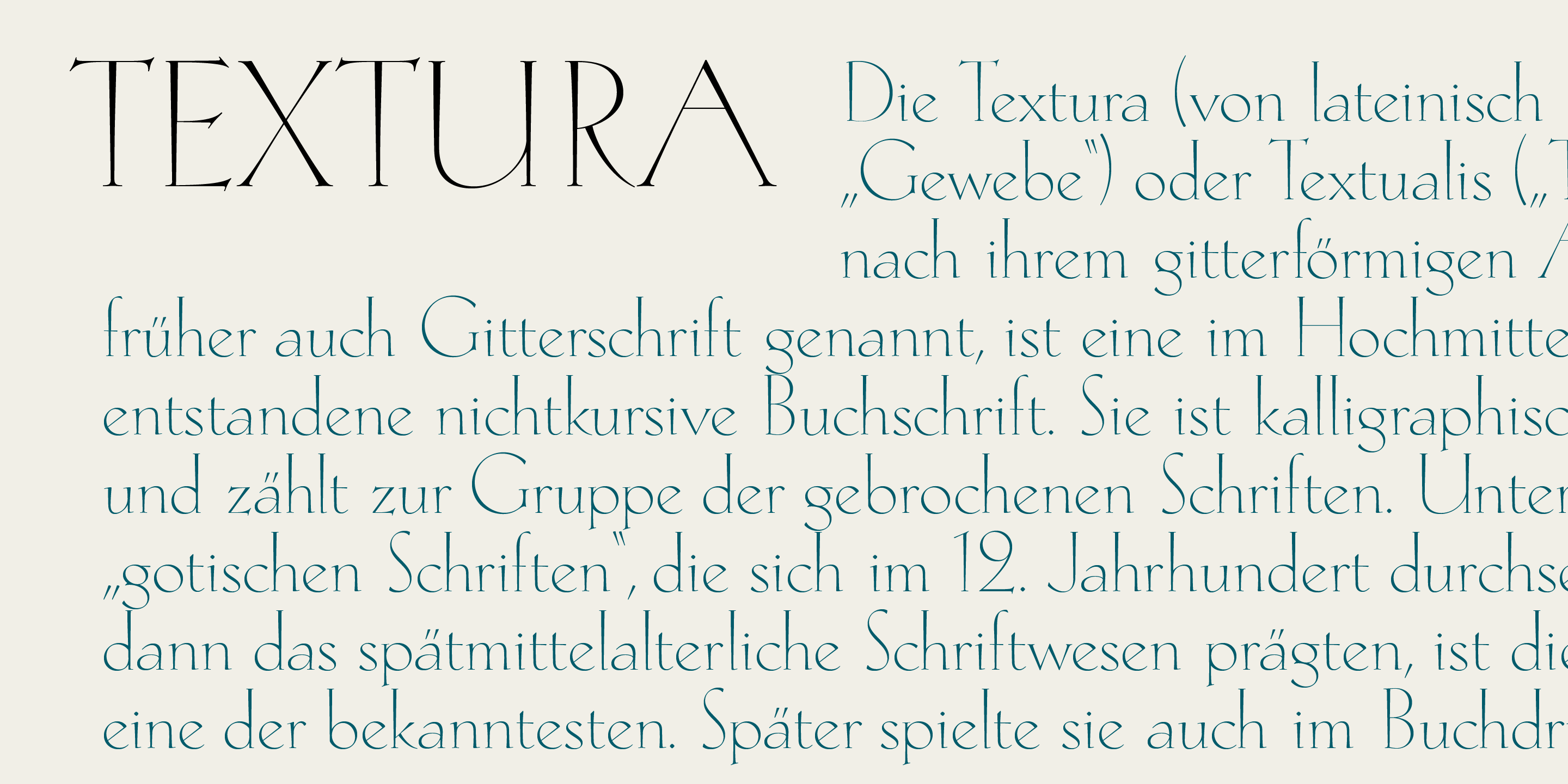
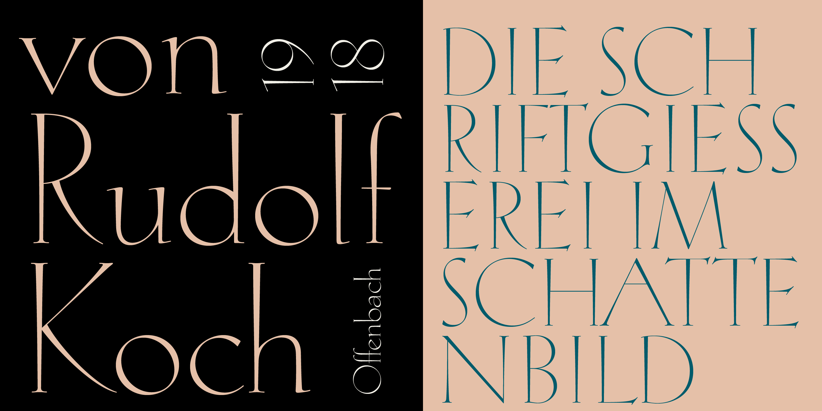
Rudolf Antiqua is a digital revival of Rudolf Koch’s Koch-Antiqua, a typeface issued in 1922 by the Klingspor typefoundry in Offenbach am Main, Germany. In 2018, Brazilian designers Claudio Rocha and Lucas Franco researched Koch’s original drawings, proofs and specimens at the Klingspor Museum library and carefully reconstructed Koch’s letterforms in digital format.
Faithful to the original spirit
Like Koch’s original metal type, Rudolf Antiqua performs well as a display face, while it is also useful for setting short texts. Koch-Antiqua’s versatility gave it unrivalled appeal for book jackets, magazine mastheads and advertising. It was fashionable and elegant. Now, Rudolf Antiqua picks up the baton and aims to meet the same needs in the digital environment.
Rudolf Antiqua vastly expands on the original character set with accented characters, symbols and punctuation as well as discretionary ligatures and contextual alternates. The result is perfectly adapted for both print and screen, and retains historical features and authentic charm.
Koch’s elegant display face was produced for hand composition, and the Klingspor foundry probably manufactured it via traditional punchcutting methods, which were still in general use in Germany at the time – though Koch himself was not involved in the cutting, as he only started cutting punches some years later. This scenario was different to what went on in other countries, where foundries had already replaced traditional methods with mechanical punchcutting and matrix-making.
A whiff of the Renaissance
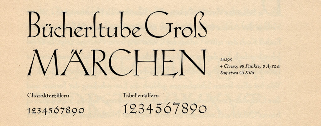
A commercial success, Koch-Antiqua face displays strongly-flared stems and a tiny x-height which makes a very visible contrast with the tall ascenders and capitals. The result is reminiscent of certain Renaissance sanserif inscriptions — the Florentine Letters — we discussed while tracing the inspiration behind another typeface by Lucas, Franco Stone.
Koch-Antiqua’s wide, round letters with a slanted axis (C, G, O …) stand in contrast to B, E, R, S, T etc., whose forms may hark back to the narrow proportions of classical Roman capitals. The lowercase has humanist letterforms, such as an e with an oblique central bar, and a g with an open lower counter. Koch dug deep into history: Venetian printers of the 15th century (many of whom were of German origin) would likely have appreciated his choice of letterforms.
Dan Reynolds: Some matter on Rudolf Koch and his work
Rudolf Koch (1876–1934) is an interesting figure and worth a closer view. So we asked Dan Reynolds – an expert in German printing and typefounding, a colleague (see for instance Cast it #3), and also a dear friend – to drop us some lines on this influential designer from the early 20th century.
Since his lifetime, the type designer Rudolf Koch has been best known for his calligraphy. Almost every typeface he designed can be traced back to his broad-pen writing. While the connection might be less clear in a design like Kabel, Koch-Antiqua originated on written test-sheets he produced in 1916. However most of the typefaces Rudolf Koch designed were blackletter. Within that genre, he explored more of the design space than he ever did with roman type, and Koch’s Fraktur, Gotisch, Rotunda, Schwabacher(ish) and even Kurrent faces helped shape German typography for decades.
The Nazi issue
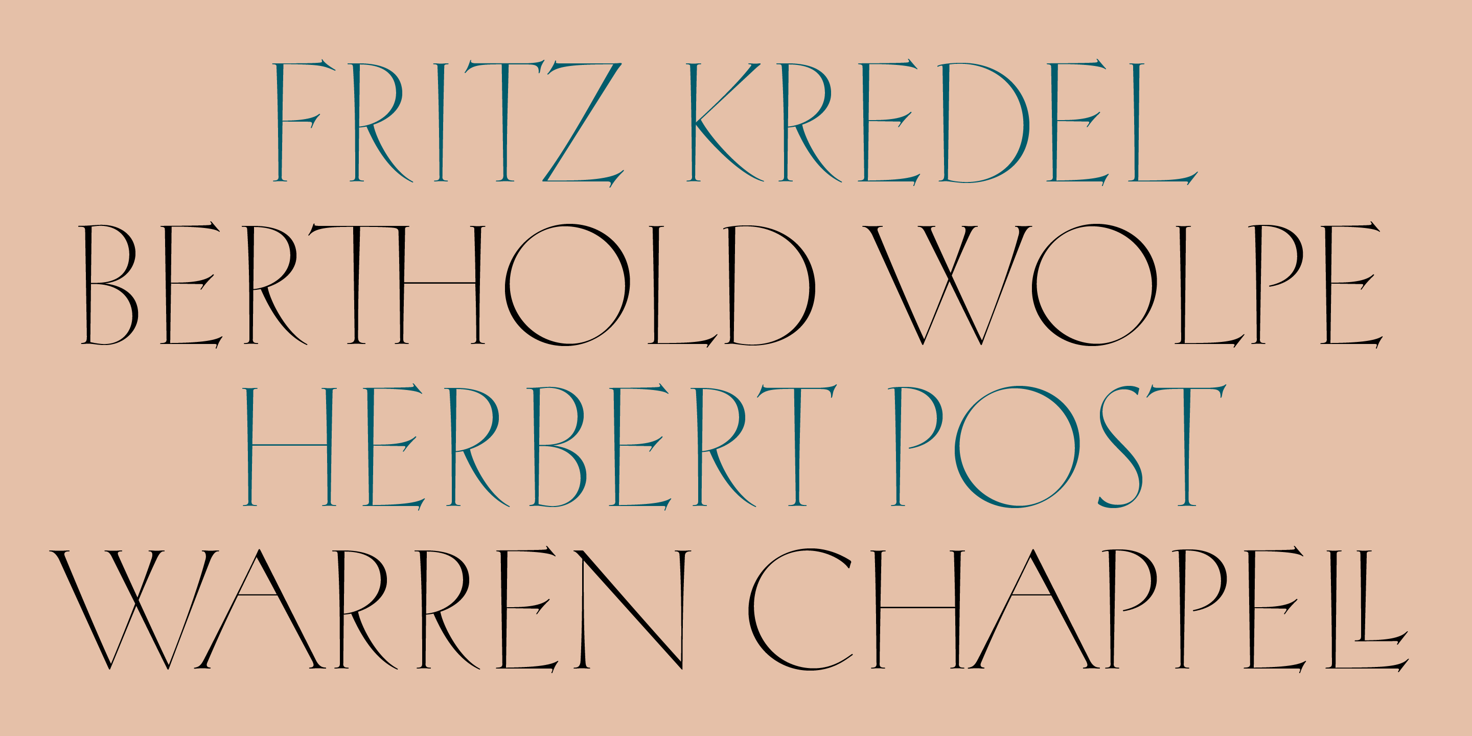
The question of whether Koch sympathized with the Nazis is a perennial one online. Based on Koch’s support in 1933 for his patron and friend Siegfried Guggenheim – after others in Offenbach had already distanced themselves from him – the suggestion that Koch was ever an open Nazi supporter seems very unlikely. Koch continued to openly collaborate with Berthold Wolpe and Fritz Kredel until his early death in 1934. Wolpe was a designer of Jewish origin; he left Germany for Britain in 1935. Kredel’s wife was Jewish, and they eventually left Germany, too. Readers unwilling to believe this should refer to current scholarship. At least three books addressing this topic were published in Germany over the last decade.

From blackletter to roman type
Compared with his blackletter typefaces, Koch’s romans had less success. Paul Renner’s Futura experienced much more use than Kabel, the geometric sans Koch designed. Marathon – a serif typeface designed for bookwork, whose punches Koch cut himself – is now an almost forgotten part of his repertoire. Neuland has been used continuously since the 1920s; this is another typeface that Koch cut himself, but since it only includes capital letters, Neuland’s use has typically been limited to display applications. While Koch-Antiqua was Koch’s first roman family, it was not the first time he had roman letterforms cast into type. Koch-Antiqua’s capital letters may have been inspired by Koch’s first-ever roman typeforms, a series of ornamented capitals he designed as alternates for an earlier blackletter typeface called Maximilian.
Koch-Antiqua: both a display and a text face
Today, type designers would classify most of Koch’s faces as ‘display’ selections. Yet, when they were produced, these were intended for use as ‘text fonts’, too. Indeed, many typographers during the first half of the twentieth century used his work to compose whole books (as Koch also did himself). Looking at the Klingspor foundry’s specimens, one sees that Koch-Antiqua was intended for both text and display purposes. Not only did those present entire pages composed in Koch-Antiqua, but they also showed designs in almost every conceivable foundry-type size, beginning with texts set as small as 6pt.
The expansion of the family
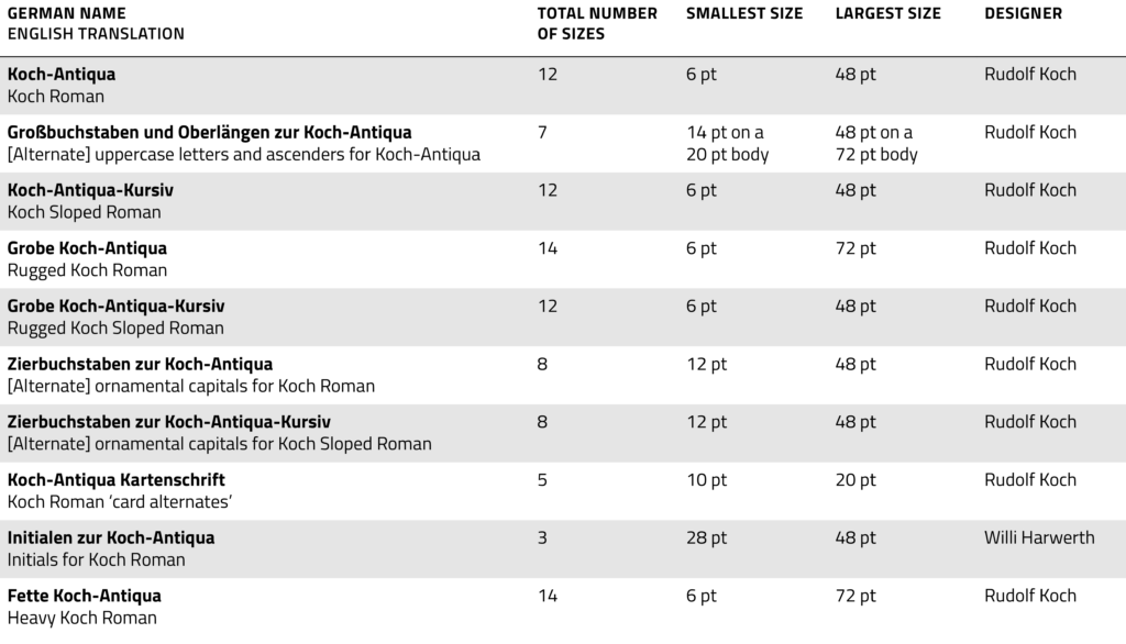
‘Koch-Antiqua’ is usually used as shorthand for the family of related typefaces detailed in the table below. As you can see, Koch-Antiqua had a sloped-roman companion whose design direction was singled in its name. A true italic might have been called just ‘Koch-Kursiv’ instead. In a big difference from the base Koch-Antiqua design, however, the uppercase letters in Koch-Antiqua-Kursiv received a more ornamental design in all sizes from 12pt on upward. The main ‘strokes’ of those letters were each made out of two lines, rather than one. In the bolder sloped roman called Grobe Koch-Antiqua-Kursiv, the uppercase only became more ornate starting with the 14pt size. The ‘Initialen zur Koch-Antiqua’ (initials for Koch-Antiqua) were a set of ‘Floriated Capitals’ that could be combined with the family or used on their own. The stylized flowers placed behind Koch’s capital letterforms were added by the illustrator Willi Harwerth, who regularly collaborated with the Klingspor foundry.
The spread of Koch-Antiqua
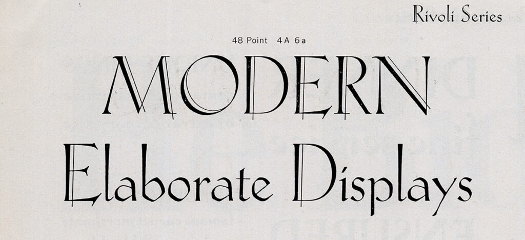
Klingspor began selling the first upright Koch-Antiqua sizes in 1922. British printers could soon buy fonts of Koch-Antiqua under the name Locarno. In the United States, the type design’s name was Eve. Klingspor did not sell typefaces in the US directly. Instead, Eve was one of the typefaces Klingspor distributed through a company established by Melbert B. Cary, Jr. in 1925, the Continental Type Founders Association in New York. Cary’s firm imported European typefaces and thereby challenged the position that the American Type Founders Company had in the US printing market. That was probably the reason ATF released a domestic copy of Koch-Antiqua in 1928: Morris Fuller Benton’s Rivoli and Rivoli Italic (followed up in 1930 with a bolder typeface by Willard T. Sniffin, called Paramount).
The great type robbery
Koch and Klingspor must have been unnerved by ATF’s challenge. In 1929, Koch condemned Rivoli in the German graphic design magazine Gebrauchsgraphik. Printed in both German and English, the article’s title was ‘Geistiger Diebstahl’/‘Intellectual Theft’. David Pankow’s ‘A Face by Any Other Name Is Still My Face: A Tale of Type Piracy’ and Gerard Cinamon’s Rudolf Koch biography each recount the episode. They reprint both the article and the contents of a letter that ATF’s Henry Louis Bullen sent to Koch as a response. Koch must have shared Bullen’s letter with others, as Konrad F. Bauer published its contents through a 1930 article in Klimsch’s Druckerei-Anzeiger, ‘Rudolf Koch und die American Typefounders Company’.
Bullen’s mud machine
Bullen accused Koch of fooling the Klingspor foundry into thinking that Koch-Antiqua was an original design (unlikely, given the relationship Koch had with foundry co-owner Karl Klingspor). Throwing Koch’s claim of intellectual theft back against him, Bullen asserted that the Koch-Antiqua typeface just recycled letterforms from a 1549 writing manual by Urban Wyss, of Zürich. Bullen must have used this likely-baseless argument to deflect away from Koch’s complaint. Bullen closed his letter with an ad hominem attack on the German mentality, bringing up the First World War when the United States and Germany had been adversaries
Rudolf Antiqua. My name is fair play
While Bullen’s letter to Koch makes the Rivoli affair salacious even today, I find the anecdote worth mentioning for another reason. Like Rivoli, Rudolf Antiqua by Rocha and Franco differs from Rudolf Koch’s original design in some details. Koch and Klingspor viewed Rivoli as theft, because Rivoli was a foundry typeface created to compete with sales of Eve directly. Rudolf Antiqua differs from Rivoli in that it is a digital reinterpretation of Koch-Antiqua, not a similar product produced in the same medium. Rocha and Franco also acknowledge their debt to Rudolf Koch in Rudolf Antiqua’s very name, a step that ATF was not able to take.
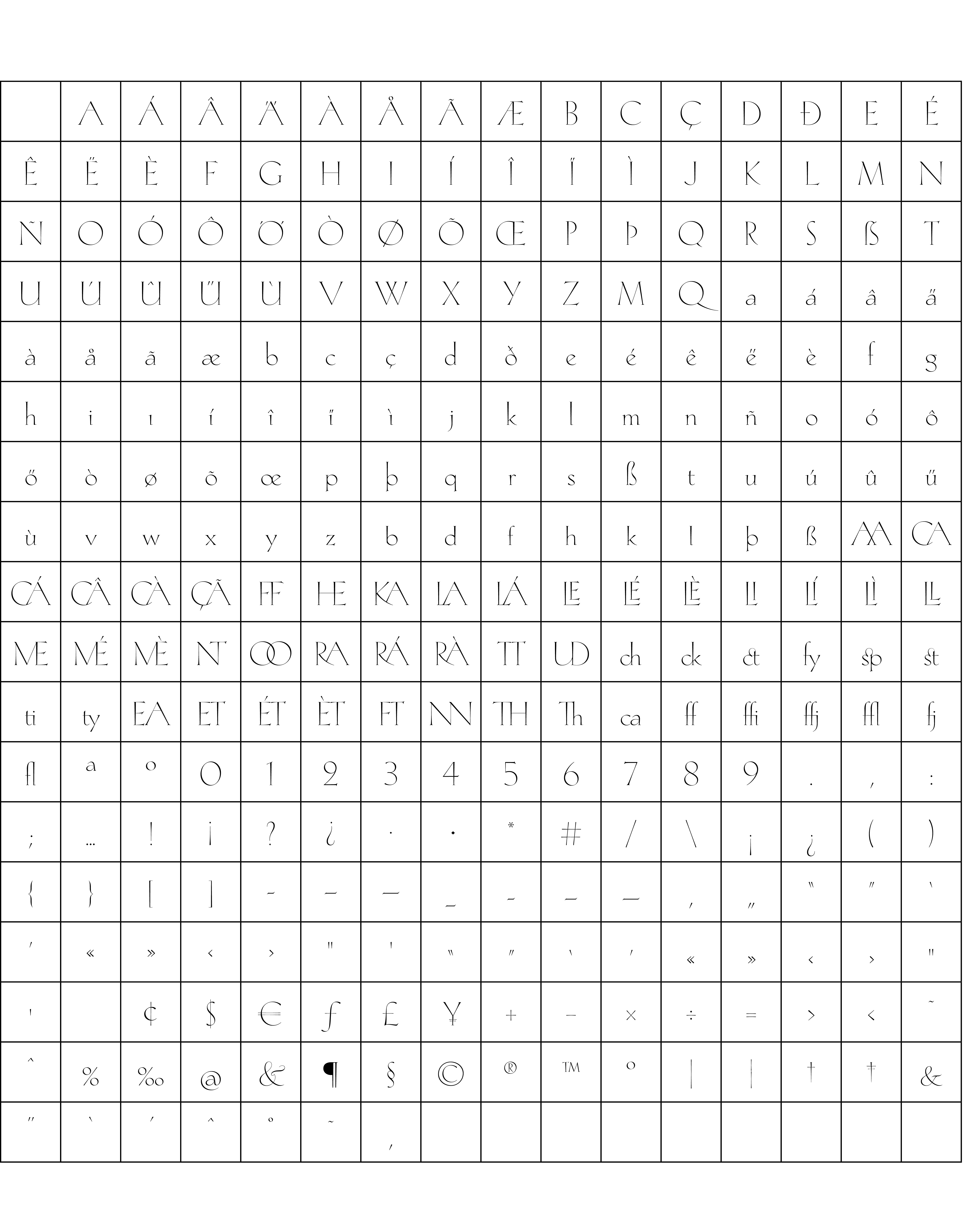
Character set
Buy
Are you a student? You can get our Educational Licences saving 90% on the full price of our fonts!
Do you want to try our fonts? Fill this form and test all CAST typefaces free of charge – including some still work-in-progress original typedesigns of ours!